AR Mobile App
See how wallpaper looks in your room before you buy it
⚡ AI Summary ⚡
Project: AR Mobile App (White-label wallpaper/paint visualization)
Client: Farrow & Ball (UK paint company) + white-label for other brands
Role: Product Designer
Team: 10+ Developers, 2 Designers, Project Manager, Project Owner
Timeline: 2019-2021 (2 years)
Platform: iOS & Android mobile app
Problem:
- People can’t visualize how wallpaper/paint will look on their walls
- Buy wrong products, returns are expensive
- Initial SDK built by developers without design input was unusable
- Room scanning was too complex for non-technical users
Research:
- 3 official usability testing rounds + multiple guerrilla tests
- Competitive analysis of AR apps in home decoration space
- Changed app direction 3 times based on findings
- Key insight: Floor scanning was hardest step — users didn’t understand “scan your room”
Solution:
- Pivoted from SDK to standalone white-label app
- Step-by-step AR session: scan floor → mark corners → measure height → success
- Clear visual guidance: dark overlay, animations showing what to do, help buttons
- Green markers (least likely to blend with real room colors)
- Haptic feedback for invisible confirmations
- Curated inspiration feed, room browsing, saved projects
Impact:
- Partnership with Farrow & Ball validated approach
- White-label app ready for other paint/wallpaper brands
- Solved hardest UX problem: making room scanning work for non-technical users
Skills demonstrated:
AR interaction design, usability testing, competitive analysis, iterative design, design systems, white-label architecture, mobile app design, workshop facilitation
What I’d do differently:
Find ways to test AR earlier (couldn’t prototype without built SDK), build analytics from day one, simplify flow further
Overview
People want to redecorate their homes but can’t visualize how wallpaper or paint will actually look on their walls. They browse catalogs, imagine possibilities, and often buy the wrong thing. Returns are expensive. Regret is common.
I designed an AR app that lets users see wall decorations live on their actual walls, a white-label solution built for paint and wallpaper companies. The first major partner was Farrow & Ball, the biggest paint company in the UK.
- My Role: Product Designer
- Team: 10+ Developers, 2 Designers, Project Manager, Project Owner
- Timeline: 2019 – 2021
- Platform: Mobile app (iOS & Android)
My contributions
- Competitive analysis
- UX research (multiple usability testing rounds)
- Mobile interface design
- AR interaction design
- User flow design
- Iterative prototyping and testing
- Design system creation
- Workshop facilitation and brainstorming
The challenge in detail
The initial idea was to build this as an SDK that other apps could integrate. Developers built it without design input. It worked technically but was completely unusable.
The original SDK built by developers without design input – technically functional but unusable
After user research, we realized this needed to be a standalone app, not an SDK. And it needed to be white-labeled so different paint/wallpaper companies could customize it with their branding and catalog.
The hardest problem: room scanning
For AR to work, the app needs to understand the room’s dimensions, where the floor is, where the walls are, how tall they are. This requires users to physically move around their room with their phone, following instructions to “scan” the space.
Users struggled with this. Early versions just said “scan your room” with no clear indication of what that meant. Users would wave their phones around randomly or give up.
This was the core UX challenge: making a complex technical process (room scanning for AR) understandable to non-technical users who just want to see how wallpaper looks.
What I did
Extensive testing
We ran three official usability testing rounds plus many informal guerrilla tests. Each round revealed new problems. We changed the entire app direction three times based on what we learned.
This wasn’t a project where we designed something and shipped it. It was constant iteration based on user feedback.
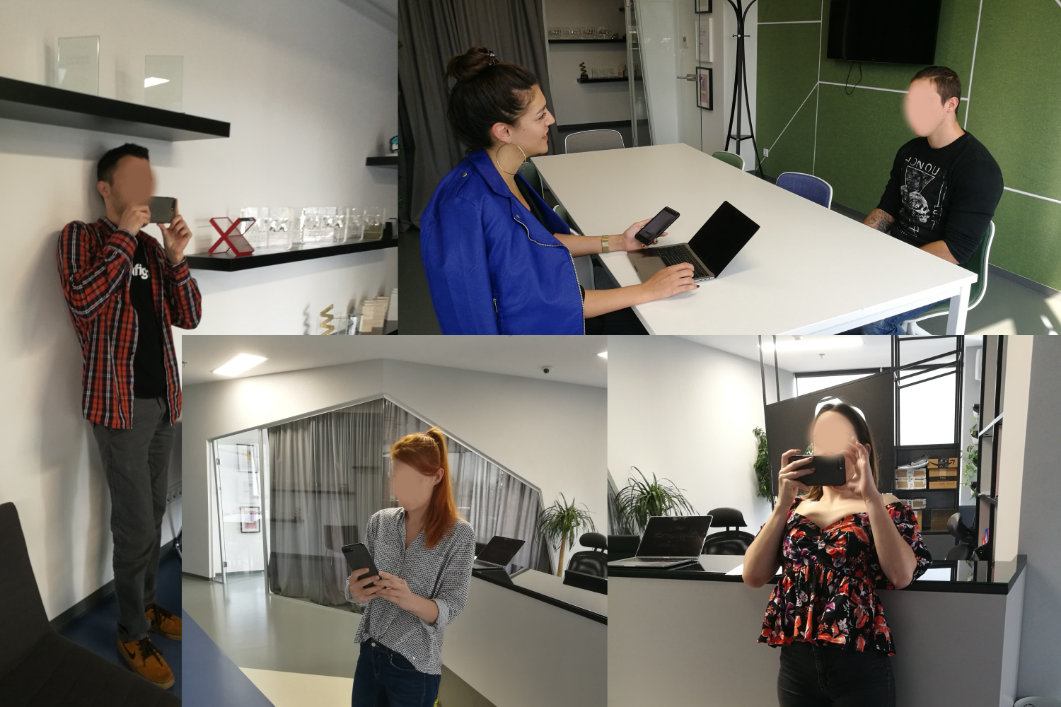
Participants testing the AR room scanning feature in various room setups
Competitive analysis
I analyzed existing AR apps in the home decoration space:
- How did competitors handle room scanning?
- How did they handle product browsing?
- What AR visualization approaches worked?
This informed our approach to floor scanning and the step-by-step AR session design.
Key finding: Competitors either skipped room scanning (lower quality AR) or had confusing scanning flows. No one had solved this well. There was opportunity to differentiate through better onboarding.
The AR scanning was the hardest part. Users struggled to scan their room’s floor. This was required for the AR to work properly, the app needed to understand the room’s dimensions and wall positions.
We figured out through usability interviews that floor scanning was the hardest part for users. They didn’t understand what “scan your floor” meant or when they’d done it successfully.
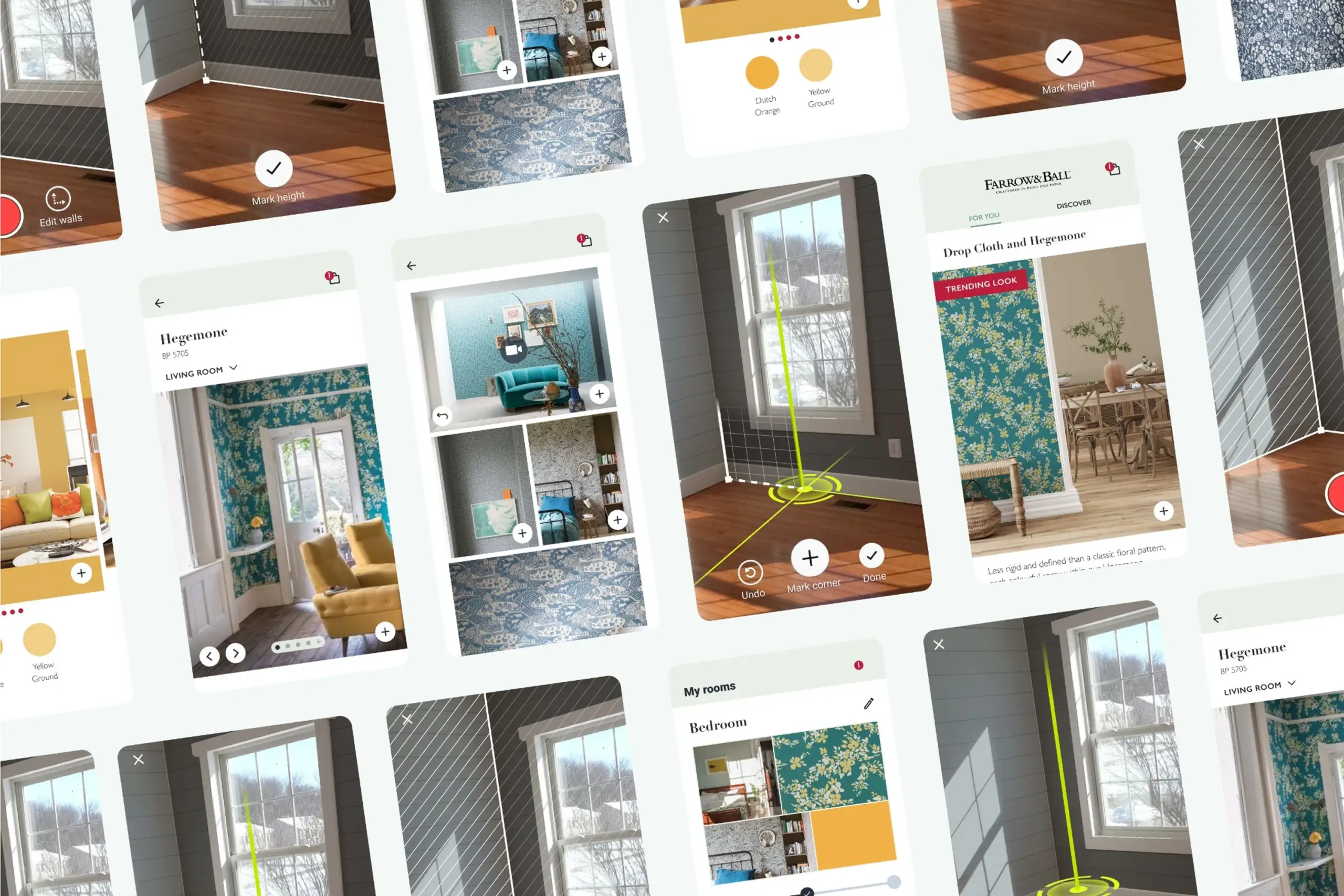
AR session design
I broke the complex room scanning process into clear steps with feedback at each stage.
Step 1: Scan floor
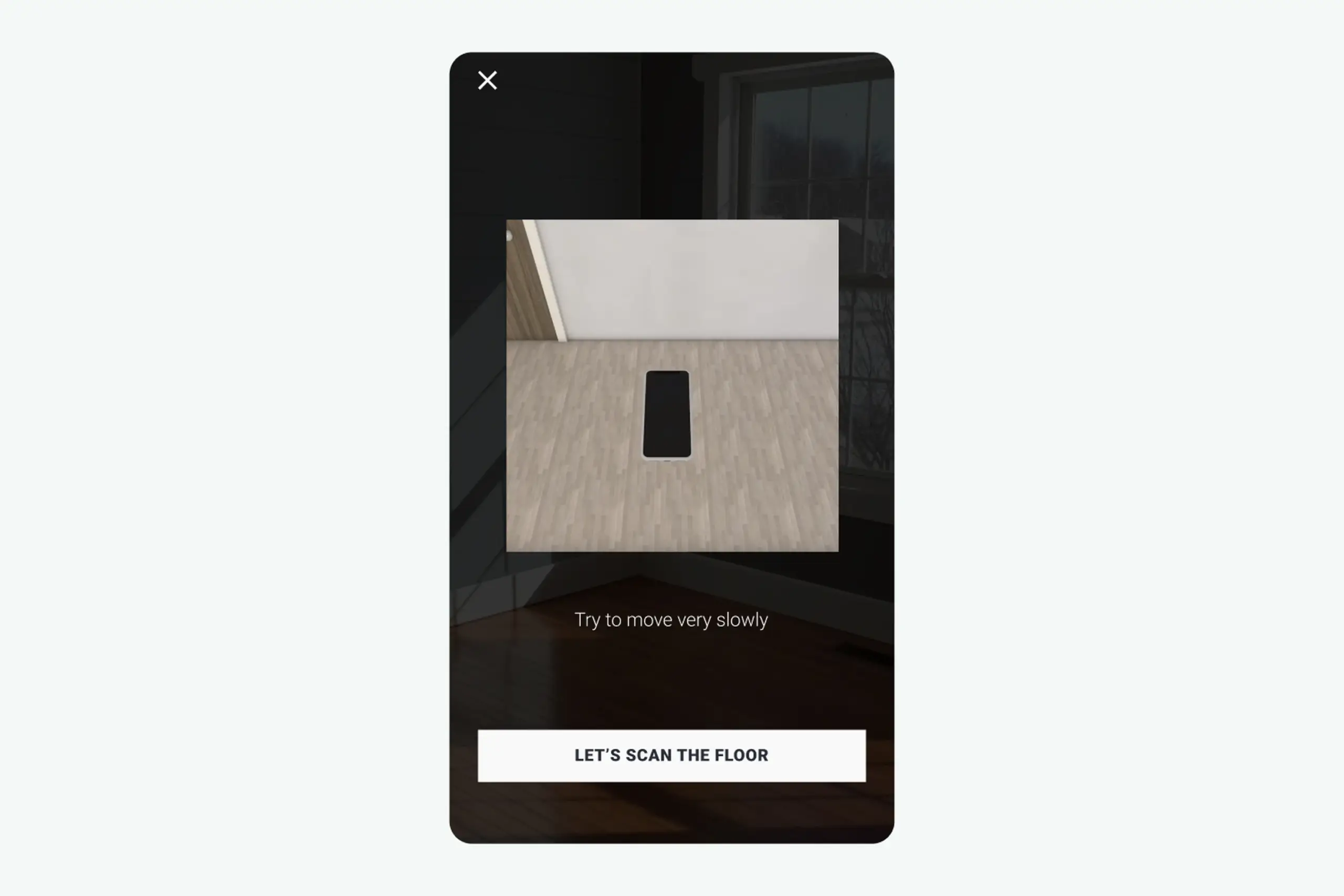
Floor scanning step with dark overlay, clear instructions, and visual animation showing what to do
What I designed:
- Dark overlay with clear instructions
- Visual animation showing what “scanning the floor” looks like
- “Help” button with 3D animation explaining the process
- Step-by-step confirmation after each completed action
- “Let’s scan the floor” button to begin
Why dark overlay: Users need to focus on instructions, not the camera feed behind them. Darkening the background while highlighting the instruction area focuses attention.
Why animation: “Scan the floor” is abstract. Showing what that looks like, slowly moving phone while pointing at ground, made the action concrete.
Step 2: Mark corners
After scanning the floor, users need to mark room corners to define walls.
Problem discovered in testing: Users had no idea which corner to start with or what the green line on screen meant.
Design decisions:
- Green marker (least represented color in real rooms, won’t blend with walls, furniture, or flooring)
- Vertical line guide to help align with actual wall corners
- White icons and text with slight black shadow for visibility on any background
- Black cross inside the marker button for maximum visibility
- Three circles at bottom for precision feedback
- Larger circle animation when height is found
Why green: I tested multiple marker colors. Red blended with brick walls and wood floors. Blue blended with many wall paints. Green was least likely to disappear against real room backgrounds.
Why three circles: Users wanted precise feedback that they’d marked corners correctly. Three expanding circles with haptic feedback confirmed “yes, you did it right.”
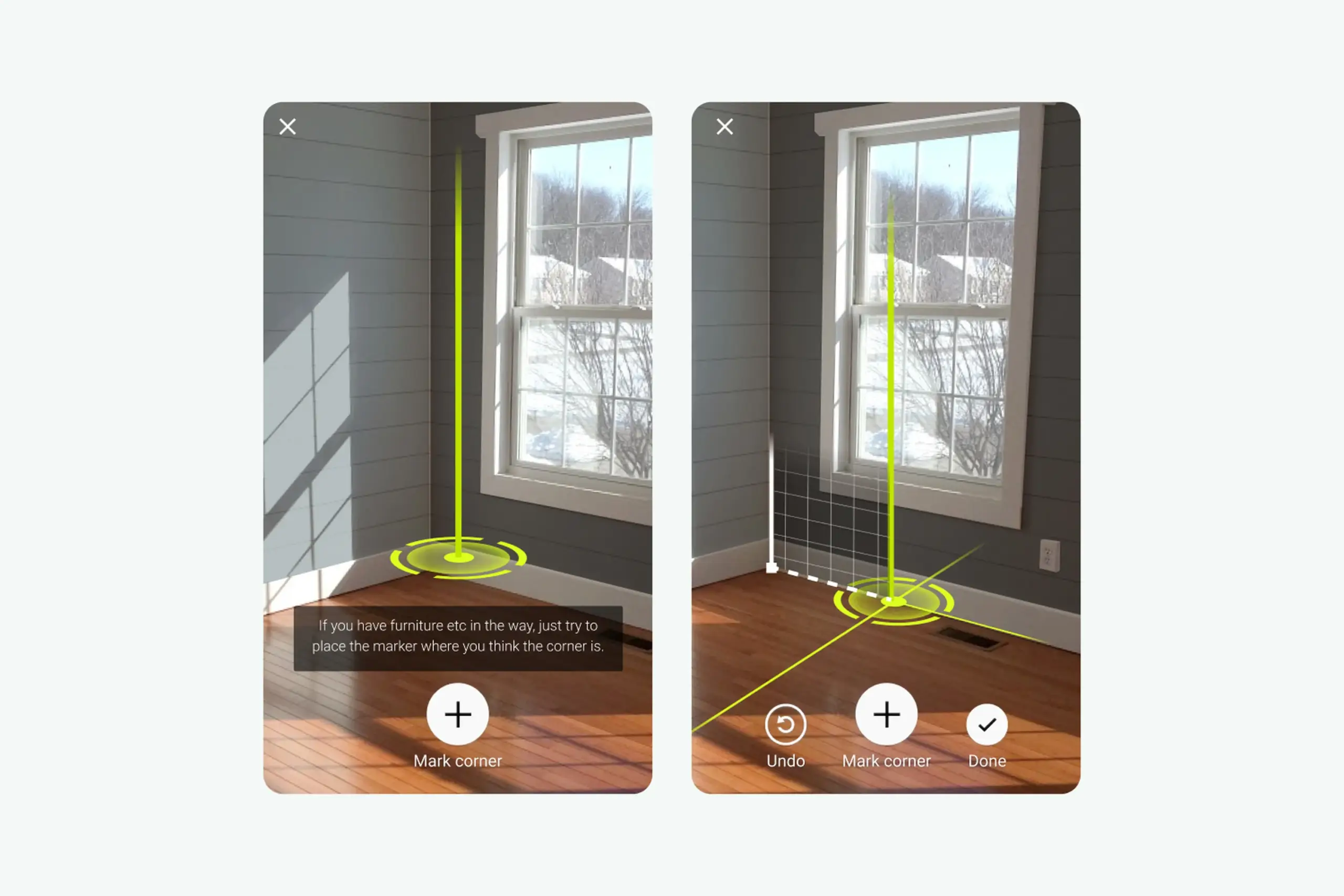
Corner marking interface with green vertical line helping users align with actual wall corners
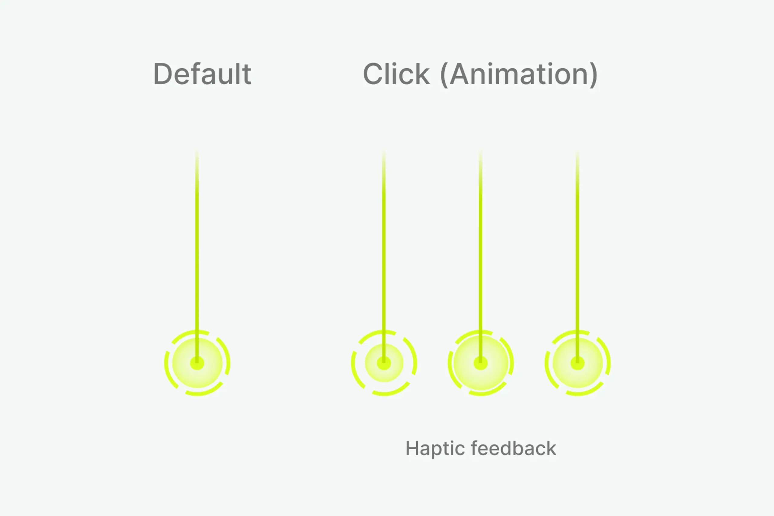
Design system showing default state, click animation, and haptic feedback for corner marking
Step 3: Measure height
Users mark wall height so the app knows where walls end.
- Two white circles move along the green line as camera position changes
- When height is found, bigger circle animates with haptic feedback
- Clear confirmation that users completed the step
Why haptic feedback: When the app detects wall height, nothing visible changes in the room. Users couldn’t tell if they’d done it right. Haptic pulse plus visual animation tells users “you did it” without adding screen clutter.
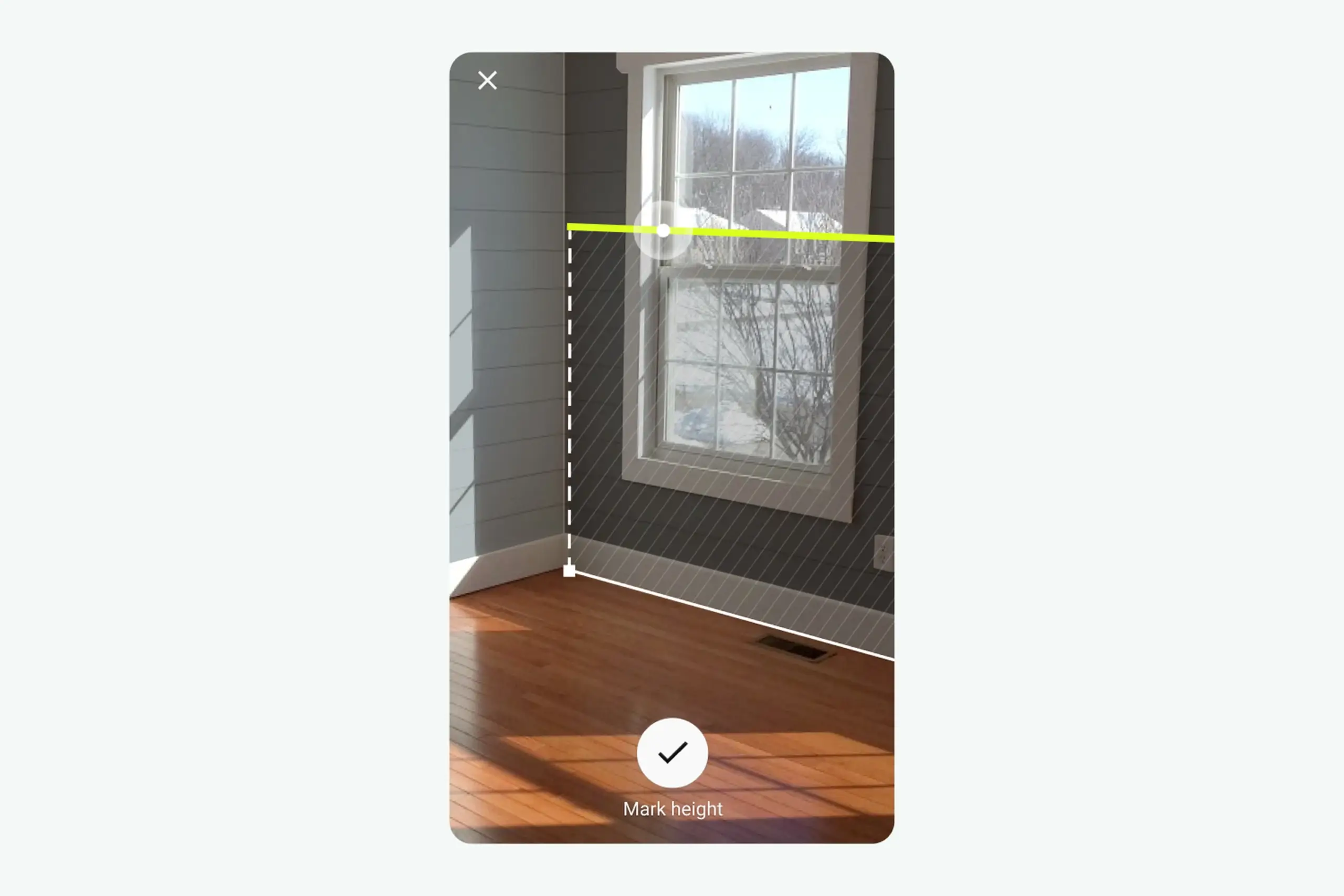
Height measurement with two white circles moving along green line, larger circle animation when height is found
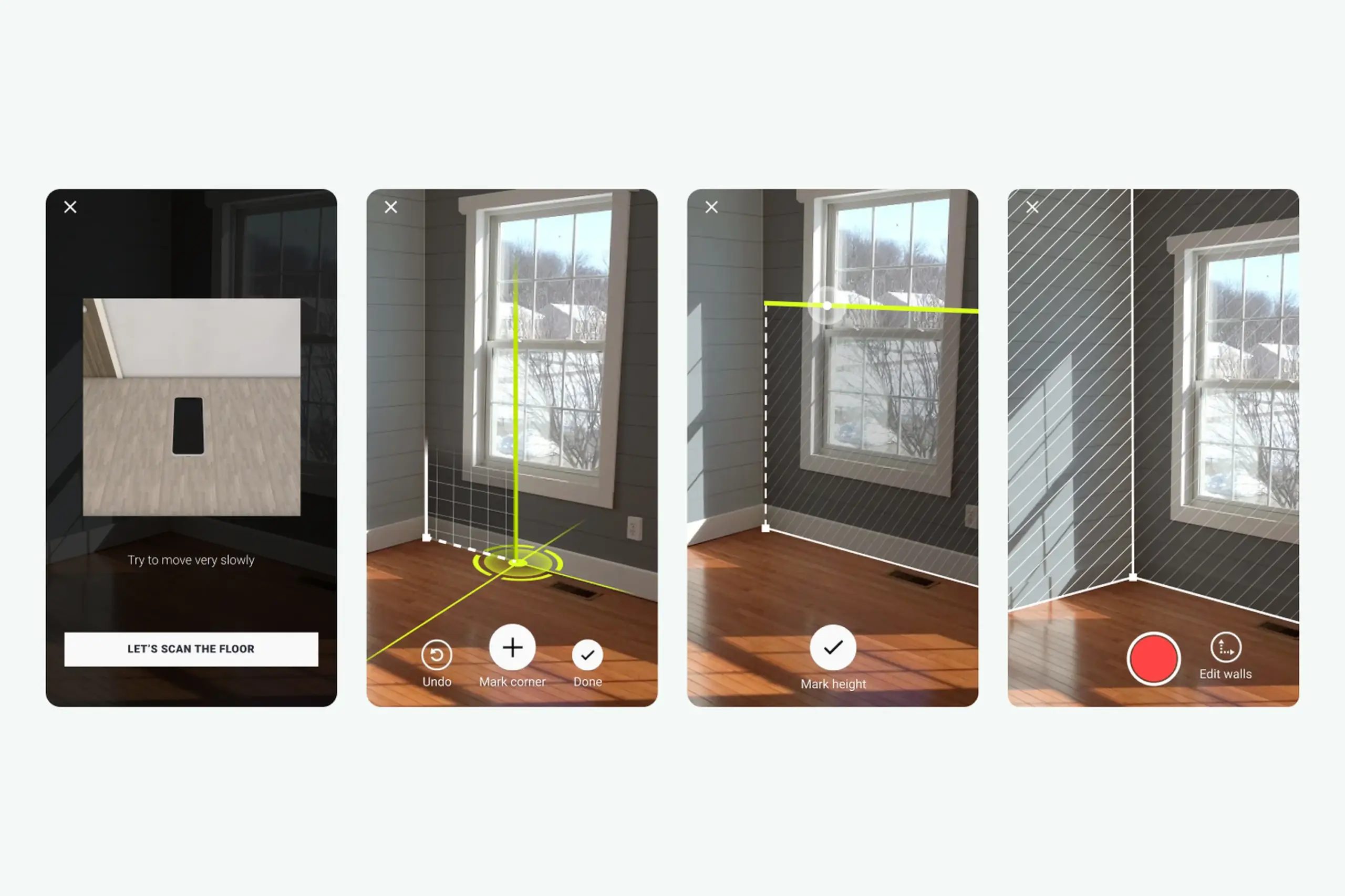
Complete AR session flow: scan floor → mark corners → measure height → confirmation
Product features
Beyond AR scanning, I designed the complete app experience:
Curated Inspiration Feed – Home page shows room pictures from Farrow & Ball. Tap any picture to see your room with that wallpaper via AR. Gives users starting points instead of blank exploration.
Curated inspiration feed with rooms from Farrow & Ball collection. Tap any picture to see it in your space via AR.
Browse and Customize – Users explore different room types and color combinations. Each option shows pricing and links to purchase. Visual browsing helps users who don’t know exactly what they want.
My Rooms – Save room projects at three stages: create project, record room, choose products. Switch between different decoration options for the same room. Supports the natural decision-making process, users want to compare options, not commit immediately.
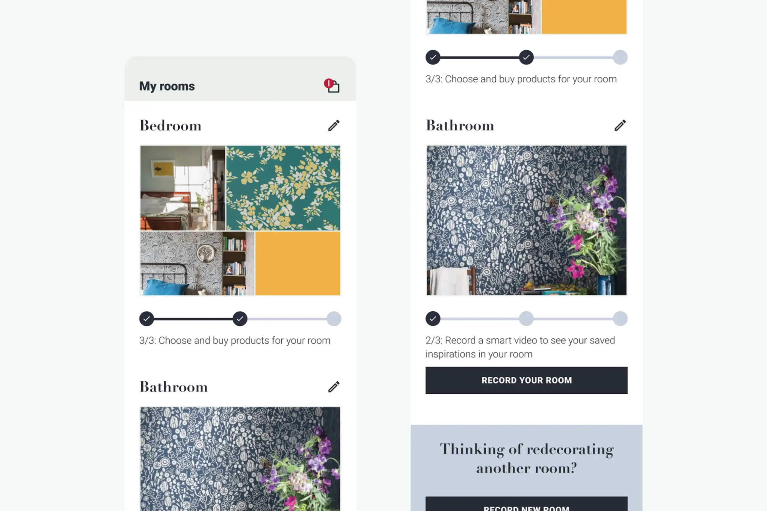
My Rooms showing saved projects at different stages: create project, record room, choose products
The process
Starting from scratch: Inherited a technical SDK built by developers without design input. Completely redesigned the user experience from the ground up.
Extensive testing: Three official usability testing rounds with recruited participants. Multiple guerrilla testing sessions in between. Each round revealed new problems and informed the next iteration.
Workshop-driven: Countless brainstorming sessions with the team. Tried different approaches, tested them, pivoted when needed. Changed the entire app direction three times based on user feedback.
Iterative design: Created multiple versions of each interaction. Tested. Refined. Tested again. The floor scanning flow went through at least 5 major iterations before it worked well.
Design system: Built a comprehensive design system covering all states, interactions, and visual elements. Documented everything for consistency across the app.
White-label architecture: Designed the app to be customizable for different brands. Started with Farrow & Ball branding but built flexible enough to adapt to other paint/wallpaper companies.
Artifacts I created
- Competitive analysis document
- Usability testing reports from multiple rounds
- User flow diagrams for AR session and browsing
- Wireframes (low and high fidelity)
- AR interaction specifications (animations, haptic feedback, state changes)
- Design system covering all components, states, and interactions
- White-label customization guidelines
The impact
For users: Can see wall decorations live in their actual room using AR. Browse curated inspiration from Farrow & Ball collection. Create and save room projects with different decoration options. Make confident purchase decisions without guessing.
For the business: Partnership with Farrow & Ball (major UK paint company) validated the approach. White-label app ready to adapt to other paint/wallpaper brands. Reduced product returns from customers choosing wrong colors/patterns. Competitive advantage in home decoration market.
Design process: Validated that the hardest UX problem (room scanning) could be solved with clear step-by-step guidance, visual feedback, and progressive disclosure.
What I learned
About users & product:
- Floor scanning was the hardest step. Users understood “point at wall” but “scan your floor” meant nothing to them. This single step needed the most design investment: animations, dark overlays, help buttons, progressive guidance.
- Green works in real rooms. Tested multiple marker colors – green was least likely to blend with walls, furniture, or flooring in real home environments.
- Haptic feedback confirms invisible actions. When the app detects wall height, nothing visible changes. Haptic pulse tells users “you did it right” without cluttering the screen.
About process:
- Can’t prototype AR without AR. We couldn’t properly test floor scanning until the SDK was built. Would explore earlier low-fidelity AR testing methods.
- Pivot when research demands it. Started as an SDK, became a standalone app based on user research. Willingness to change direction based on evidence was crucial.
- Build analytics from day one. We didn’t track where users got stuck in production. Would implement funnel tracking from launch next time.
Details adjusted for confidentiality