Data-Driven Logo Design Tool
Designers argue with clients about logo choices. We built a tool that gives them research-backed recommendations instead of opinions.
⚡ AI Summary ⚡
Project: Data-Driven Logo Design Tool
Type: Academic research project + application
Role: Designer & Researcher
Team: 2 Designers, 1 Developer/Professor (University of Zagreb)
Timeline: 2015-2017 (2 years)
Type: Research project & application
Problem:
- Designers and clients argue about logo choices based on opinions
- No data to back up design decisions
- “Make the logo bigger” debates with no evidence
Research:
- Surveyed 267 people across high schools, university, homes, elderly care
- Tested 6 colors (primary + secondary chromatic)
- Tested 6 shapes (basic geometric forms)
- Tested 5 typography groups (basic, technical, individual, manuscript, profile)
- Tested 2 emotion groups: positive and warm
- Collected demographics: age, gender, education, profession, interests, income
Solution:
- Algorithm calculating “objectivity of results” with weighted rankings
- App with 3 steps: define target audience → choose desired emotions → get recommendations
- Results show optimal color, shape, typography for specific demographic + emotional goal
- Adjustable objectivity factor for different use cases
Recognition:
- Gold Medal — International Warsaw Invention Show IWIS 2017
- Dean’s Award — IWIS 2017
- Bronze Medal — Istanbul International Inventions Fair IFIS’18
- Bronze Medal — 10th International Exhibition of Inventions, Foshan, China
Limitations acknowledged:
- 267 participants is starting point, not definitive
- Research conducted in Croatia, needs localization for other cultures
- Wireframe/proof of concept, needs development for production
Skills demonstrated:
Research design, survey methodology, data analysis, algorithm design, UI design, academic collaboration
Why it matters:
Shaped my approach to evidence-based design decisions. Instead of arguing opinions, gather data.
Overview
Designers and clients argue endlessly about logo choices. “Make the logo bigger.” Designers have opinions, clients have opinions, nobody has data.
We decided to fix this. We surveyed 267 people to find out which colors, shapes, and typography they associate with specific emotions. Then we built a tool that gives designers research-backed recommendations based on their target audience.
- My Role: Designer & Researcher
- Team: 2 Designers, 1 Developer/Professor (Faculty of Graphic Arts, University of Zagreb)
- Timeline: 2015 – 2017
- Type: Research project & application
My contributions
- Research design
- Survey creation and testing
- Data analysis
- Application wireframes
- UI design
The problem
There’s an eternal conflict between designers and clients. Designers work hard on a logo, clients want changes that don’t make sense. Both sides argue based on gut feeling.
We wanted to give designers evidence instead of opinions. If we could prove that certain colors, shapes, and typography create specific emotional responses in specific demographics, designers would have numbers to back up their decisions.
Our mission: give designers data so they can say “Research shows that for your target audience of women aged 25-35, this color creates feelings of trust” instead of “I think this looks good.”
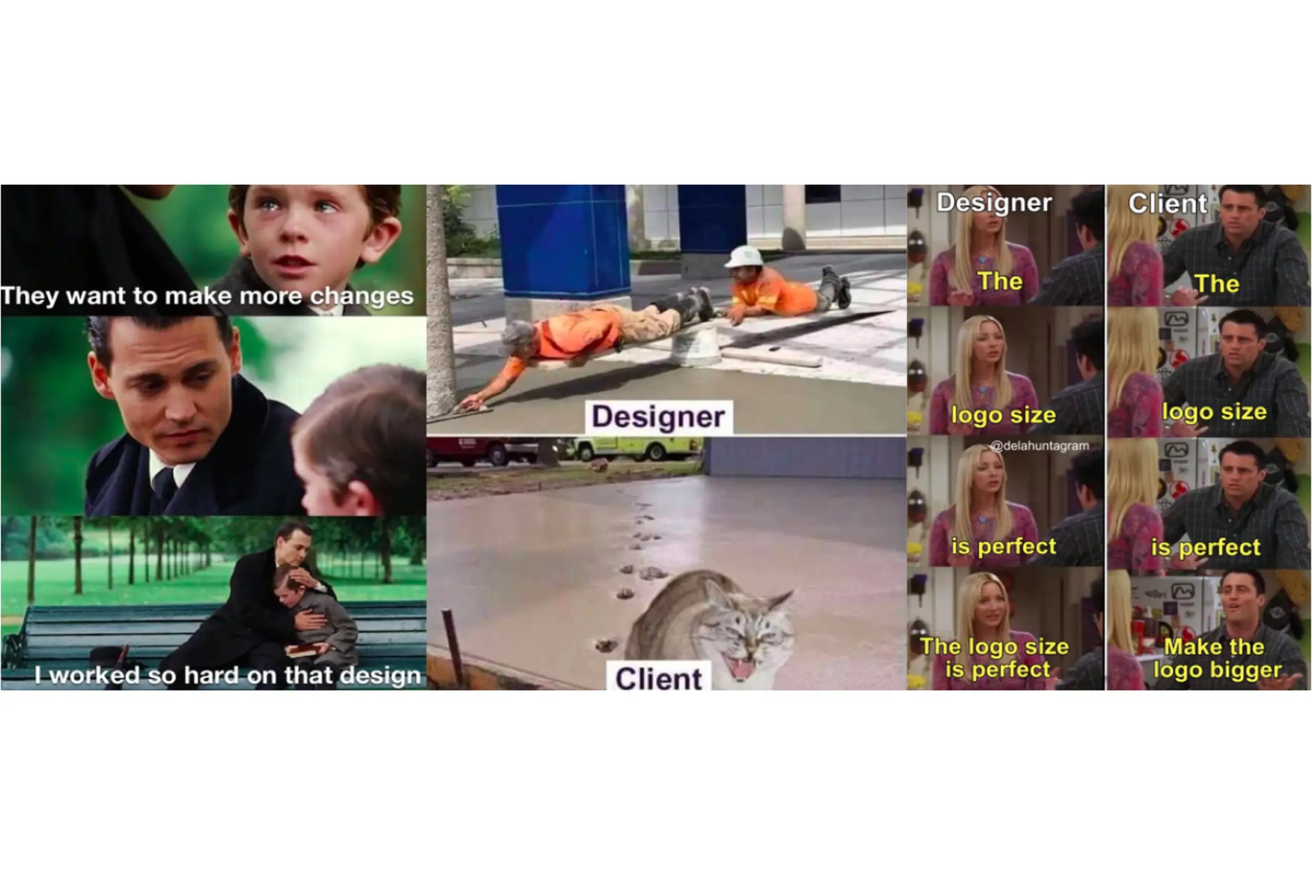
The eternal designer-client conflict – we wanted to solve it with data
The research
A logo has three basic parts: color, typography, and shape. We needed to understand how people connect each of these to emotions.
Colors we tested
We selected six colors: green, red, yellow, purple, orange, and blue.
Why these? Colors are divided into chromatic (colors of sunlight) and achromatic (black, white, gray). Chromatic colors split into primary (red, yellow, blue) and secondary (orange, green, purple). We used primary and secondary chromatic colors because tertiary colors are just derivatives – testing them would add noise without insight.
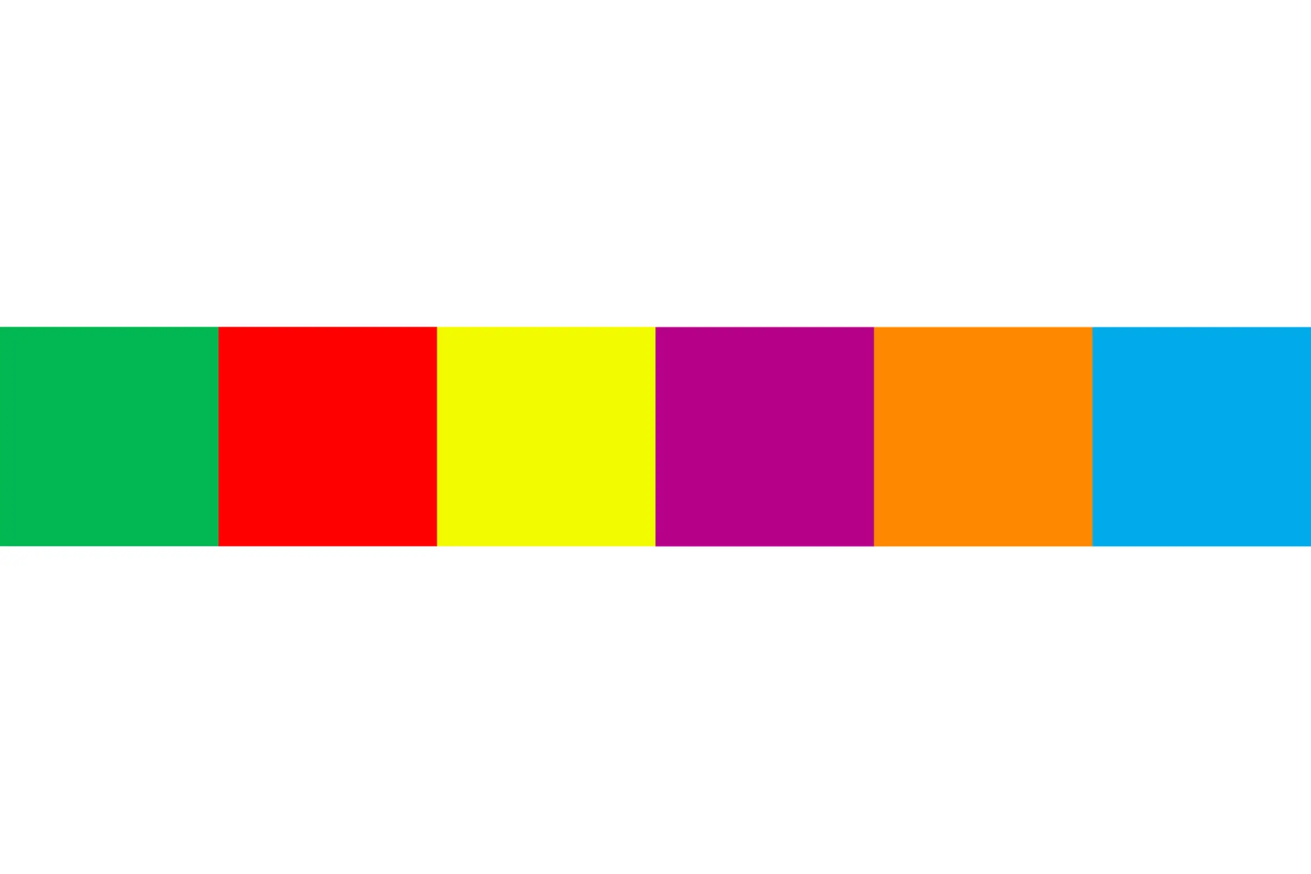
Primary chromatic colors (red, yellow, blue) and secondary chromatic colors (orange, green, purple)
Shapes we tested
Six shapes: triangle, square, circle, parallelogram, trapeze, and hexagon.
Why these? They’re the simplest forms according to research on shape perception. We included hexagon as representative of polygons. We had to limit the number to keep survey time reasonable.
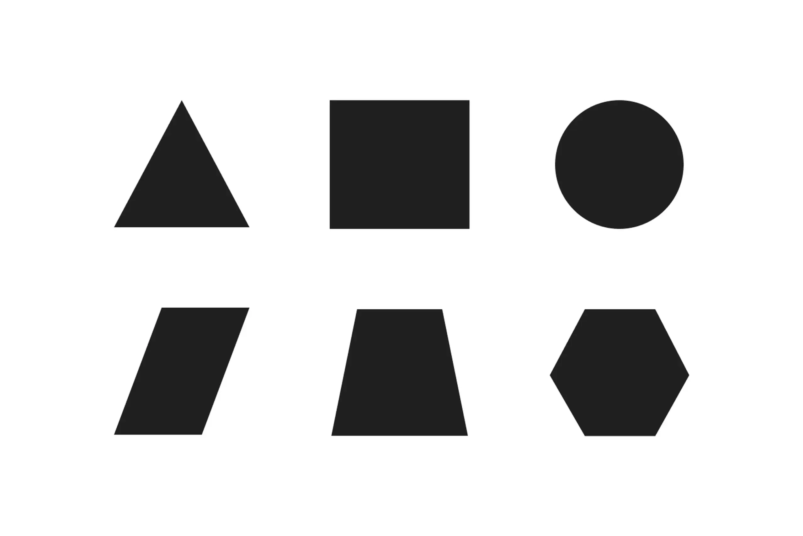
Simple geometric forms chosen based on shape perception research
Typography we tested
Five groups of typefaces:
- Group A (Basic): Garamond, Minion Pro, BodoniMTPoster
- Group B (Technical): Courier, Helvetica, OCRAExtended
- Group C (Individual): Harrington, Ravie, CooperBlack
- Group D (Manuscript): Lucida Calligraphy, Chopin Script, Mistral
- Group E (Profile): Jokerman, Sketch Block, Circus
Why these groups? Typography classification divides fonts into basic, technical, individual, manuscript, and profile categories. We chose three fonts from each category that are available on every computer – so the results would be practically applicable.
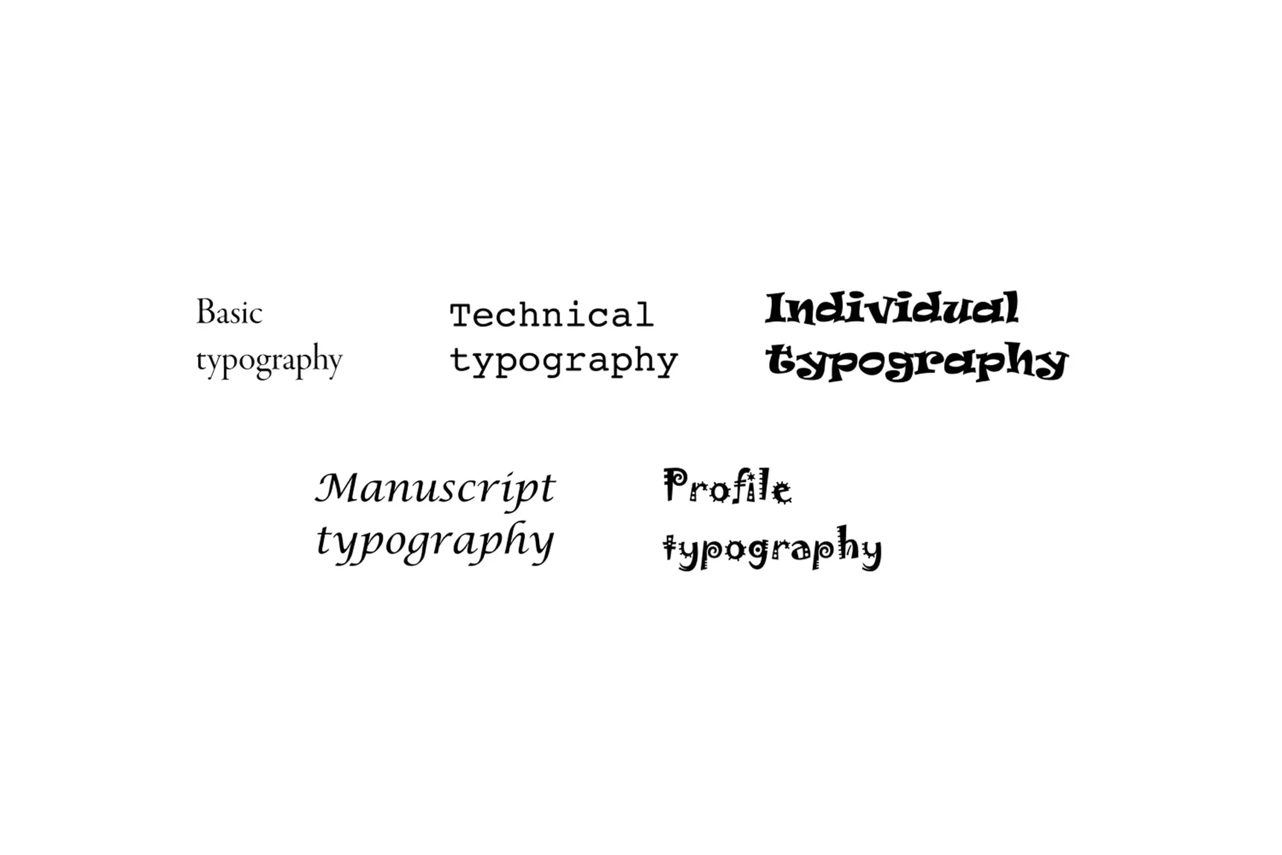
Typography groups representing basic, technical, individual, manuscript, and profile categories
Emotions we tested
Two groups of emotions:
Group A (Positive): Satisfaction, Creative, Inspiration, Strength, Excitement, Happiness, Interesting, Pride, Confidence
Group B (Warm): Calm, Emotionality, Hopefulness, Kindness, Moved, Peacefulness, Sentimental, Touched, Warmhearted
Why no negative emotions? Designers never want to cause negative emotional responses. We divided emotions based on advertising research that categorizes feelings as positive, negative, or warm.
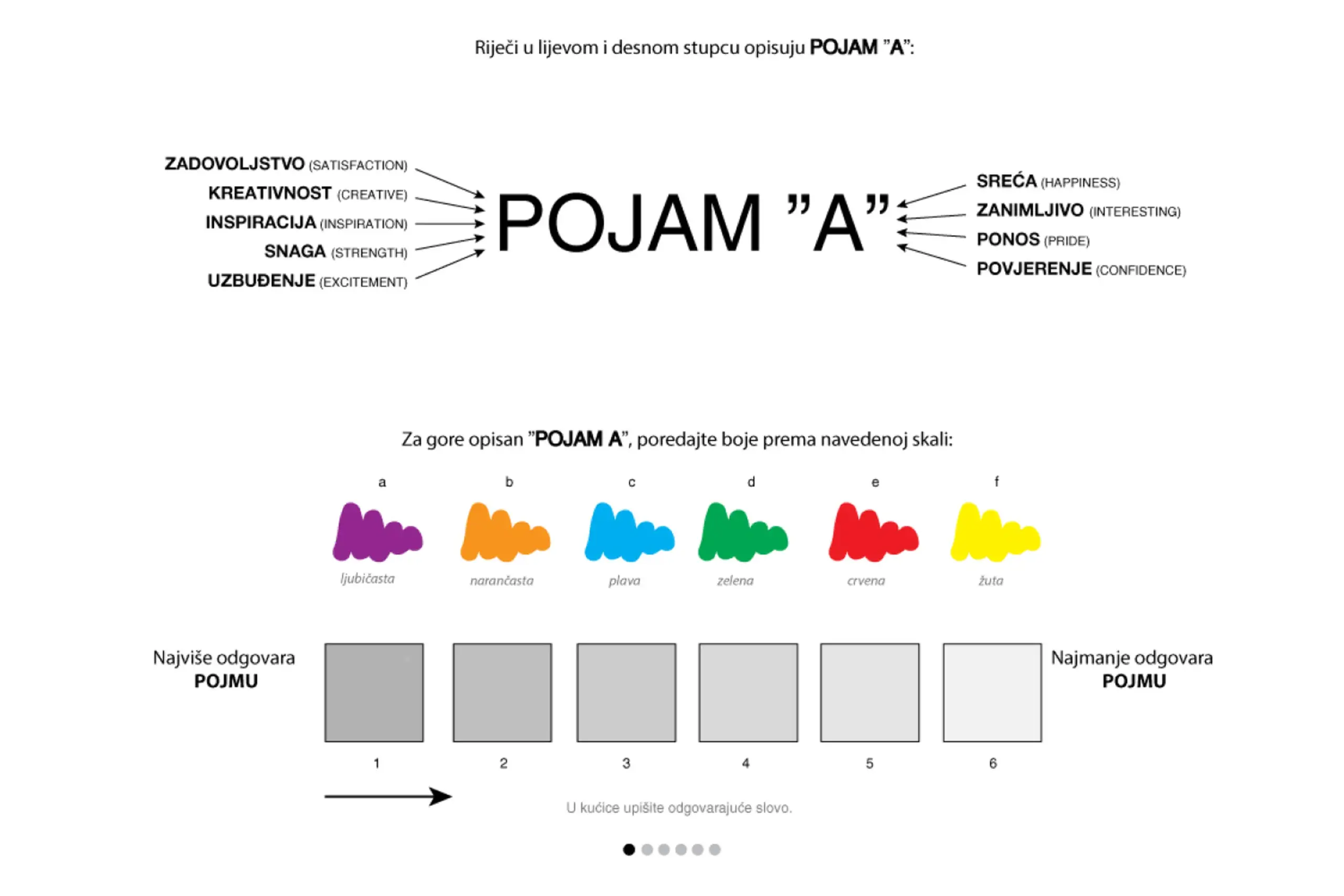
Survey asked participants to connect colors, shapes, and typography with emotions
The testing
We surveyed 267 people across different locations: high schools, university, homes, and elderly care facilities. We wanted demographic diversity.
Each participant provided:
- Demographics (age, gender, education, profession, interests, income)
- Their emotional associations with each color, shape, and typography
The demographic data is crucial. It lets designers filter results by their specific target audience. A logo for teenagers might need different colors than a logo for retirees.
The survey asked participants to rank which colors, shapes, and typography they associate with specific emotions, from “most associated” to “least associated.”
The innovation
We built an algorithm that calculates the “objectivity of results.”
Here’s how it works: when someone ranks their emotional responses, their first choice gets highest weight (6), last choice gets lowest (1). The algorithm considers both frequency of responses and their position in the ranking.
We also added an “objectivity factor” that lets designers influence how strictly the results are applied. This makes the tool flexible for different use cases and target audiences.
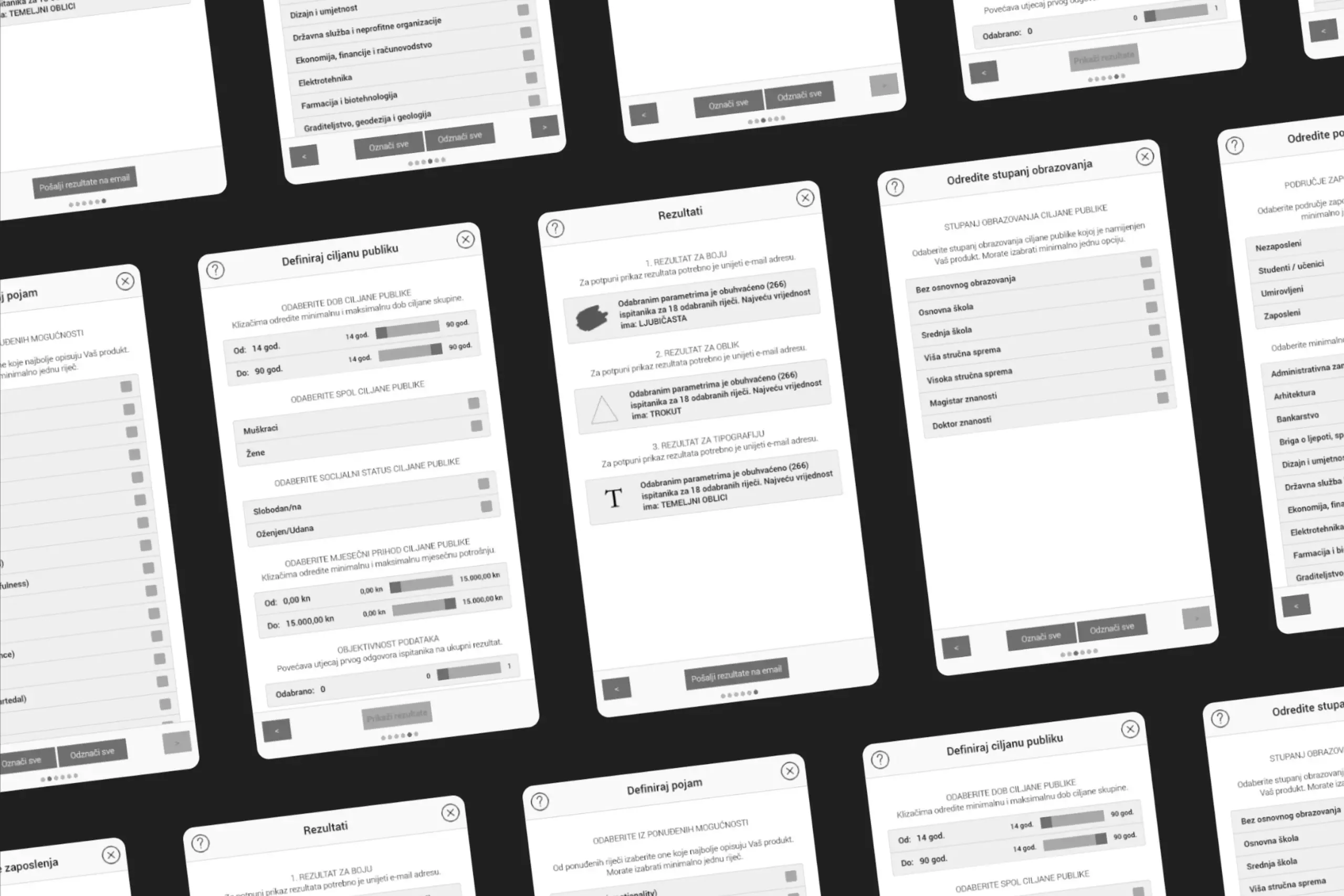
The application
The app works in three steps:
Step 1: Define your target audience. Select the characteristics of who the logo is for: age range, gender, education level, profession, interests.
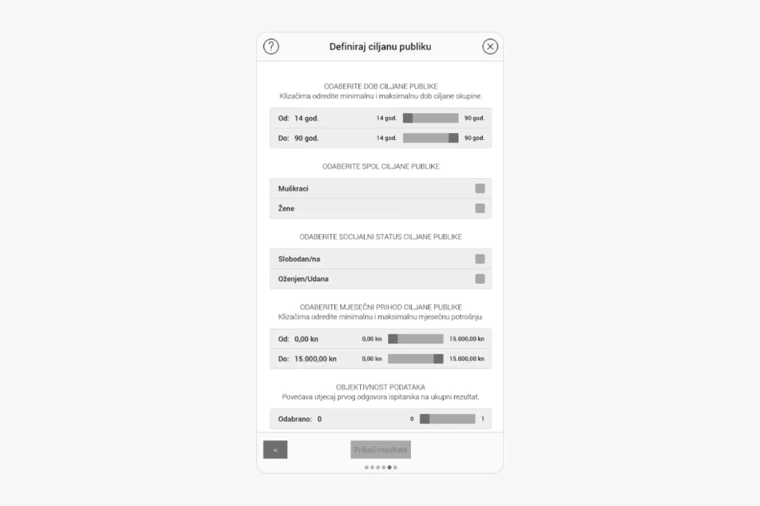
Users define their target audience demographics
Step 2: Choose desired emotions. What should people feel when they see this logo? Select from the emotion options.
Users select which emotions the logo should evoke
Step 3: Get recommendations. The app returns the optimal color, shape, and typography for that specific target group and emotional goal.
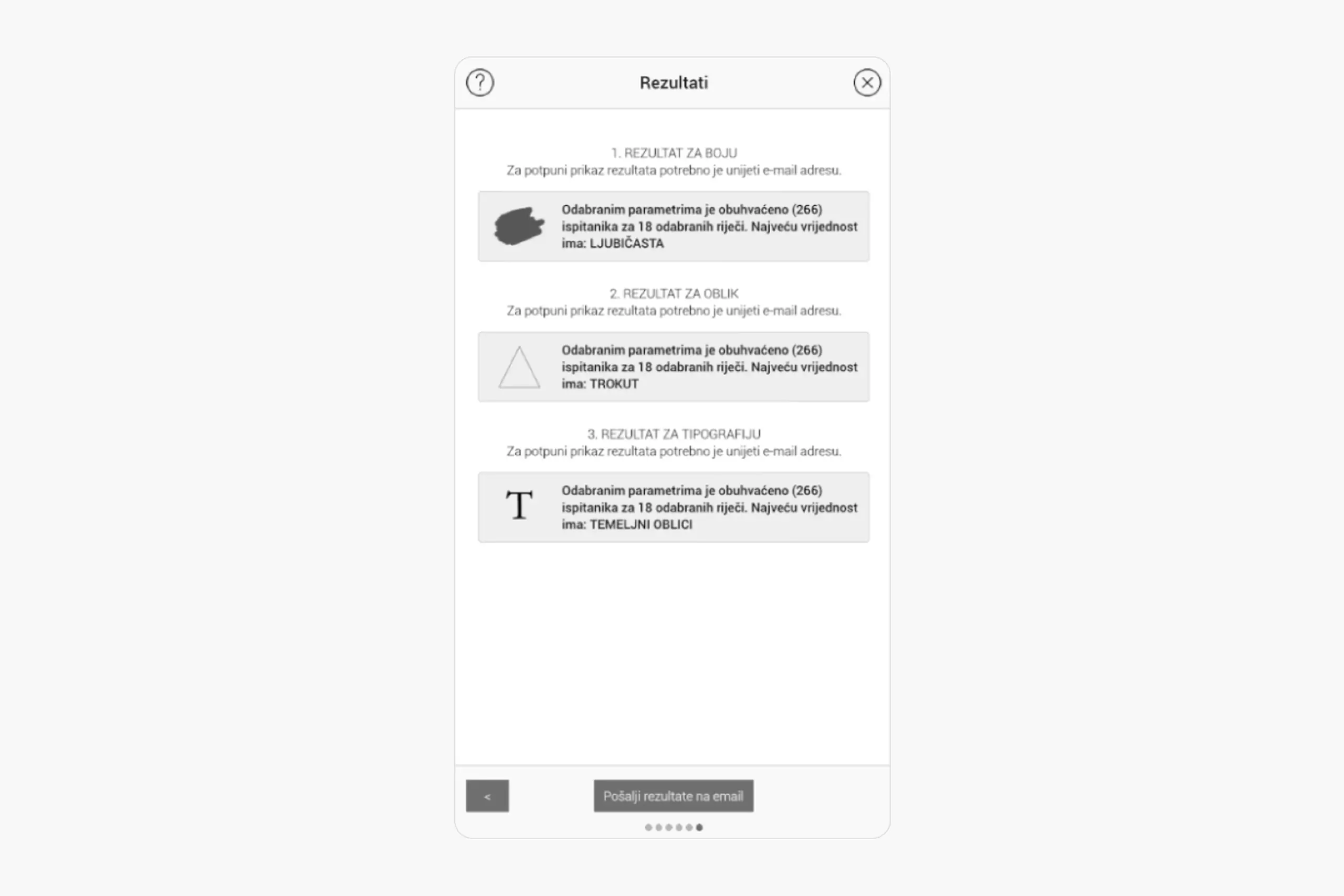
Results show recommended color, shape, and typography with data backing
Artifacts I created
- Research methodology documentation
- Survey instruments
- Data analysis and statistical findings
- Application wireframes
- UI design for all screens
- Algorithm specifications (with developer)
Recognition
This work won four international awards:
- Gold Medal – International Warsaw Invention Show IWIS 2017
- Bronze Medal – 3rd Istanbul International Inventions Fair IFIS’18, Istanbul, Turkey
- Bronze Medal – 10th International Exhibition of Inventions & 3rd World Invention and Innovation Forum, Foshan, China
Limitations & future work
Sample size: 267 people is a starting point, not a definitive database. More participants would make results more reliable.
Cultural context: Research was conducted in Croatia. Color and shape associations vary across cultures – this would need localization for other markets.
Practical application: This is a wireframe/proof of concept. A production version would need more development work.
What I learned
About Research & Design: This project taught me to approach design problems with research rigor. Instead of arguing opinions, we gathered evidence. Instead of assuming what works, we tested it.
About Methodology: The methodology, survey design, demographic segmentation, weighted algorithms, applies far beyond logo design. It’s a framework for making any design decision more objective.
About Evidence-Based Design: This was academic/research work, different from my product design projects. But it shaped how I think about evidence-based design decisions. When I conduct user research now, I’m applying the same principle: gather data instead of guessing.
What I learned (Process)
About Research Scope: 267 participants across diverse demographics takes significant time to recruit and survey. Planning for realistic research timelines is essential.
About Cross-Cultural Considerations: Color and shape associations aren’t universal. Any expansion of this tool would require separate research per market.
About Academic vs. Commercial Work: Academic research prioritizes rigor and documentation. Commercial projects prioritize shipping. Both have value, and the skills transfer.
Why this matters
This project taught me to approach design problems with research rigor. Instead of arguing opinions, we gathered evidence. Instead of assuming what works, we tested it.
The methodology – survey design, demographic segmentation, weighted algorithms – applies far beyond logo design. It’s a framework for making any design decision more objective.
This was academic/research work, different from my product design projects, but it shaped how I think about evidence-based design decisions.