Document Scanning SDK
Making document scanning actually work for real people
⚡ AI Summary ⚡
Project: Document Scanning SDK
Client: Company providing SDK to banking/identity verification apps
Role: Product Designer
Team: 3 Designers, Developer, Project Owner
Timeline: 2020
Platform: SDK for iOS & Android
Problem:
- 70% failure rate — users couldn’t complete document scans
- Instructions said “scan barcode” but US licenses have two barcodes
- Instructions scrolled too fast over moving camera feed
- Pulsing animation confused users (thought it was a button)
- No confirmation when scan succeeded or failed
Research:
- Usability lab with 3 cameras, 10 participants across 2 rounds
- Tested with barcode reduced to 25% size (worst-case scenario)
- Key insight: Users didn’t know which barcode to scan, had no confidence scans registered
Solution:
- Better instructions: fixed position, stable background, specific language
- Changed “scan front side of document” to “scan the barcode” with visual indicator
- Scan position guide: clear frame showing where to place document
- Removed confusing pulsing animation, added clear success/failure feedback
- Error handling: explicit failure message with next steps
Impact:
- Round 2 users completed tasks significantly faster than Round 1
- Users understood what to do immediately after redesign
- Client complaints about usability dropped
- SDK became easier for developers to integrate
Skills demonstrated:
Usability testing, lab setup, quantitative + qualitative analysis, mobile interface design, error handling, SDK/developer-facing products
What I’d do differently:
Test earlier in development (SDK was already built), test with more document types (only tested driver’s licenses), collaborate with ML team earlier
Overview
This wasn’t an app, it was an SDK (software development kit) that other companies integrate into their apps for document scanning. Banking apps, identity verification, any app needing to capture ID documents uses SDKs like this.
The SDK was technically sophisticated, built on computer vision and machine learning, but had a 70% failure rate. Users couldn’t figure out how to scan their documents. Client complaints about usability were killing adoption.
I ran a proper usability study and redesigned the scanning experience.
- My Role: Product Designer
- Team: 3 Designers, Developer, Project Owner
- Timeline: 2020
- Platform: SDK for mobile apps (iOS & Android)
My Contributions
- UX research and usability testing (10 participants, 2 rounds)
- Mobile interface design
- Interaction design for scan feedback
- Error handling design
- Usability lab setup and analysis
- Design iteration based on testing results
The Challenge in Detail
The company was getting feedback from their clients (app developers integrating the SDK) that end users couldn’t scan their documents. This was killing adoption, why integrate an SDK that your users can’t use?
I tested the SDK myself first. Tried to scan my own ID card. Failed. Like many users, I couldn’t figure out what to do.
What I observed:
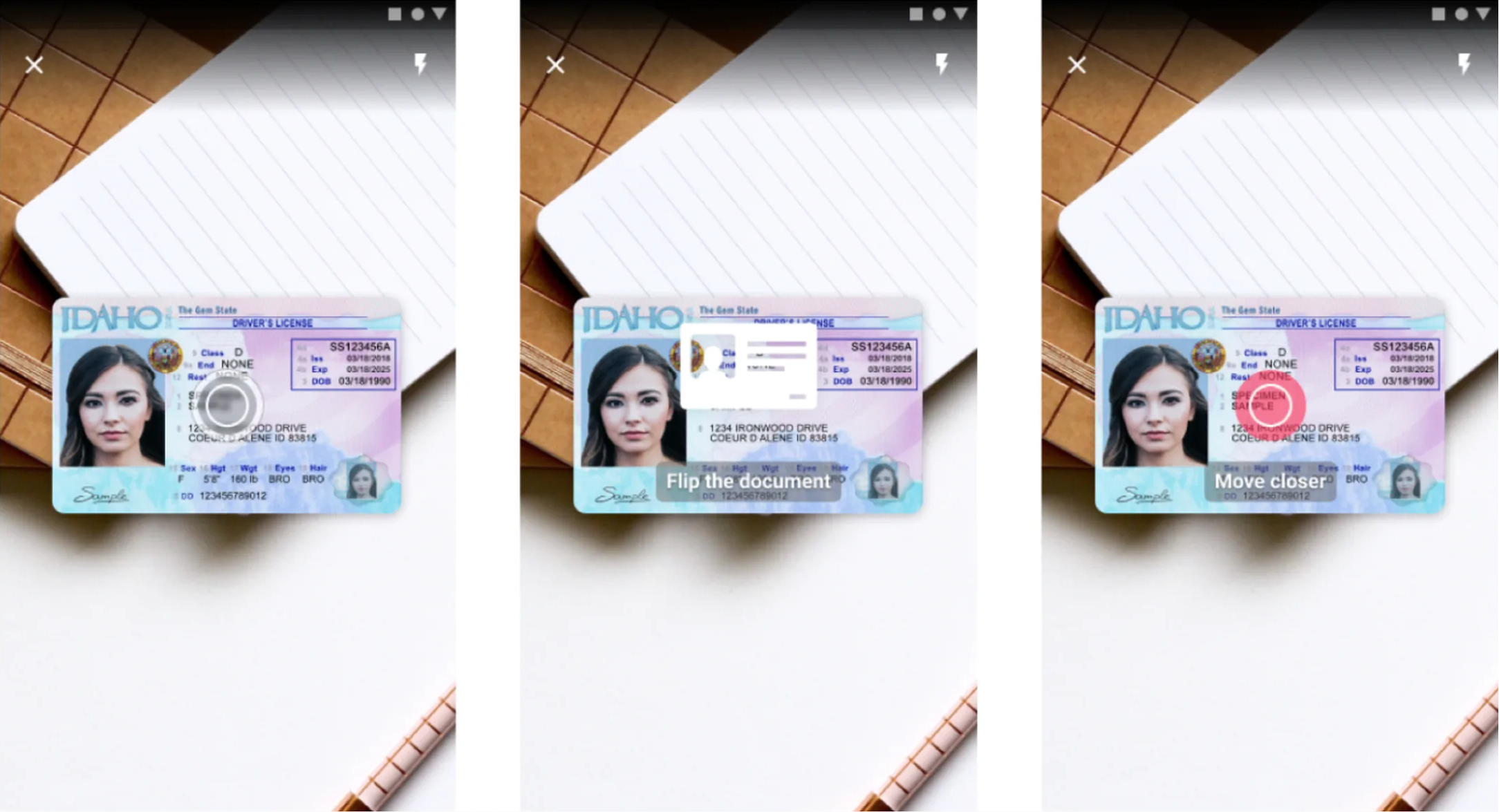
Unclear instructions: Text appeared saying “Scan the front side of a document.” But users didn’t know if that meant the whole card or just the barcode. US driver’s licenses have two barcodes, one on top, one on bottom. The instructions just said “barcode” with no indication of which one.
Instructions too fast and poorly positioned: The instruction text appeared over the center of the screen where the camera feed was, the part users were focused on. It scrolled by quickly and disappeared behind camera movement. Users couldn’t read it while positioning their document.
Confusing visual feedback: A circular animation pulsated on screen constantly. Users thought it was a button and kept tapping it. It wasn’t a button, it was just… decoration? A loading indicator? No one knew what it meant.
No scan confirmation: When a scan succeeded, nothing clear happened. Users weren’t sure if it worked or if they should try again. They’d retry unnecessarily or continue with failed scans.
Which barcode to scan: US driver’s licenses have two barcodes, a 1D barcode on top and a PDF417 barcode on the bottom. The SDK needed the PDF417 (bottom) but users had no way to know this. They’d try the wrong one, fail, get frustrated, give up.
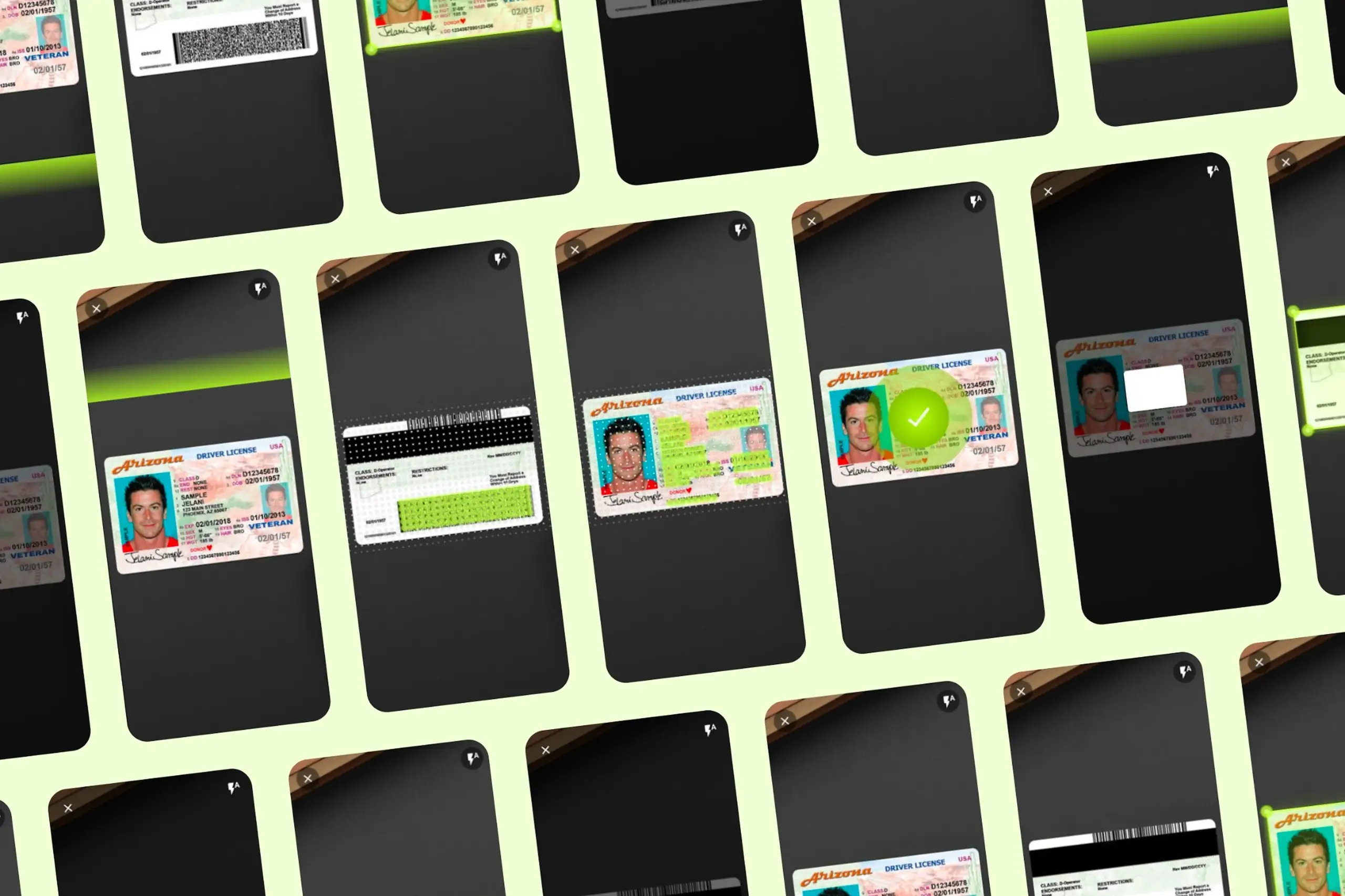
Document scanning SDK interface showing driver’s license positioned in scan frame with visual guides
What I did
Setting up proper usability testing
I converted a classroom into a testing lab with three cameras recording from different angles, one on the participant’s face, one on their hands/phone, one showing the overall interaction.


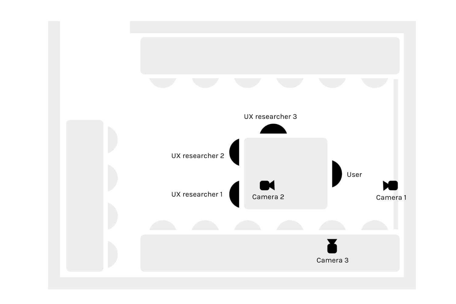
The test:
- Task: Scan a US driver’s license (specifically the PDF417 barcode)
- We reduced the barcode to 25% of its original size to create “worst case” conditions, if scanning worked with a tiny barcode, it would definitely work with full-size
- We wanted to observe what happened when things went wrong, not just when they succeeded
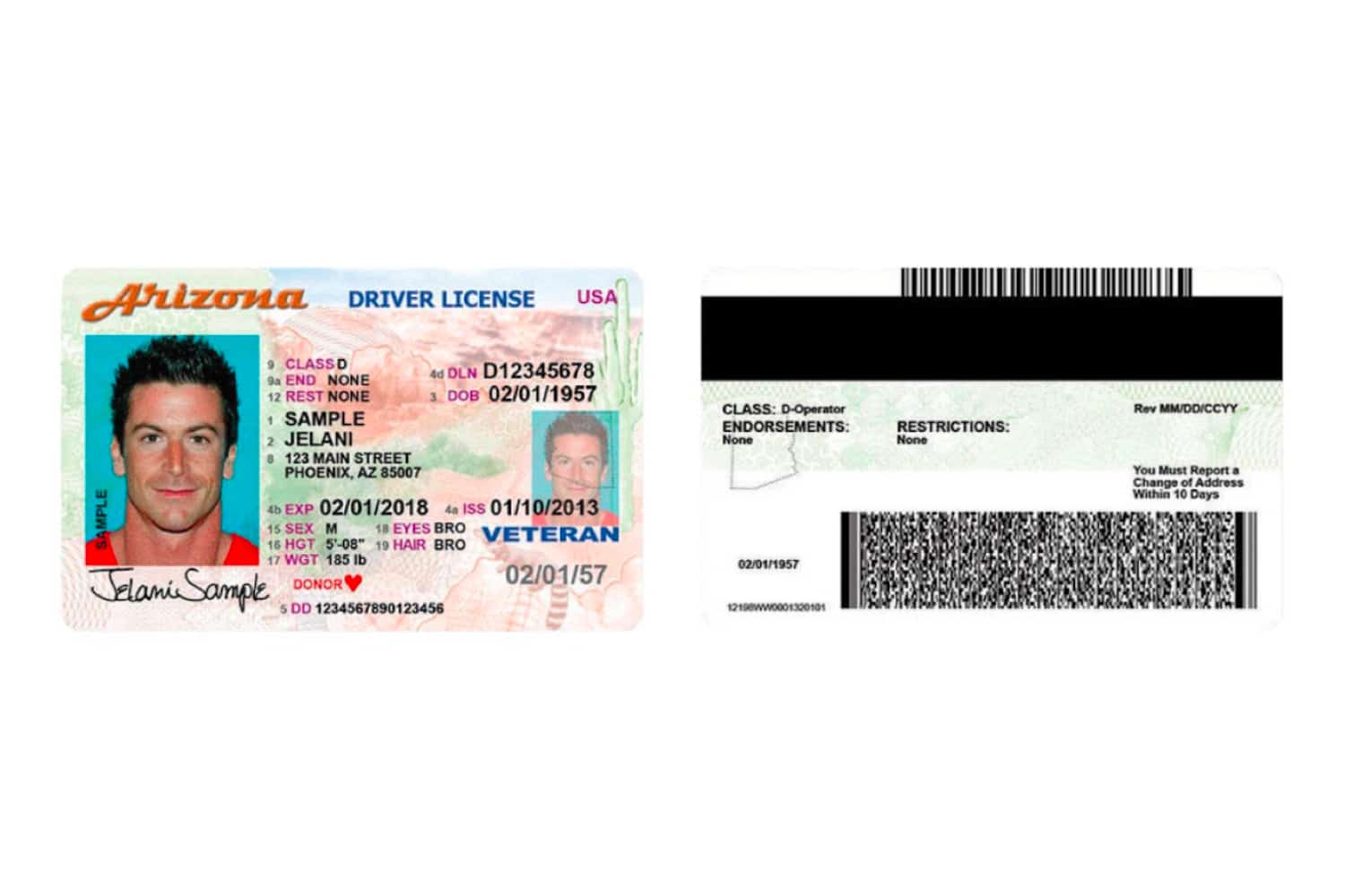
US driver’s licenses have two barcodes. The PDF417 barcode (bottom, circled) is the one needed for scanning.
Round 1: 4 users, ages 18-29, all Android users, all had used mobile banking apps. Most failed. They took almost twice as long as Round 2 users.
Between rounds: I changed the instruction text from “Scan the front side of a document” to “Scan the barcode” and made other adjustments based on observations.
Round 2: 6 users, ages 18-39, mix of iOS and Android, all had used mobile banking. Still struggled, but less than Round 1.
Each session was 30 minutes including questions. We analyzed both qualitative observations (what users said, facial expressions, confusion points) and quantitative metrics (time to complete, number of attempts, success/failure).
Key quotes from testing:
“I don’t know if this means this barcode or this barcode? I’m not very clear with that word barcode.” – Users didn’t know which of the two barcodes to scan.
“Why did you tap on the screen?” “I thought it hadn’t sharpened, so I pressed it intuitively like in a camera. Although I can see on the screen that it is in focus, I thought it was okay. Maybe I’m doing something wrong, so I clicked several times.” – Users thought the pulsing circle was a focus or shutter button.
“I would scan this now, but I’m missing a tick to tell me that I’m sure I scanned this.” – No confirmation feedback meant no confidence.
“The instructions were too fast for me and went over the center of the screen.” – Text appeared over the moving camera feed, making it impossible to read.
The solution
Better instructions
Changes:
- Created a visible, stable background strip that works against any camera background
- Instructions no longer scroll behind the moving camera feed, they stay in a fixed, readable position
- Bright green color (most legible in most lighting conditions)
- Clear, specific language
Key copy change: “Scan the front side of a document” → “Scan the barcode” with a visual indicator showing exactly which barcode (the PDF417 on the bottom).
Scan position guide
Added a frame showing exactly where to position the document.
- Clear boundary showing scan area
- Frame is transparent, everything outside is slightly blurred
- Guides users to position correctly before scanning begins
- Works for any document type (ID cards, driver’s licenses, passports)
One user literally asked for this: “If this is just for scanning cards such as personal and driver cards, I would love to have guides.”
Replaced the circular animation
The pulsating circle had to go. It confused everyone.
Replaced it with:
- Visual checkmark or success indicator when each step completes
- Progress indication through multi-step scans
- Clear visual state changes, not ambient decoration
Continuation from failure
If scanning fails midway:
- Users can continue from where they stopped
- No starting over from scratch
- Reduces frustration when things go wrong
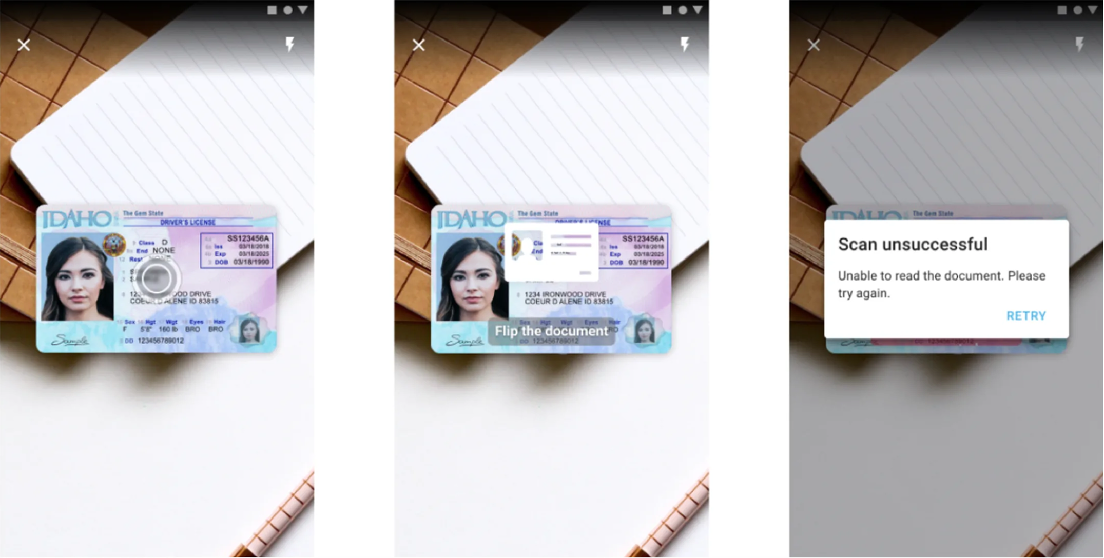
Better error handling
When scan fails:
- Clear “Scan unsuccessful” message
- Specific instruction on what to do next
- User must acknowledge and restart
- No ambiguity about whether it worked or not
This prevents users from continuing with a failed scan, thinking it succeeded.
Artifacts I created
- Testing lab setup documentation and camera placement diagrams
- Participant observation notes from 10 sessions
- Analysis document with quotes organized by issue type
- Quantitative comparison between Round 1 and Round 2
- Redesigned interface specifications
- Interaction flow diagrams for success and failure states
- Component specifications for instruction display, frame guide, feedback states
- Before/after comparison documentation
The impact
Round 1 vs Round 2: Just changing instruction text from “Scan the front side of a document” to “Scan the barcode” made a measurable difference. Round 2 users completed tasks significantly faster.
Post-redesign: Users understood what to do immediately. The frame guide eliminated positioning confusion. Replacing the circular animation removed the “is this a button?” problem. Clear success/failure feedback gave users confidence.
For the business: Client complaints about usability dropped. The SDK became easier for app developers to integrate because their users could actually complete scans. Adoption improved.
What I learned
About users & product:
- Users didn’t know which barcode to scan. US driver’s licenses have two barcodes. Instructions saying “scan the barcode” were useless. Specific visual guidance showing exactly where to position the document solved this.
- Pulsing animations read as buttons. Users kept tapping the loading animation expecting something to happen. Decorative motion confused rather than helped.
- No feedback equals no confidence. Without clear success/failure states, users couldn’t tell if scans worked. They’d retry unnecessarily or continue with failed scans.
About process:
- Test the product yourself first. I tried scanning my own ID before starting research – failed immediately. This gave me credibility and focus before formal testing began.
- Two rounds of testing caught different issues. Round 1 revealed instruction problems. Fixing those revealed positioning problems in Round 2. Single-round testing would have missed the second layer.
- Collaborate with ML team earlier. The computer vision model had constraints that affected UI possibilities. Earlier technical alignment would have prevented some dead ends.
Details adjusted for confidentiality