Enterprise CMS Platform
Making content publishing fast and foolproof for sports teams
⚡ AI Summary ⚡
Project: Enterprise CMS Platform
Client: Mobile sports app serving professional sports clubs
Role: Product Designer
Team: Product Manager, 3 Developers
Timeline: 2021
Platform: Responsive web (desktop, tablet, mobile)
Problem:
- CMS organized by content type, but users think in teams/channels
- Content creators published to wrong channels daily
- No mobile access (creators work from stadiums, press events)
- Scheduling had no preview, calendar view, or conflict detection
- Partner clubs saw overwhelming interface with features they couldn’t use
Research:
- 8 content creator interviews
- Key insight: Users organize work by club/team, not content format
Solution:
- Channel-first navigation (see teams on login, not content types)
- Scheduling with preview, calendar view, clear status states
- Role-based interfaces (full toolset for internal, simplified for partners)
- Mobile-first design for on-location publishing
- Content library with curated sources per channel
Impact:
- Publishing to wrong channels: daily → rare
- Partner team training: weeks → self-service
- Mobile publishing: impossible → full functionality
- User feedback: “The interface makes sense immediately”
Skills demonstrated:
User research, information architecture, responsive design, design systems, role-based permissions, mobile-first design, B2B/enterprise platforms
What I’d do differently:
Establish baseline metrics before launch, test wireframes earlier, document design decisions during process
Overview
Content creators managed 12 professional sports clubs across multiple countries. They published 50+ pieces of content daily match updates, breaking news, lineup changes, transfer announcements. The existing CMS organized everything by content type (articles, videos, images), but creators thought in teams. A Barcelona editor hunting for “Barcelona articles” had to search across multiple sections, wasting time while competitors published first.
I redesigned the entire CMS around how content creators actually think and work.
- My Role: Product Designer
- Team: Product Manager, 3 Developers
- Timeline: 2021
- Platform: Responsive web (desktop, tablet, mobile)
My contributions
- User research (8 content creator interviews)
- Information architecture redesign
- End-to-end workflow design
- Mobile-first interface design
- Web dashboard design
- Design system extension
- Cross-functional collaboration with PM and developers
The challenge in detail
Content creators at a mobile sports app were drowning in a CMS that fought them at every turn.
The old system was built around content types. The navigation showed “Articles,” “Videos,” “Images,” “Match Data.” But content creators don’t think this way. They think: “I’m working on Barcelona today.”
They’d publish breaking news to the wrong club channel because finding the right destination required navigating through content-type menus, then filtering by team, then double-checking they hadn’t selected the wrong club with a similar name.
The worst part: they couldn’t use it on their phones. Content creators work from stadiums during matches, from press conferences, from airports. When breaking news happened, they’d either wait until they reached a desktop or publish through awkward workarounds, sometimes texting colleagues to publish on their behalf.
Scheduling was chaos. Creators would schedule posts with no idea what was already queued. No preview, no calendar view, no way to see if their scheduled post would collide with someone else’s. They’d schedule match-day content and discover conflicts only when angry users complained about duplicate posts.
Partner clubs had it worse. External teams (partner clubs using the platform) logged into the same interface as internal power users. They saw dozens of features they couldn’t access, buttons that did nothing for their permission level. Training took weeks. Support tickets about “why can’t I click this?” flooded the help desk.
The old system organized by content type (articles, videos) instead of by team/channel
What I did
I interviewed 8 content creators to understand what was actually broken. Not what they said was broken what their actual workflows revealed.
Key findings from research:
- They organize work by club/team, not by content format
- They publish constantly throughout the day match results, lineup changes, breaking news
- Mobile access wasn’t nice-to-have; it was critical for their most important moments
- The old library existed but was so confusing they searched the internet manually for every image
- Internal teams needed power features; partner clubs needed simplicity
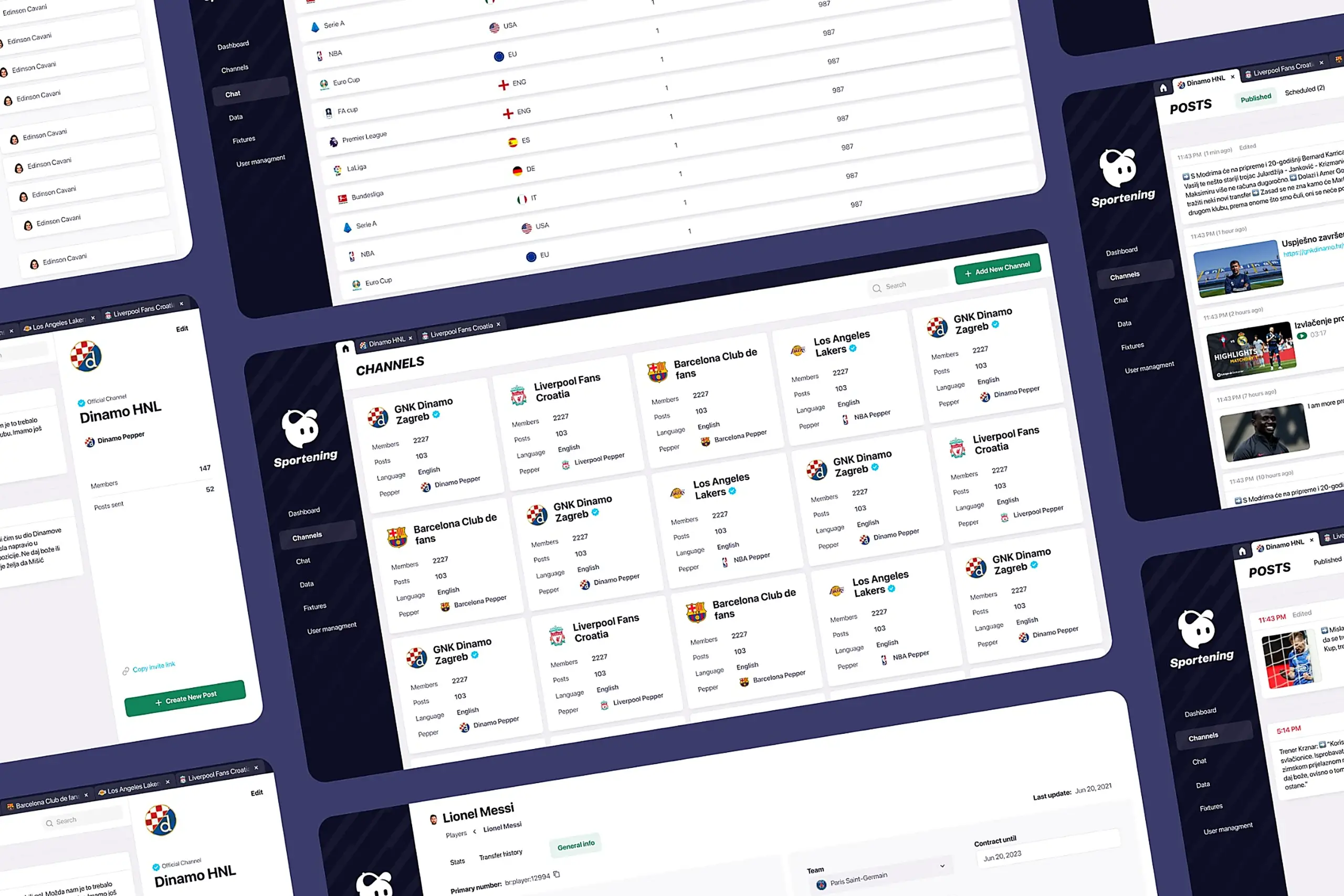
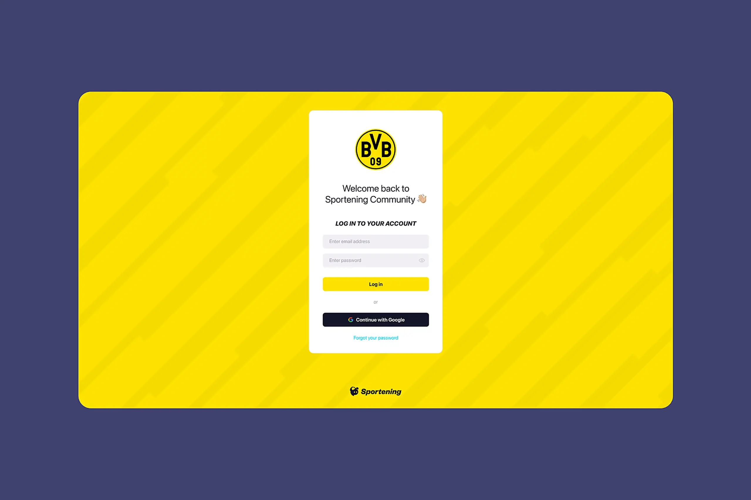
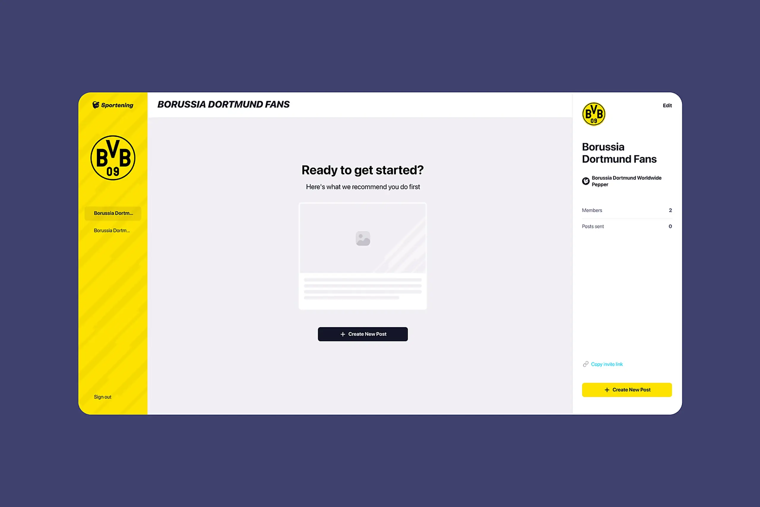
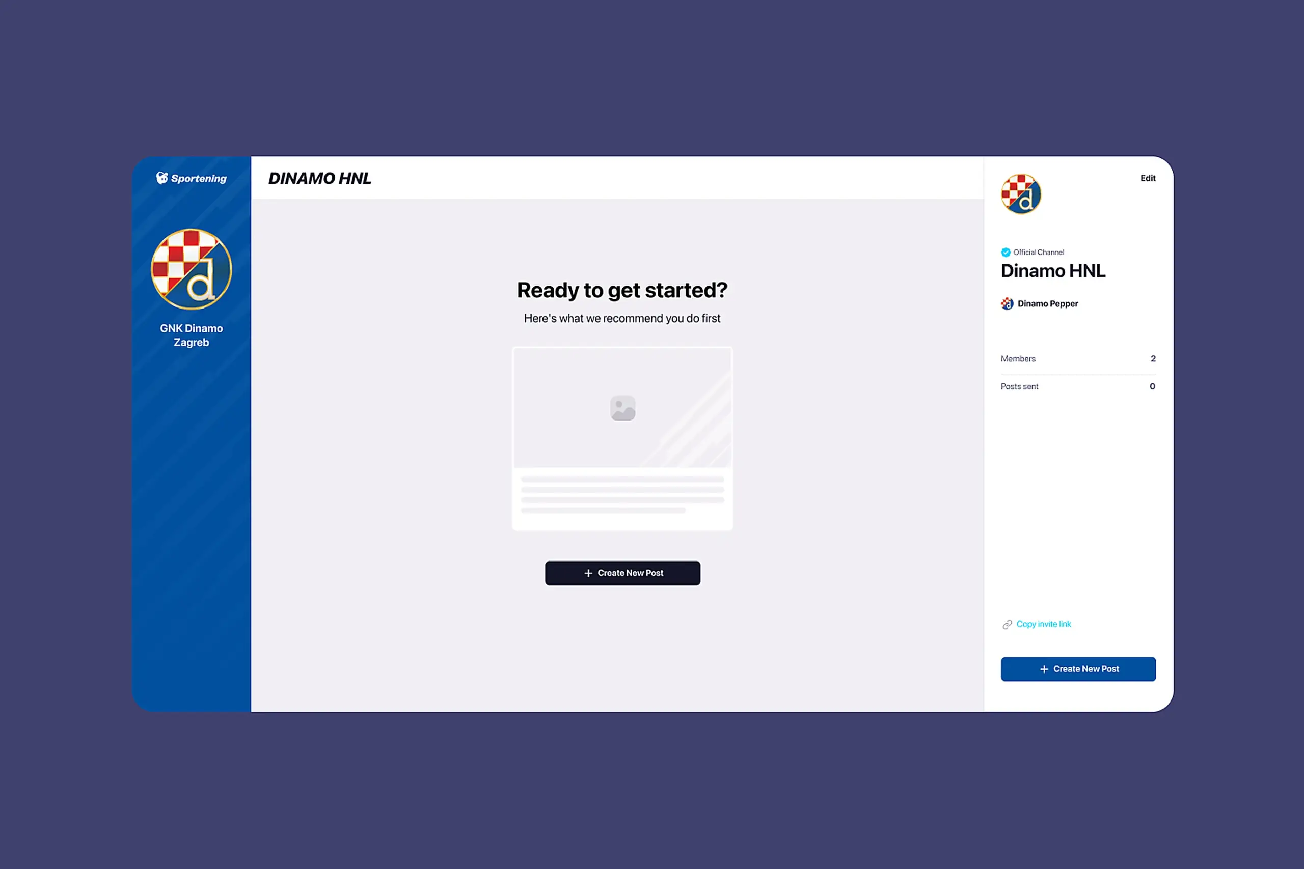
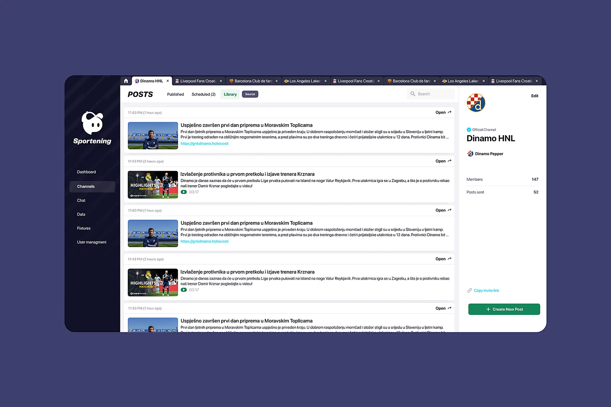
1. Channel-first navigation
I restructured the entire CMS around teams instead of content types.
Why this specific solution: I considered several alternatives. A search-first approach would have let creators search for their team each time, but testing showed they work with the same 2-3 clubs repeatedly. Switching daily workflows to search-based would add friction. A favorites system would let creators pin their clubs, but this still required navigating content-type menus within each club. A channel-first architecture meant when you open the CMS, you see clubs: Barcelona, Liverpool, LA Lakers. Click one, and you’re in that team’s workspace with everything you need, articles, videos, scheduling, library, all scoped to that club.
What I tried first that didn’t work: Early wireframes kept the content-type tabs but added a team filter at the top. User feedback was immediate: “So I still have to click Articles, then filter to Barcelona, for every single task?” The mental model was wrong. I scrapped the approach and rebuilt navigation from the team level down.
The result: Content creators see their assigned channels immediately. Click one, and you’re in that workspace. No hunting.
CMS dashboard showing channel-based navigation with sports team logos and content management interface
Channel navigation showing teams with their branding. Content creators see their assigned channels immediately.
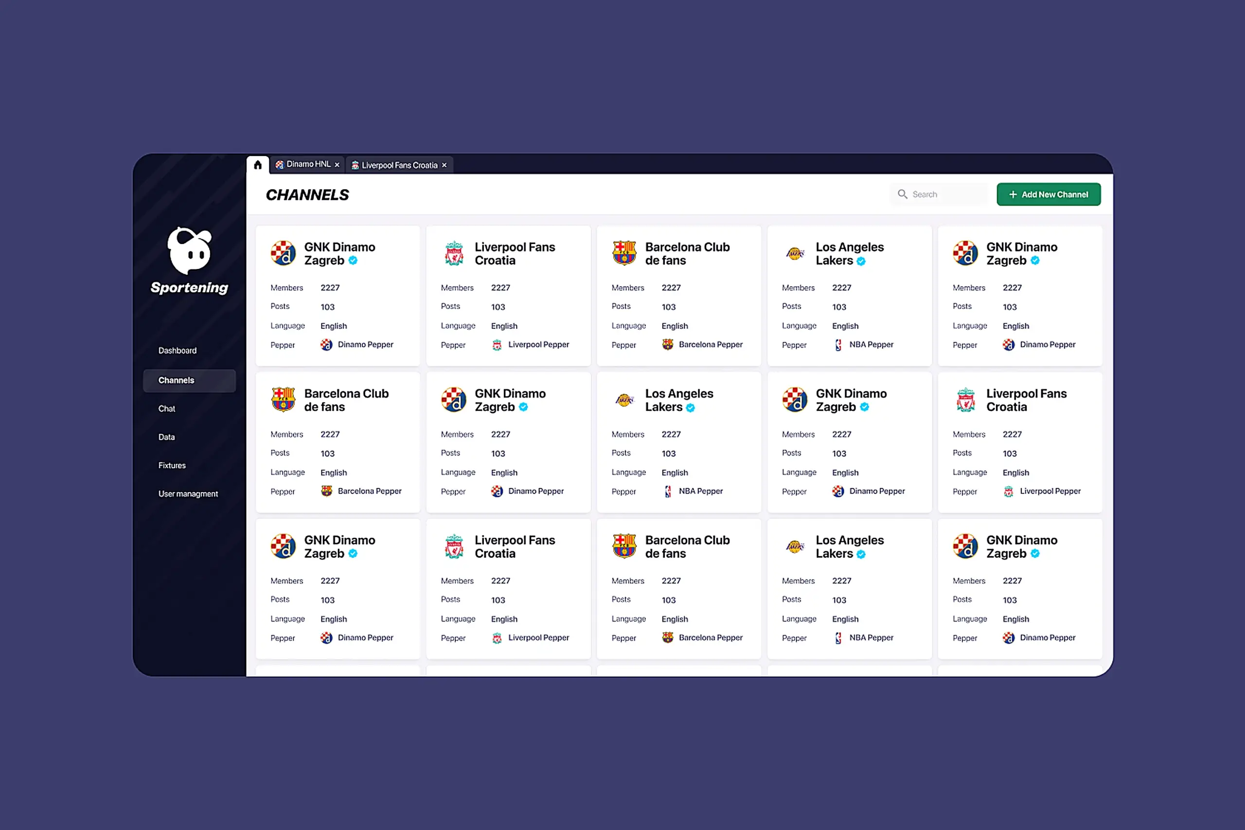
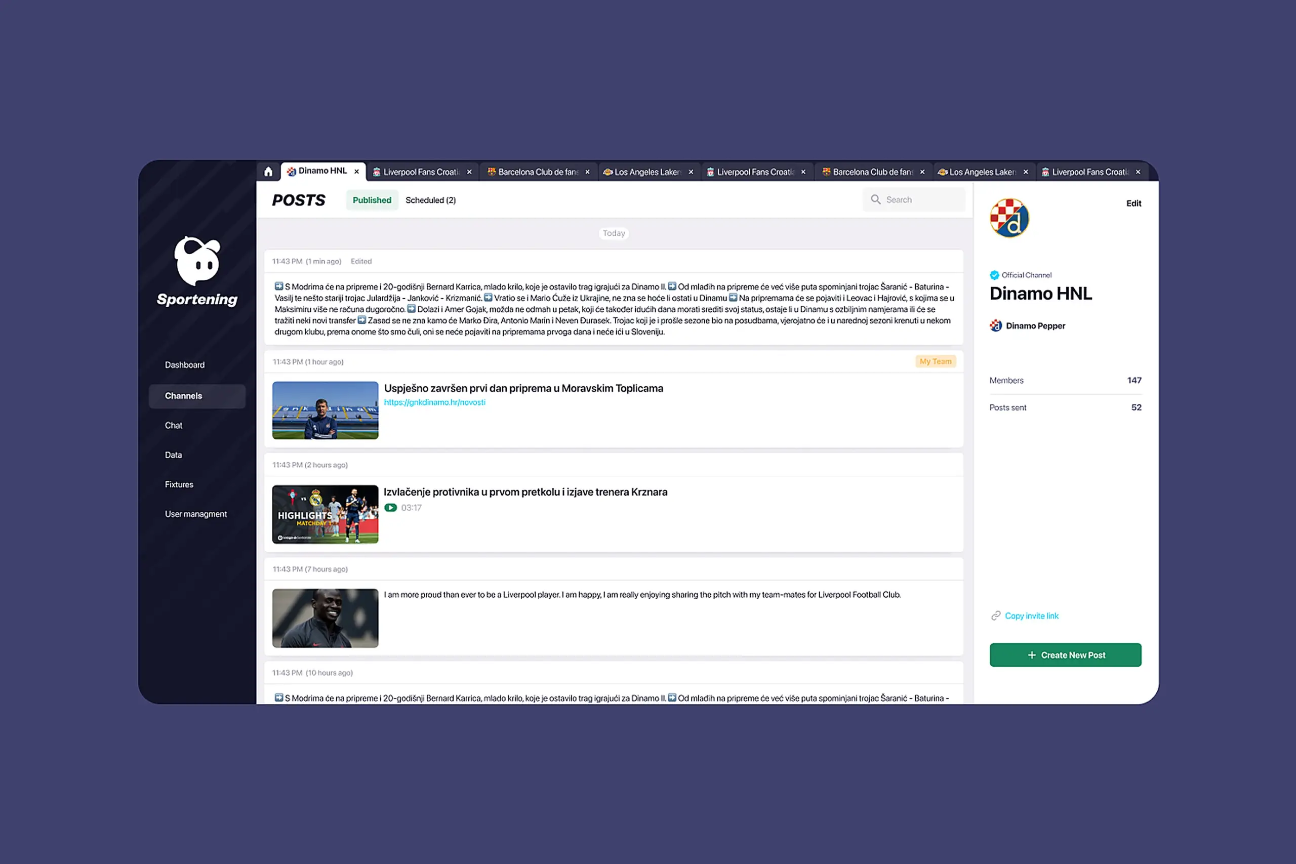
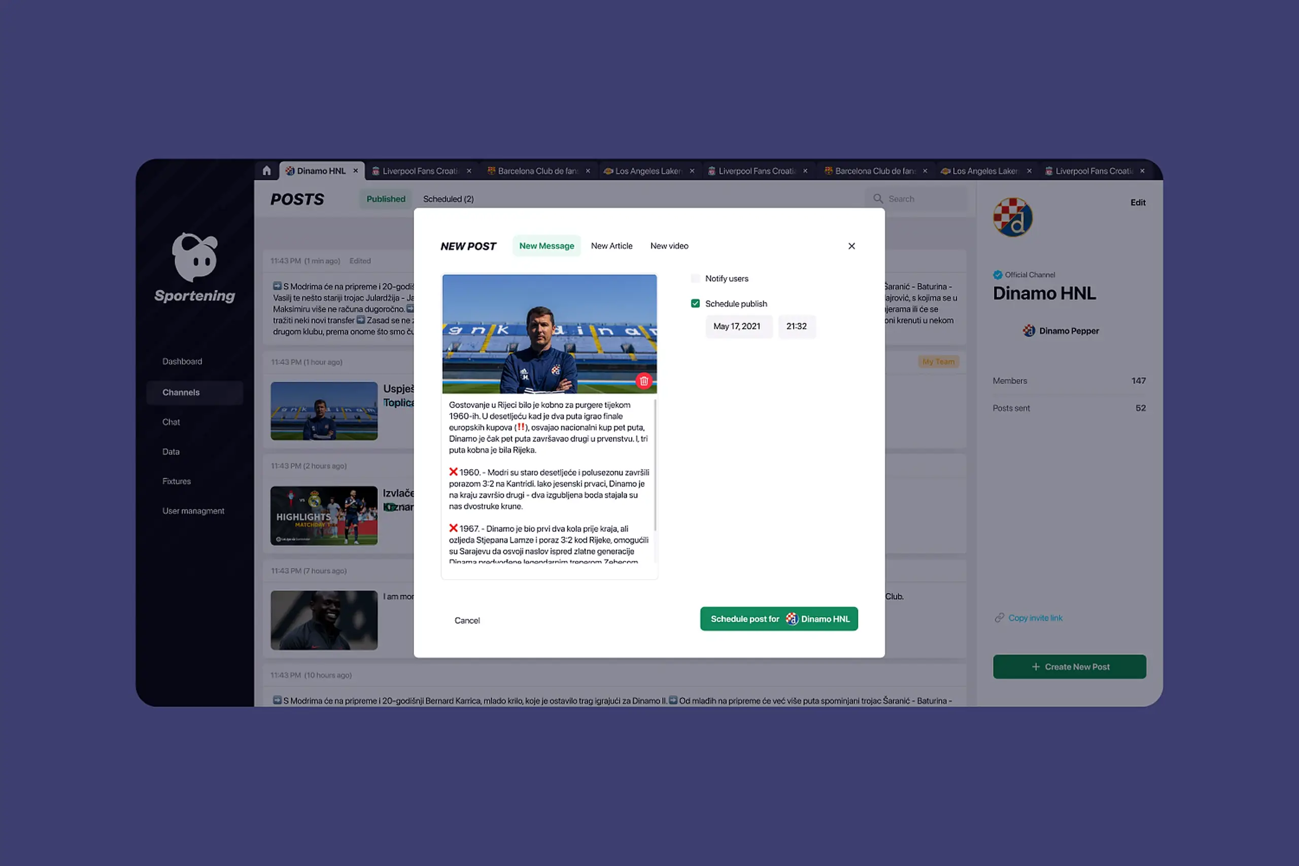
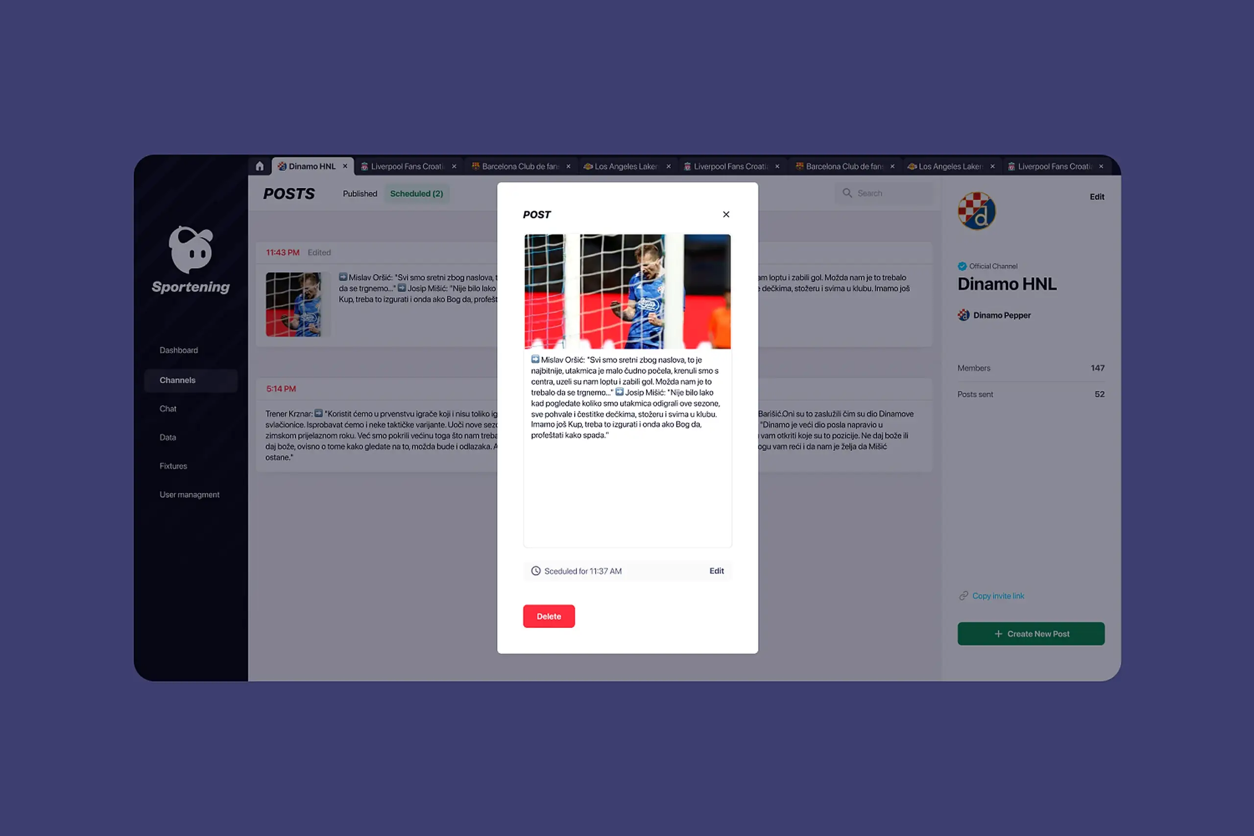
2. Scheduling that prevents mistakes
I redesigned scheduling as a core workflow, not an afterthought.
The system now shows:
- Preview of content before it publishes (critical for videos and match data)
- Scheduling history and upcoming posts in calendar view
- Edit and delete controls for scheduled content
- Clear visual states: draft, scheduled, published
Why calendar view over list view: Content creators think in time, “What’s going out on match day?” A list sorted by date required scanning and mental math. A calendar shows density at a glance: “Saturday is packed, Sunday is empty.”
Design detail: Scheduled posts show the destination channel with team branding. Users can verify at a glance that their Barcelona content isn’t accidentally queued for Real Madrid.
Scheduling interface with calendar view, content preview, and status indicators (draft, scheduled, published)
Match-day content gets prepared in advance and publishes automatically. Less panic, fewer mistakes.
Mobile interface allowing content creators to schedule on the go
3. Different interfaces for different users
Partner teams saw the same overwhelming interface as power users. I designed role-based experiences.
Internal creators get the full toolset – all channels they manage, all features, bulk operations, advanced scheduling.
Partner clubs get a simplified view – only their channel, streamlined feature set, cleaner interface with less visual noise.
Why not just hide buttons? Early approach was to hide unavailable features. But the layout still felt complex – empty spaces where buttons should be, navigation patterns optimized for power users. I redesigned the partner experience from scratch: different information hierarchy, simplified navigation, focused on their three core tasks (create post, schedule post, check library).
Training time dropped. Support tickets about permissions disappeared.
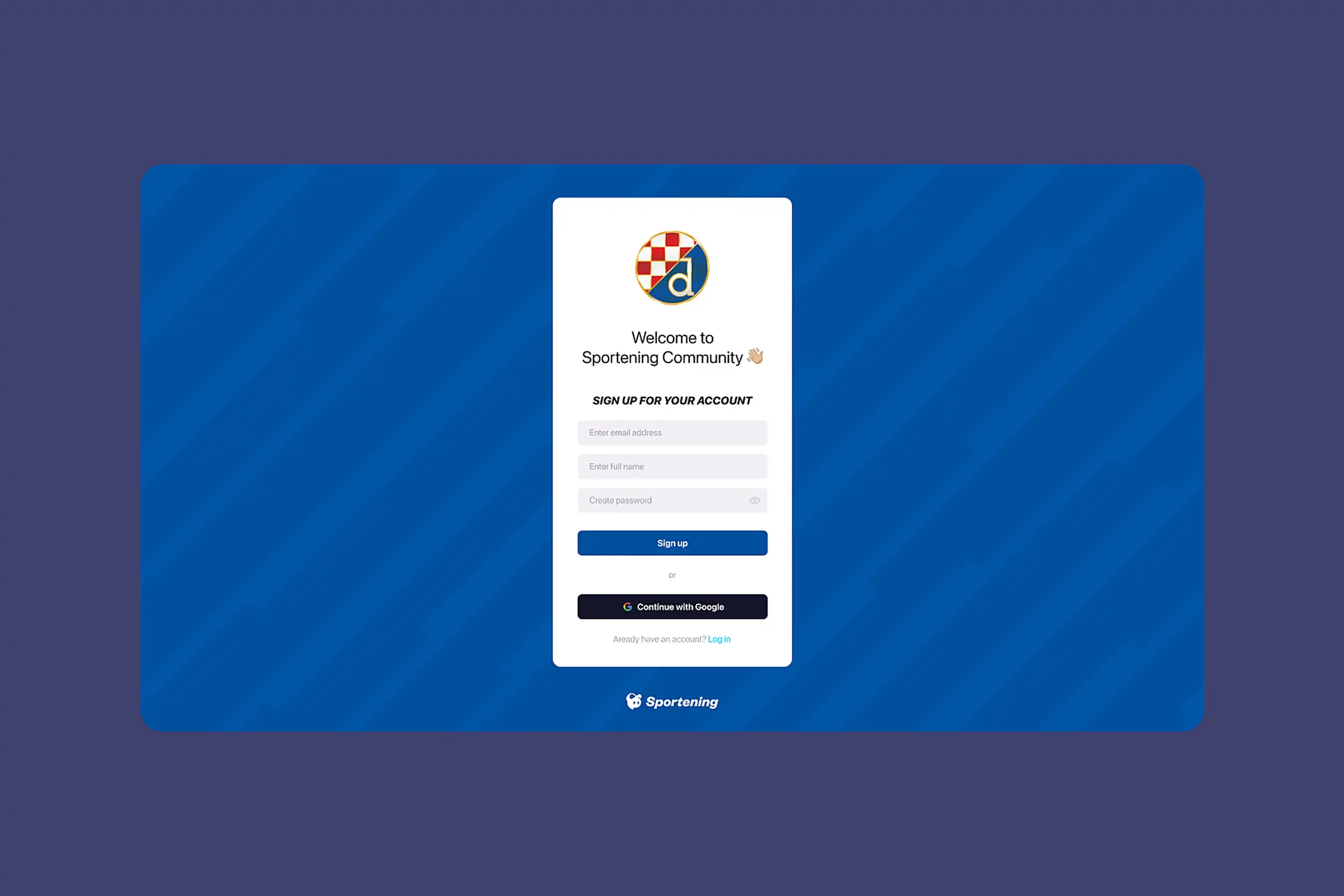
Partner teams have simplified interface with only their channel. Internal teams has access full toolset.
4. Library that actually gets used
The old library was so bad that content creators manually searched the internet for every image.
What made it unusable:
- No clear organization by team
- Couldn’t tell which images were approved for use
- Search was slow and inaccurate
- Upload process was buried
What I built:
- Library scoped to each channel, so Barcelona’s library shows Barcelona assets
- Curated internet sources automatically scraped per club (official team sites, approved photo agencies)
- Manual upload for custom assets
- Search that actually works across filenames and tags
- Clear licensing indicators
This became one of the most-used features. Content creators told me it saves them hours of repetitive work weekly.
Content library showing scraped articles and media organized by channel
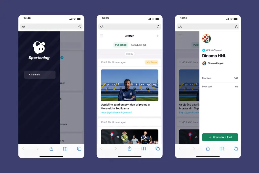
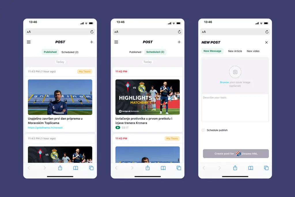
5. Mobile-first design
I designed every feature for phone use from day one.
Why mobile-first rather than responsive adaptation: Content creators’ most critical moments happen away from desks. Match updates from stadiums, breaking news from press conferences, schedule changes from airports. If mobile was an afterthought, those moments would fall back to workarounds. I designed phone layouts first, then expanded to tablet and desktop.
Key mobile decisions:
- Bottom navigation for thumb reach
- Full publishing flow accessible on phone
- Scheduling works completely on mobile
- Library browsable and usable on small screens
Artifacts I created
- Interview synthesis document with quotes organized by theme
- Information architecture diagram showing old vs. new navigation structure
- User flow maps for publishing, scheduling, and library workflows
- Wireframes (low-fidelity for structure testing, high-fidelity for visual design)
- Component library extending the mobile app’s design system
- Responsive breakpoint specifications
- Developer handoff documentation with interaction states
The impact
Without baseline metrics, I can’t give percentage improvements. But qualitative outcomes were clear:
Publishing to wrong channels became rare instead of daily. Channel-first navigation meant creators always knew where they were.
Partner teams became self-sufficient. Support tickets about navigation and permissions stopped. Training time dropped from weeks of hand-holding to self-service onboarding.
Mobile publishing actually happened. Content creators could publish from stadiums, press conferences, anywhere, without calling colleagues for help.
The library became heavily used. Creators stopped searching the internet manually for every image.
User feedback was consistently positive:
- “The interface makes sense immediately.” – Content creator
- “I don’t need to ask for help anymore.” – Partner team feedback
What I learned
About users & product:
- Channel-first navigation solved the core mental model problem. Content creators think in teams (Barcelona, Liverpool), not content types (articles, videos). Matching the interface to their mental model eliminated most navigation errors.
- Safety rails beat training. You can’t train people out of making mistakes under pressure. Scheduling previews and clear status indicators prevented errors that training never would have.
- Mobile wasn’t optional. Content creators work from stadiums and press conferences. Desktop-only would have failed regardless of how good the interface was.
About process:
- Establish success metrics before launch. Without baseline measurements for publishing time, error rates, or training duration, I can’t quantify improvement. I’d define these upfront next time.
- Test wireframes earlier. I inherited some design decisions and relied on user feedback after patterns were established. Earlier testing with rough wireframes would have caught issues sooner.
- Document design decisions as you go. Reconstructing rationale later for handoff and this case study was harder than it needed to be.
Note: Some details have been adjusted to protect client confidentiality while maintaining the integrity of the design process and outcomes.