Meditation & Spirituality App
People want to maintain their spiritual practice, but existing apps are too complex. They end up googling prayers instead of using the apps they downloaded.
⚡ AI Summary ⚡
Project: Meditation & Spirituality App
Client: Croatian market meditation app
Role: Solo Product Designer
Team: 2 Project Managers, 1 Developer
Timeline: 2021
Platform: iOS & Android mobile app
Problem:
- Existing meditation apps are too complex
- Users google prayers instead of using apps (faster to find)
- Can’t find their own notes later
- Phone interruptions break practice focus
- Some prayers too long, users need shorter options
Research:
- 13 user interviews (ages 23-46, existing spiritual content users)
- Created 2 personas: Marina (38, mom) and Luka (27, programmer)
- User journey mapping for both personas
- Competitive analysis: Nova Eva, E-duhovne, Reimagining the Examen, Hallow, Headspace
- Key insight: Apps feel overwhelming, so users default to Google
Solution:
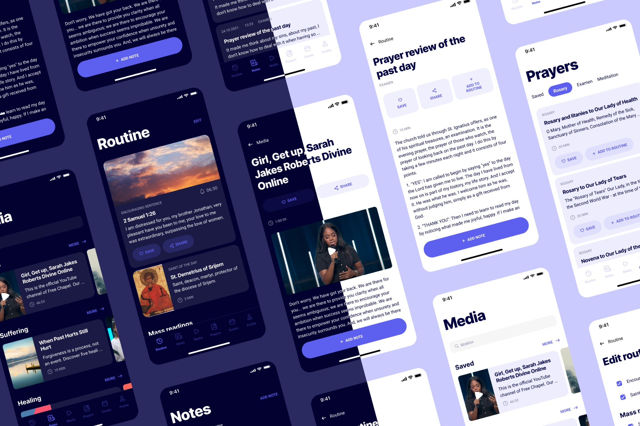
- 6 main sections: Routine, Notes, Media, Prayers, Events, Profile
- Customizable daily routine (add/remove prayers, readings, meditations)
- Notes with date and theme filters + “on this day” yearly reminders
- Media organized by topic and author with reading time displayed
- Prayers with Save and Add to Routine actions
- Events with calendar integration showing availability
- Light and dark themes for morning/evening use
Impact:
- Complete design addressing core pain points: complexity, findability, interruptions
- Differentiated product for Croatian market
- Calendar integration protects practice time
Skills demonstrated:
User research, personas, user journeys, competitive analysis, information architecture, mobile app design, design systems
What I’d do differently:
Usability test final designs (only tested concepts), prototype routine customization flow, accessibility audit for purple color scheme, design onboarding flow
Overview
Spiritual and meditative apps are popular, the wellness market is worth $1.5 trillion and growing 5-10% annually. People want peace and happiness. They download apps to help.
But I discovered something surprising: spiritual people google instead of using their apps. Existing apps feel so overwhelming that searching “morning prayer” on Google is faster than navigating to it within the app.
- My Role: Solo Product Designer
- Team: 2 Project Managers, 1 Developer
- Timeline: 2021
- Platform: Mobile app (iOS & Android)
My contributions
- User research (13 interviews)
- Personas and user journeys
- Competitive analysis
- Information architecture
- Wireframing
- UI design
- Design system creation
The challenge in detail
The client wanted to build a meditation app for the Croatian market. But before designing anything, I needed to understand: what do spiritual people actually struggle with?
I talked with 13 people aged 23-46 about their daily spiritual life. These were existing users of the client’s website, people already engaged with spiritual content.
The core finding: existing apps are too complex, so users default to Google.
Users told me they mostly use “liturgy of the day” (a short daily Bible reading), but they google it instead of opening an app because it’s faster to find.
One user’s quote captured it perfectly: “If only I had everything I need every day in one place. This way I have to have a lots of applications or google a lot… It’s easier for me to google than search for things through this app. I have a feeling I’m getting to what I need faster.”
Key pain points from research
They google instead of using apps. Apps feel overwhelming. Search engines feel faster, even if the app technically has what they need.
Apps feel overwhelming. “Slight frown on the face – it’s too complex. When she just opened the app, she seemed a little scared. Too aggressive colors, too much information.”
They can’t find their notes. Users write down important things from videos and articles, but later can’t find them. They spend time searching through notes trying to remember something that might help them.
Phone interruptions during practice. During spiritual activities, they look at their phone to check time and get interrupted by notifications. This breaks their focus.
They plan practice for morning and evening. If they miss those times, they try to fit it in randomly during the day. They often write things in phone notes and google the liturgy since they don’t carry bibles everywhere.
Some prayers are too long. People skip prayers because they don’t have enough time. They need options.
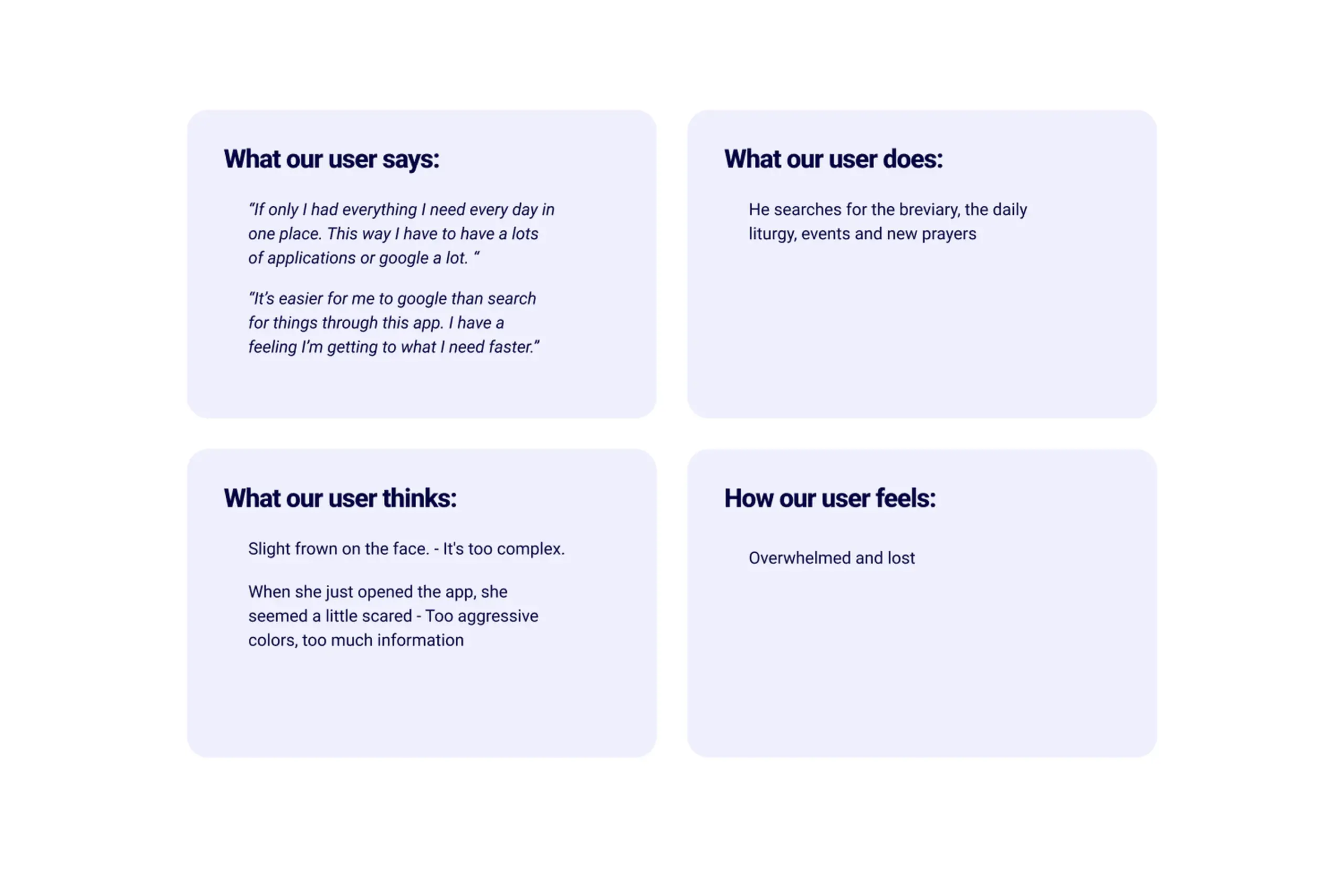
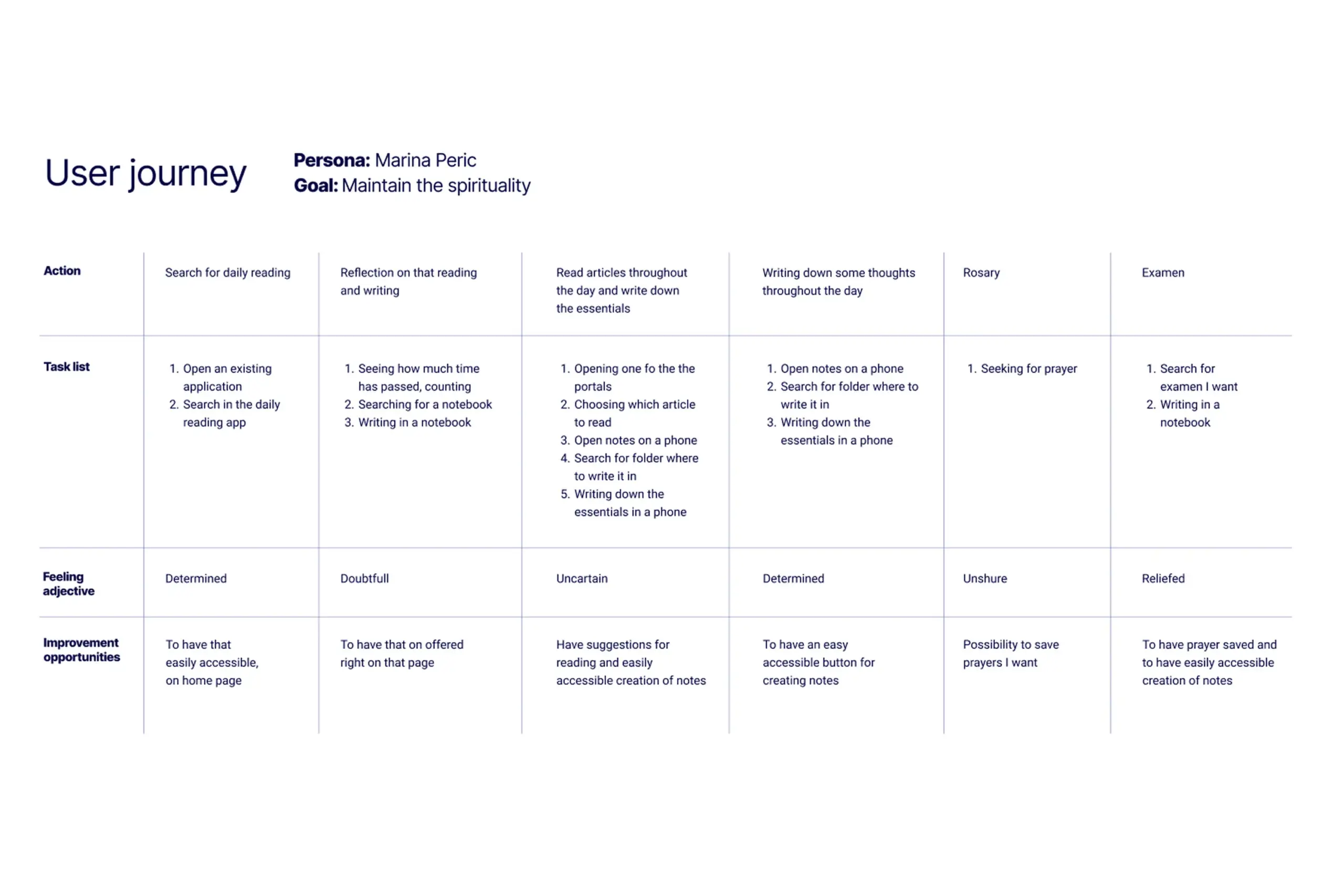
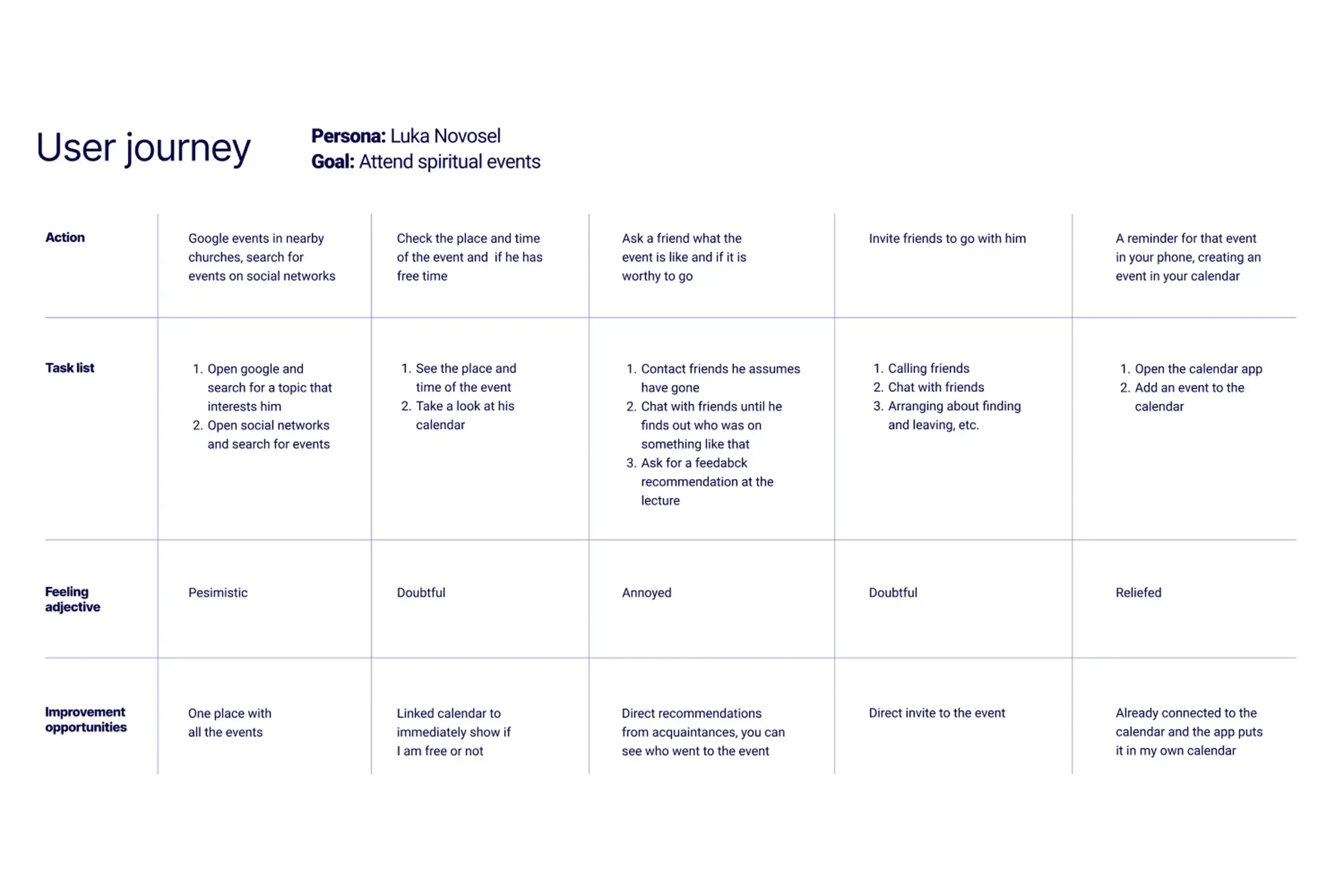
Key insights from 13 user interviews about daily spiritual practice
Who I was designing for
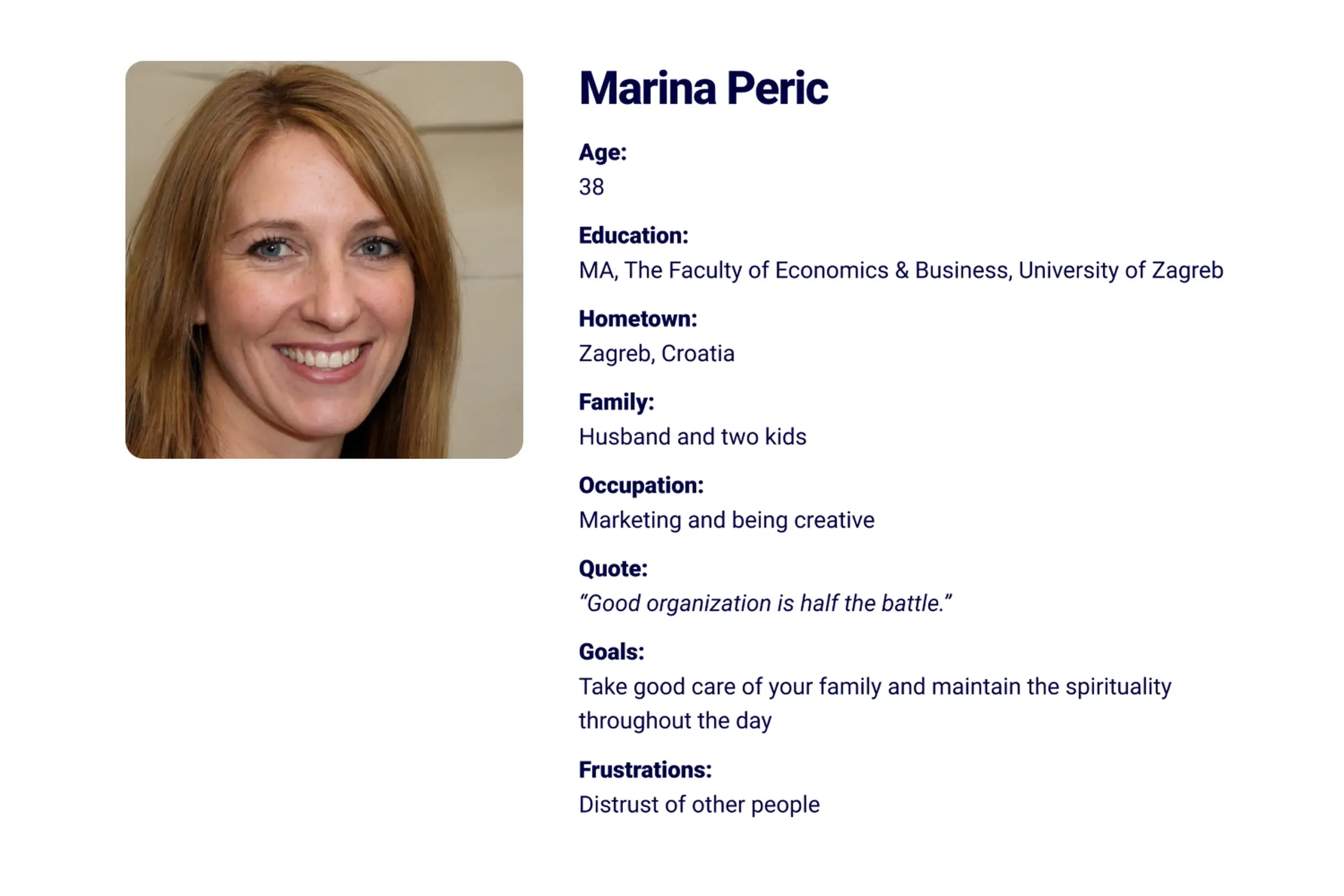
Based on research, I created two personas representing the main user types:
Marina (38, mom of two)
Needs to maintain daily spirituality while managing family life. Wants to feel happy and fulfilled. Struggles with organization and finding time. Goal: Help parents maintain their daily spirituality easily.
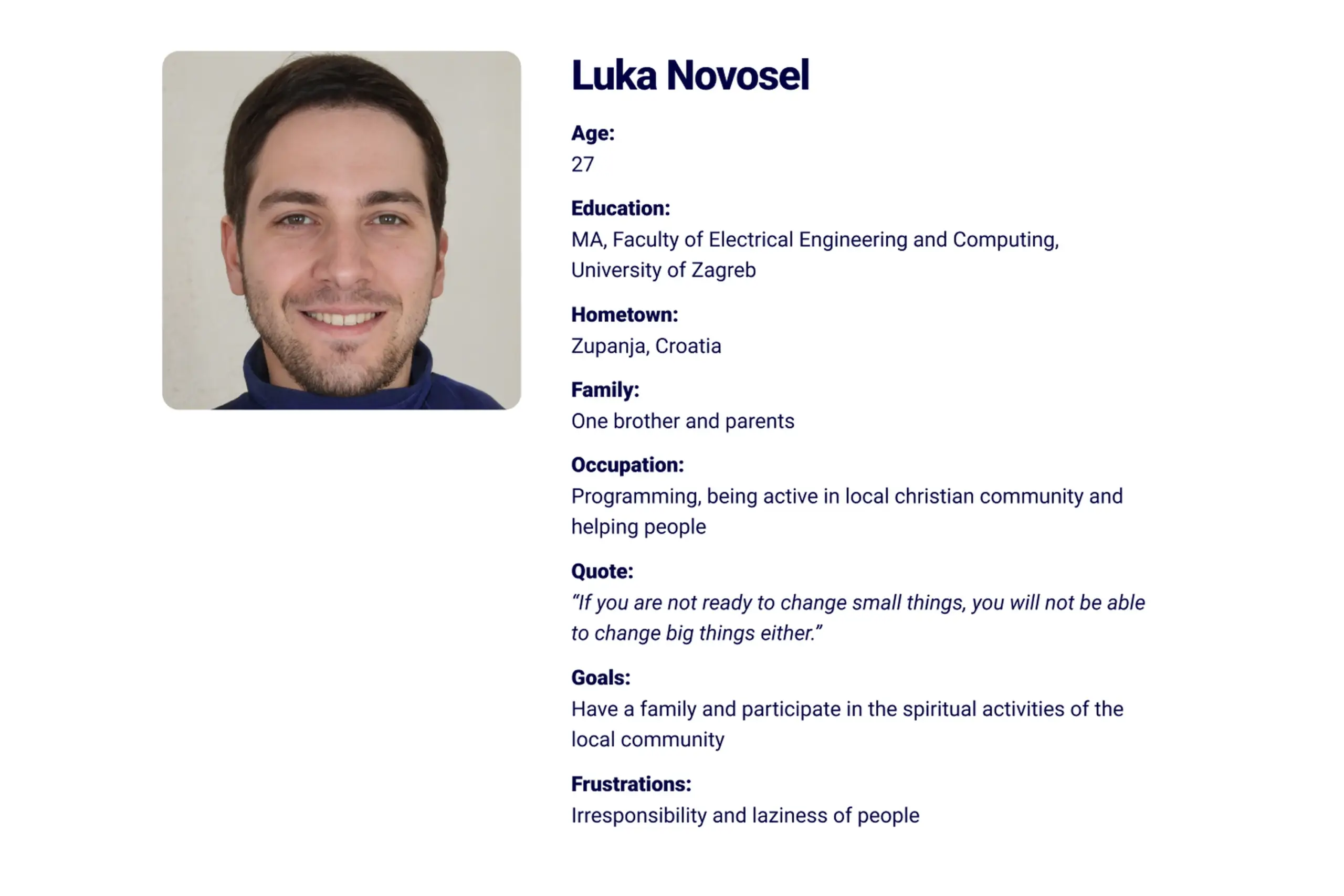
Luka (27, programmer)
Active in local Christian community. Wants to attend spiritual events and meet new people. Needs to discover events and coordinate with friends. Goal: Help people attend spiritual events and meet people easily.
I mapped user journeys for both personas to understand where they struggled most with existing solutions and where our app could help.
Competitive analysis
Users mentioned three apps they use most: Nova Eva, E-duhovne, and Reimagining the Examen. These became my direct competitors.
I also looked at indirect competitors – English apps like Hallow, Intellect, and Headspace. They’re not direct competition because of language, but they have features we wanted: meditations, prayers, daily routines, and journaling.
What competitors got wrong:
- Too much information on screen
- Hard to navigate to specific content
- No way to organize personal notes
- No calendar integration
What we could do better:
- Simpler, calmer interface
- Content organized by topic and author (how users search)
- Notes with filters and “on this day” reminders
- Calendar sync to protect practice time
My approach
Information architecture
Given everything I learned, I organized the app around six main sections:
Routine – The home screen. Everything users need daily: encouraging sentence, saint of the day, mass readings, breviary prayers, and suggestions. Fully customizable.
Notes – All notes in one place with two filters: by date and by theme. Plus “on this day” notifications reminding users what they wrote a year ago.
Media – Articles, videos, and books grouped by topic and author. Shows reading time so users know if they have time.
Prayers – Searchable prayer library. Users can save prayers or add them directly to their routine.
Events – Spiritual events grouped by theme and organizer. Calendar integration shows if users have time and lets them invite friends.
Profile – Personal settings, calendar connection, and preferences.
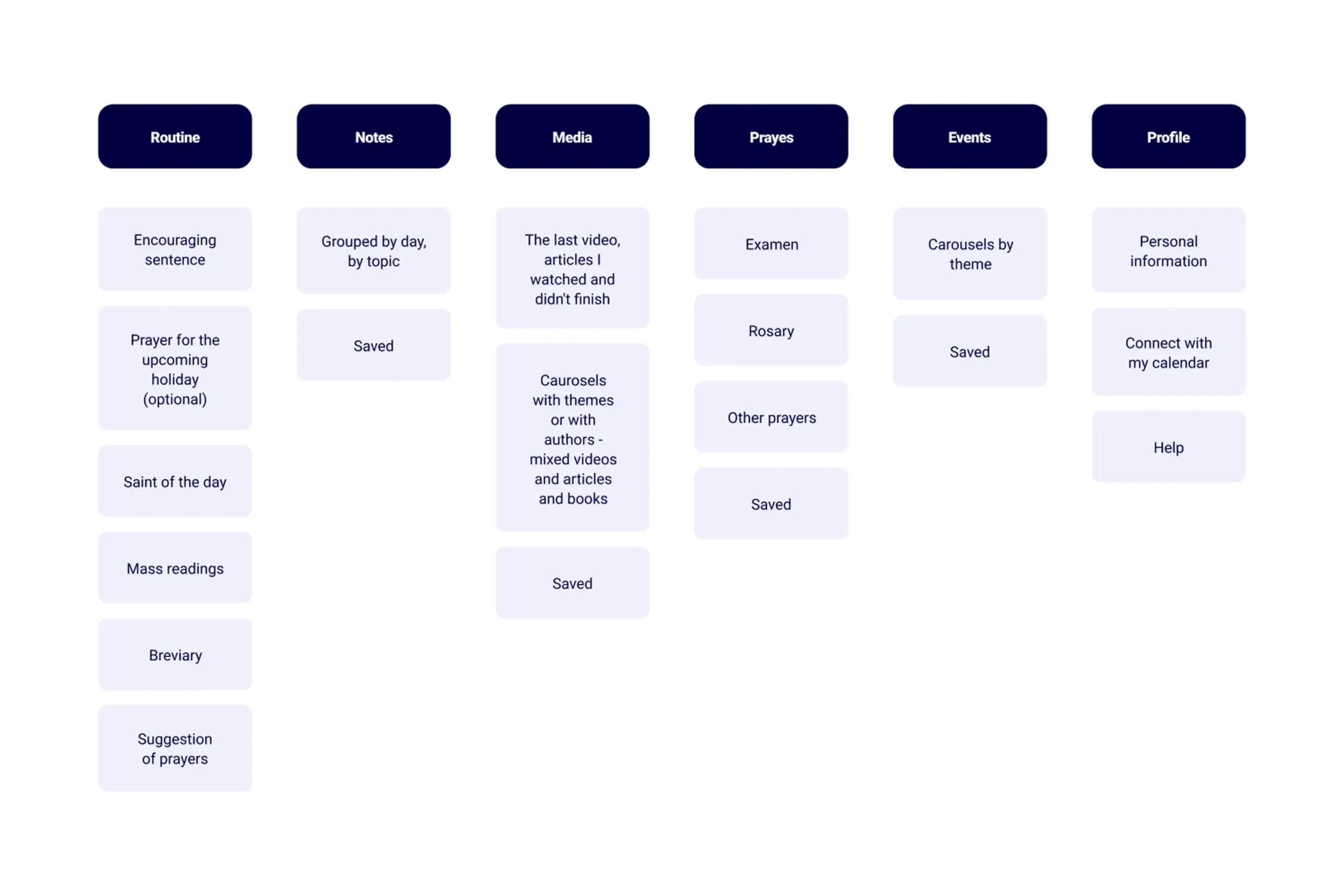
Information architecture organized around user mental models and daily workflow
Key design decisions
The routine screen
This is the heart of the app. Users told me they plan spiritual practice for morning and evening, so I designed the home screen to show everything they need for daily practice – all in one scrollable view.
But people are different. Some want more, some want less. So I made the routine fully editable. Users can add or remove any element: prayers, readings, meditations.
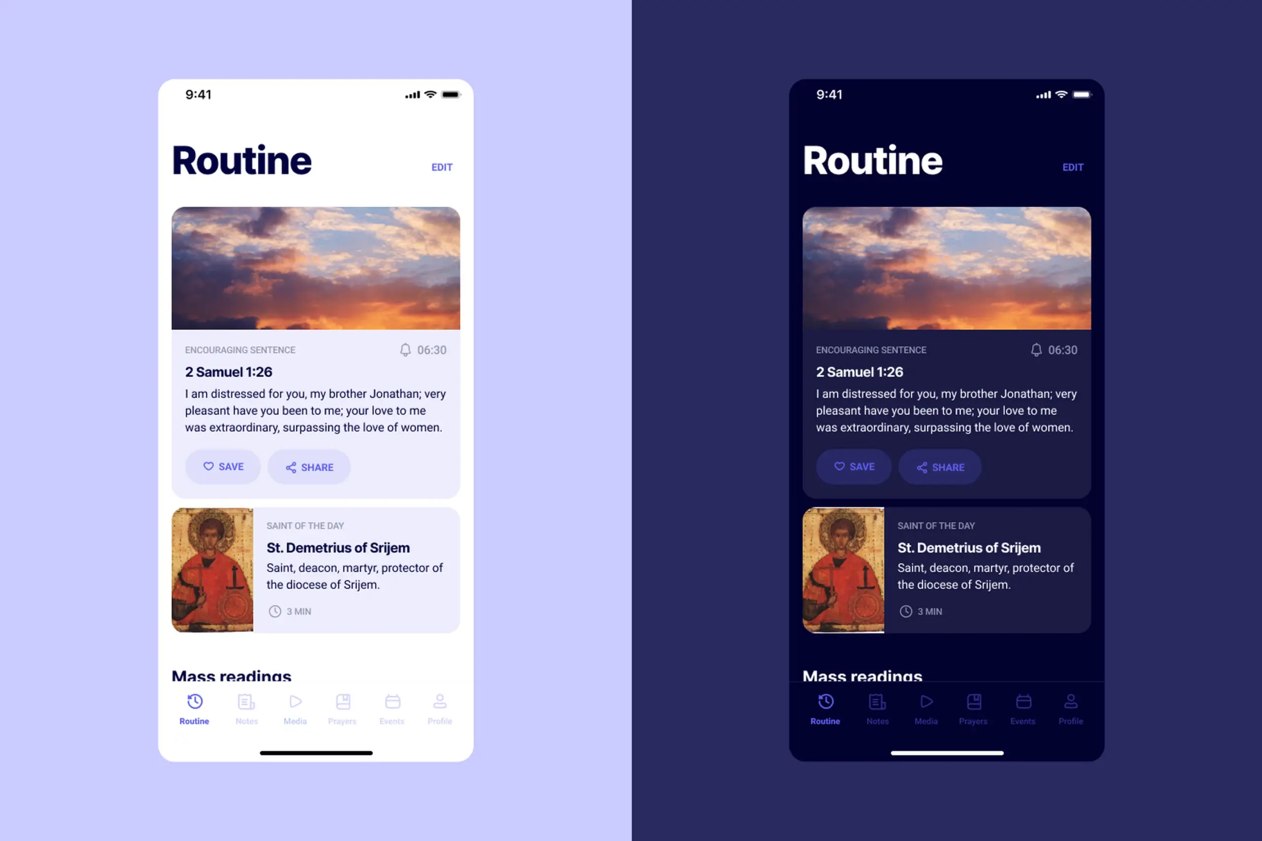
The home screen shows everything for daily practice, fully customizable
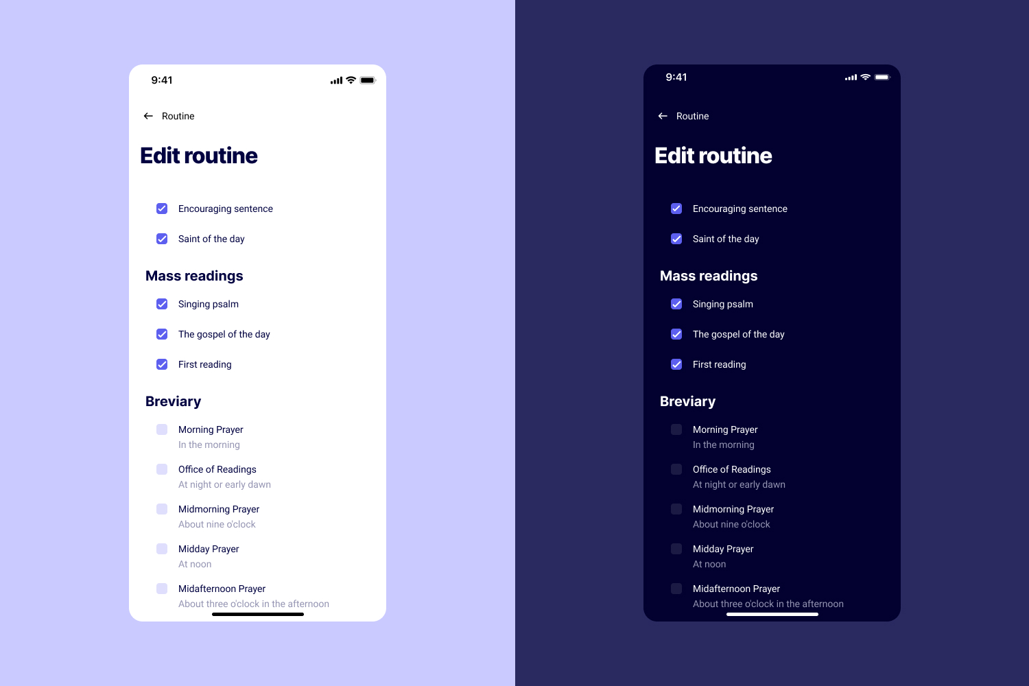
Users can add or remove any element from their daily routine
The app also suggests prayers users might want to add. This helps discovery without overwhelming them.
Notes that are actually findable
Users told me they write notes but can never find them later. I gave them two ways to filter: by date and by theme.
Plus, I added “on this day” notifications. A year from now, users get reminded: “On this day, a year ago, you wrote…” This creates reflection and makes old notes valuable again.
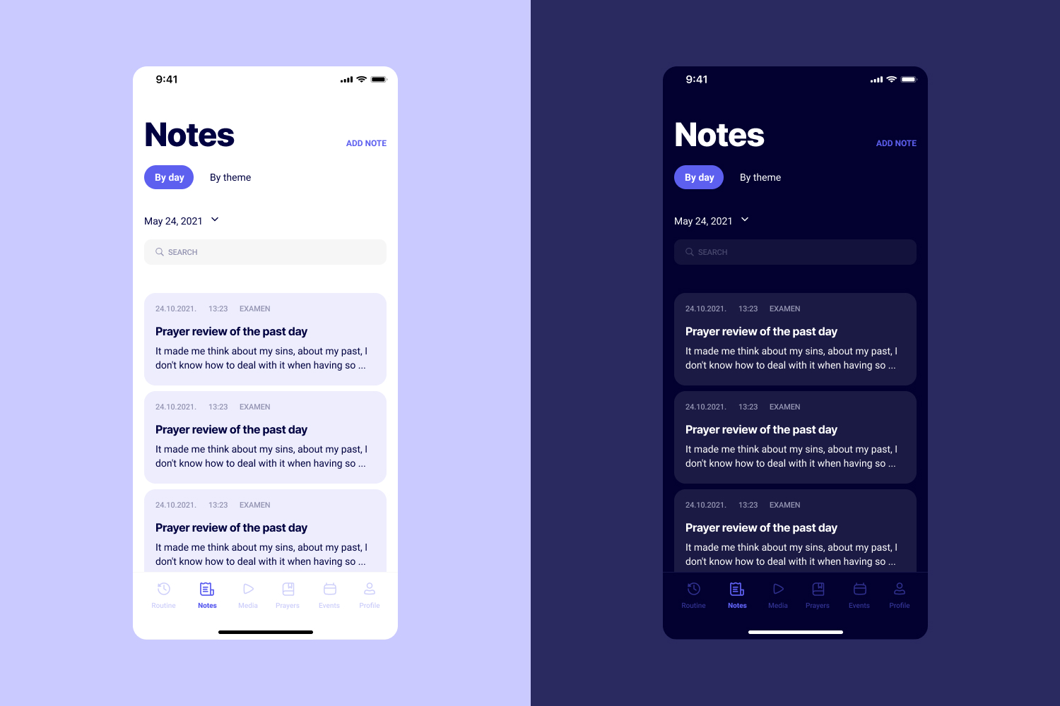
Notes organized by date and theme, with color options users requested
Users specifically asked for colors in notes. They like to use color when writing things down. Small detail, but it came directly from interviews.
Media organized how users think
Users search for content by topic (“suffering”, “healing”) or by author/speaker they follow. So that’s how I organized it.
Every piece of content shows reading/watching time. Users constantly mentioned lack of time – this helps them decide if they can fit something in.
At the end of every content list, there’s a “Search the internet” button. Users told me if they don’t find what they want, they’ll google it. So why not help them? No dead ends.
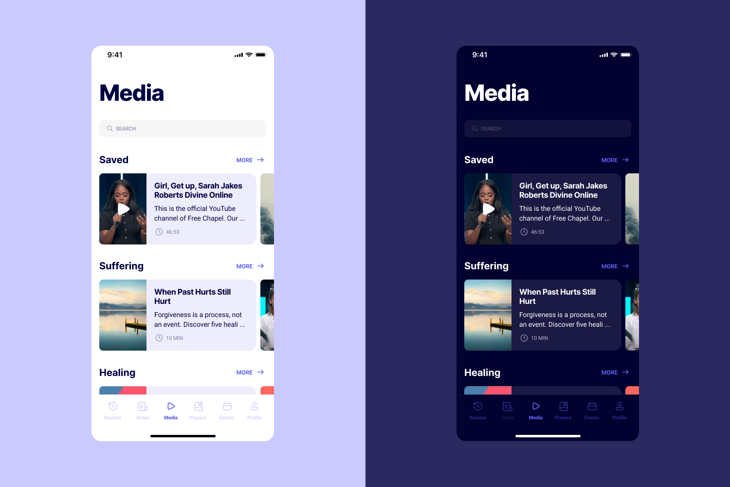
Content organized by topic and author, with time estimates for each piece
Prayers with save and add to routine
The prayer section has two actions: Save and Add to Routine.
Save is for “I like this but don’t need it daily” – building a personal collection. Add to Routine is for “I want this every day.”
This distinction came from user research. They have lists of books to read, videos to watch, prayers they like. Save supports that behavior.
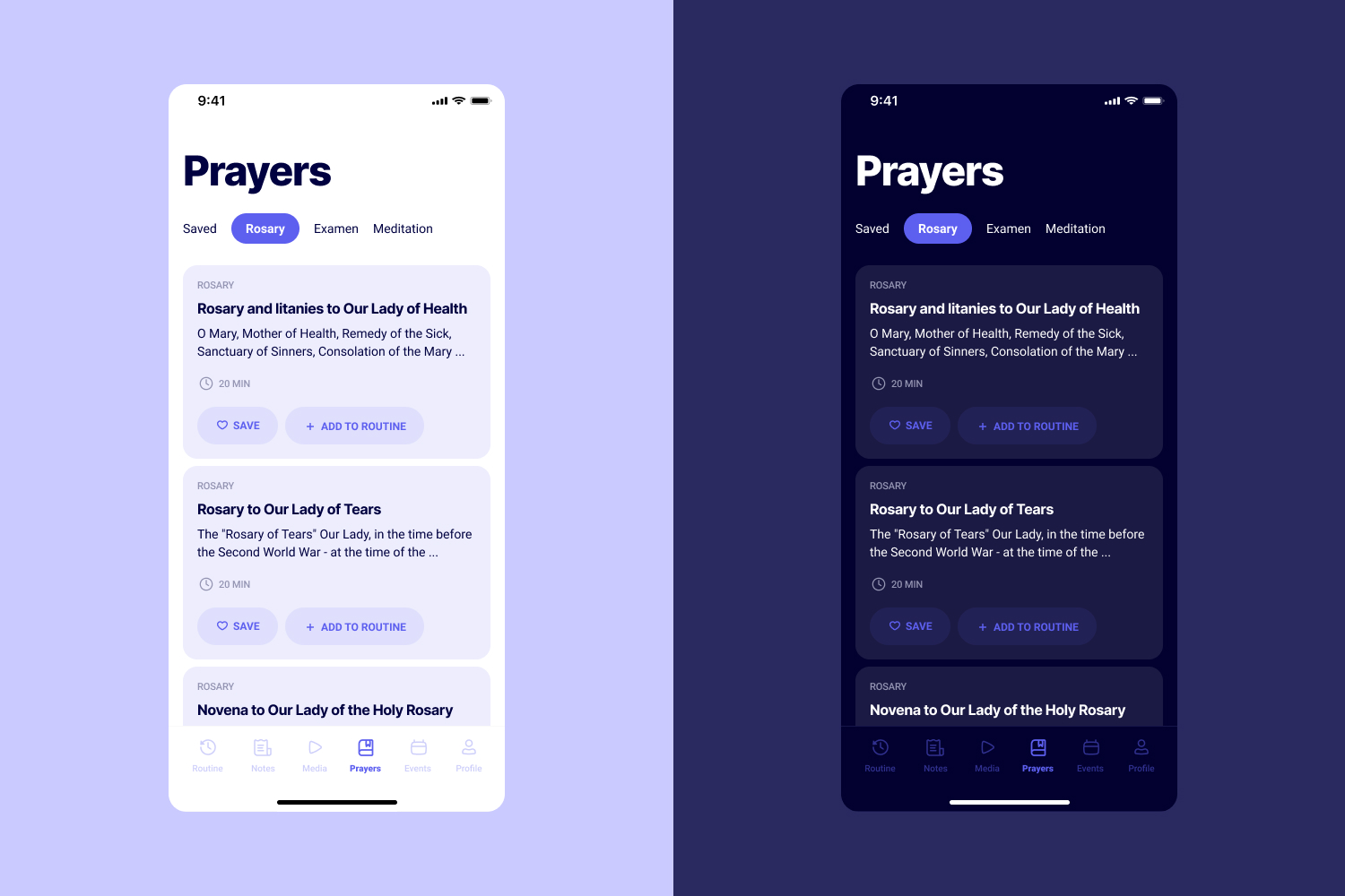
Prayers can be saved for later or added directly to daily routine
Events with calendar integration
Events show a green dot if users have free time in their calendar. This requires calendar connection, but it solves a real problem: users want to attend events but don’t know if they’re free without checking.
They can also share events with friends directly – addressing Luka’s need to coordinate with his community.
Art direction
I searched for fonts by listing adjectives I wanted the app to feel: calm, peaceful, friendly, confident, secure.
For color, I chose purple because it symbolizes spirituality and imagination. I found inspiration in meditation app designs on Dribbble and adapted them for this context.
I created both light and dark themes. Users often practice in the morning or evening – dark mode reduces eye strain and feels appropriate for quiet, reflective moments.
Font and color choices driven by desired emotional qualities
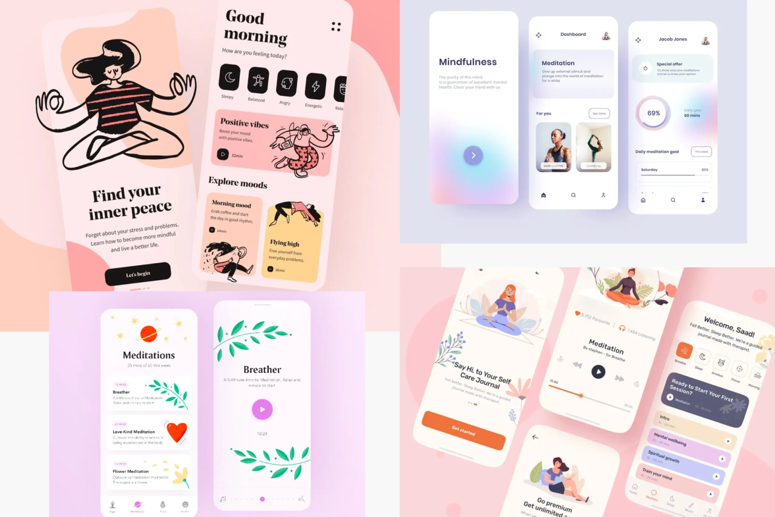
Light and dark themes for different times of day and user preferences
The process
Research-driven from the start: 13 user interviews before any design work. Every feature maps back to something users told me.
Personas and journeys: Created specific people to design for, mapped their daily struggles to find opportunities.
Competitive analysis: Understood what exists, what works, and where competitors fail users.
Information architecture first: Organized the app around user mental models before designing any screens.
Wireframes before UI: Validated structure and flows before investing in visual design.
Two themes: Recognized that context matters – morning and evening use, different lighting conditions.
Artifacts I created
- Interview guide and notes from 13 sessions
- Empathy maps and user quotes
- Two personas with detailed backgrounds
- User journey maps showing pain points and opportunities
- Competitive analysis document
- Information architecture diagram
- Low-fidelity wireframes
- High-fidelity UI designs for all screens
- Light and dark theme designs
- Art direction documentation (fonts, colors, imagery)
- Design system components
The impact
For users: Everything they need for daily spiritual practice in one place. Customizable routine they can edit based on their schedule. Notes organized by theme and date, easy to find later. Calendar integration to block time for prayer without phone interruptions. Content grouped by topic and author (how users actually search).
For the business: Differentiated product in the $1.5 trillion wellness market. Addresses specific pain points competitors ignore. Designed for Croatian market with potential to expand.
What I learned
About users & product:
- Users google instead of using apps. Existing apps were so complex that searching “morning prayer” on Google was faster than navigating to it in the app. Simplicity was the core requirement.
- Customizable routines match real behavior. Some users want extensive morning practice, others want two minutes. Editable routine screens accommodate both without separate app versions.
- “On this day” notifications make old notes valuable. Users write reflections and never find them again. Yearly reminders resurface past writing at meaningful moments.
About process:
- Research before any design. 13 interviews before wireframes meant every feature mapped to something users actually said. No guessing.
- Validate actual designs with users. I tested concepts through interviews but not the finished UI. Would add usability testing of high-fidelity designs.
- Check accessibility early. Purple for spirituality works conceptually but needs careful contrast checking, especially in dark mode.
Details adjusted for confidentiality