Responsive Reservation App
Users kept hitting “no results” because the app demanded exact dates. But people planning camping trips are flexible – they’d shift by a few days for the right camper.
⚡ AI Summary ⚡
Project: Responsive Reservation App (Campervan booking)
Client: FreewayCamper
Type: Independent project
Role: Product Designer
Team: Developer, Project Manager
Timeline: 2022
Platform: Responsive web (mobile + desktop)
Problem:
- Users almost never got search results
- App demanded exact dates, but camping trips are planned flexibly
- Users would shift dates by a few days for the right camper
- App was hiding available inventory from willing customers
Research:
- User interviews about trip planning behavior
- Key insight: People know roughly when they want to go, not exact dates
Solution:
- Two booking flows: flexible dates vs exact dates
- Flexible flow: select timeframe, duration, flexibility level → see all available date ranges
- Exact flow: standard calendar picker for users with specific dates
- Both flows: location picker, traveler info, camper preferences
- Results show campers with all their available periods
- Complete responsive design system for mobile and desktop
Impact:
- Users get results instead of “no results” dead ends
- Flexible travelers can actually find and book campers
- Mobile-first experience for on-the-go planning
Skills demonstrated:
User research, booking flow design, responsive design, design systems, mobile-first approach, developer collaboration
What I’d do differently:
Test two-flow concept with actual interface (only validated through interviews), define conversion metrics upfront, document edge cases earlier
Overview
FreewayCamper lets people rent campervans for road trips. The booking flow was straightforward: pick your dates, pick your location, see available campers.
The problem? Users almost never got results. The app demanded exact dates, but people planning camping trips are flexible, they’d happily shift by a few days for the right camper. The app was hiding inventory from willing customers.
I redesigned the booking flow to accommodate how people actually plan trips.
- My Role: Product Designer
- Team: Developer, Project Manager
- Timeline: 2022
- Platform: Responsive web (mobile & desktop)
My contributions
- User research and interviews
- Mobile-first interface design
- Desktop responsive design
- User flow redesign
- Design system creation
- Developer collaboration
The challenge in detail
The existing flow worked like this: choose your camping dates, choose pickup/return location, choose number of travelers. Simple.
But most of the time, users would complete this flow and hit a wall: “No results… Looks like those dates are popular! Find more availabilities in our new flexible search.”
Users who would have been happy with nearby dates never saw those options. They’d hit the dead end and leave.
What I discovered in research:
People planning camping trips usually don’t have exact dates. They know roughly when they want to go, maybe sometime in August, or a week in early summer. They’d happily shift their trip by a few days if it meant getting a great camper.
But the app didn’t support this. It demanded exact dates, searched only for those specific days, and returned nothing when there wasn’t a perfect match. Users who would have been happy with nearby dates never saw those options.
The app was essentially hiding inventory from people who would have booked it.
If users played around manually, trying different date combinations, they’d eventually find available campers. But that’s work the app should do automatically. Users won’t do it. They’ll just leave.
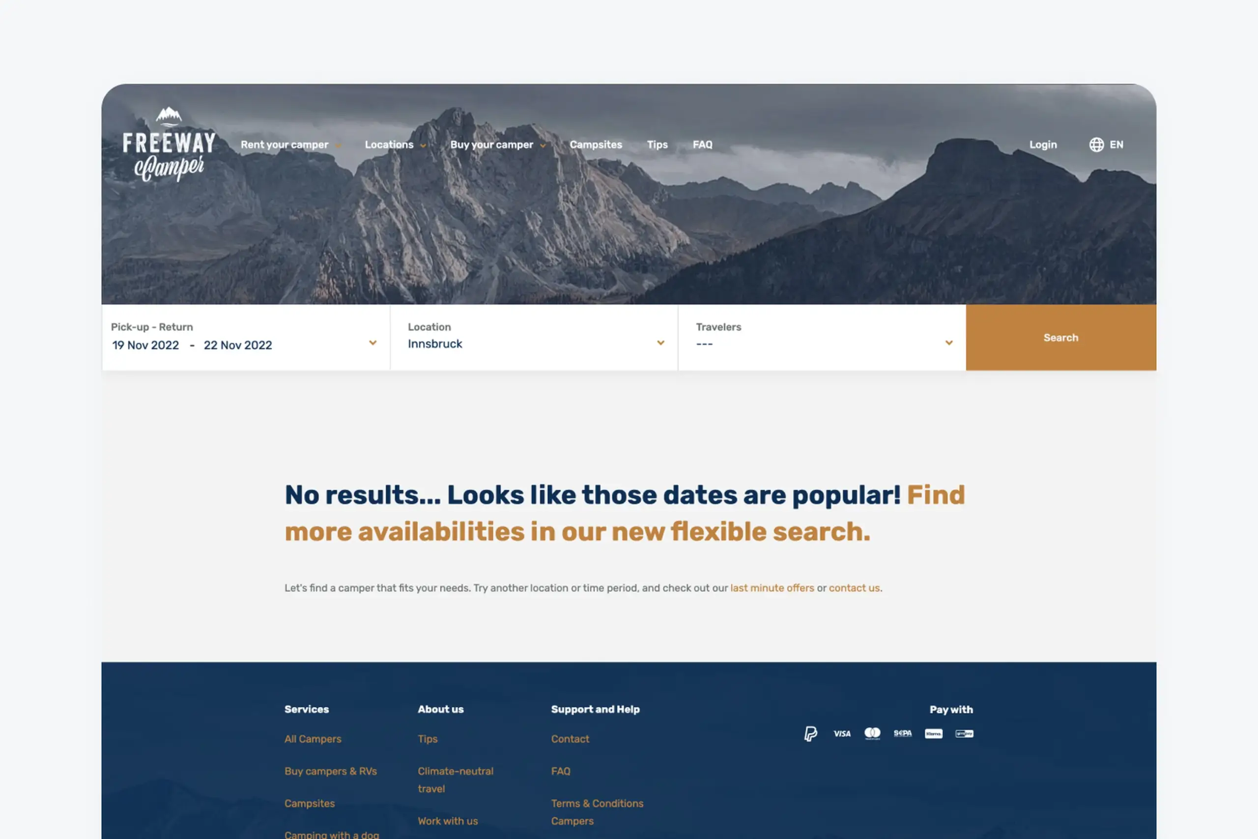
Users saw this screen constantly because exact date matching rarely worked
What I did
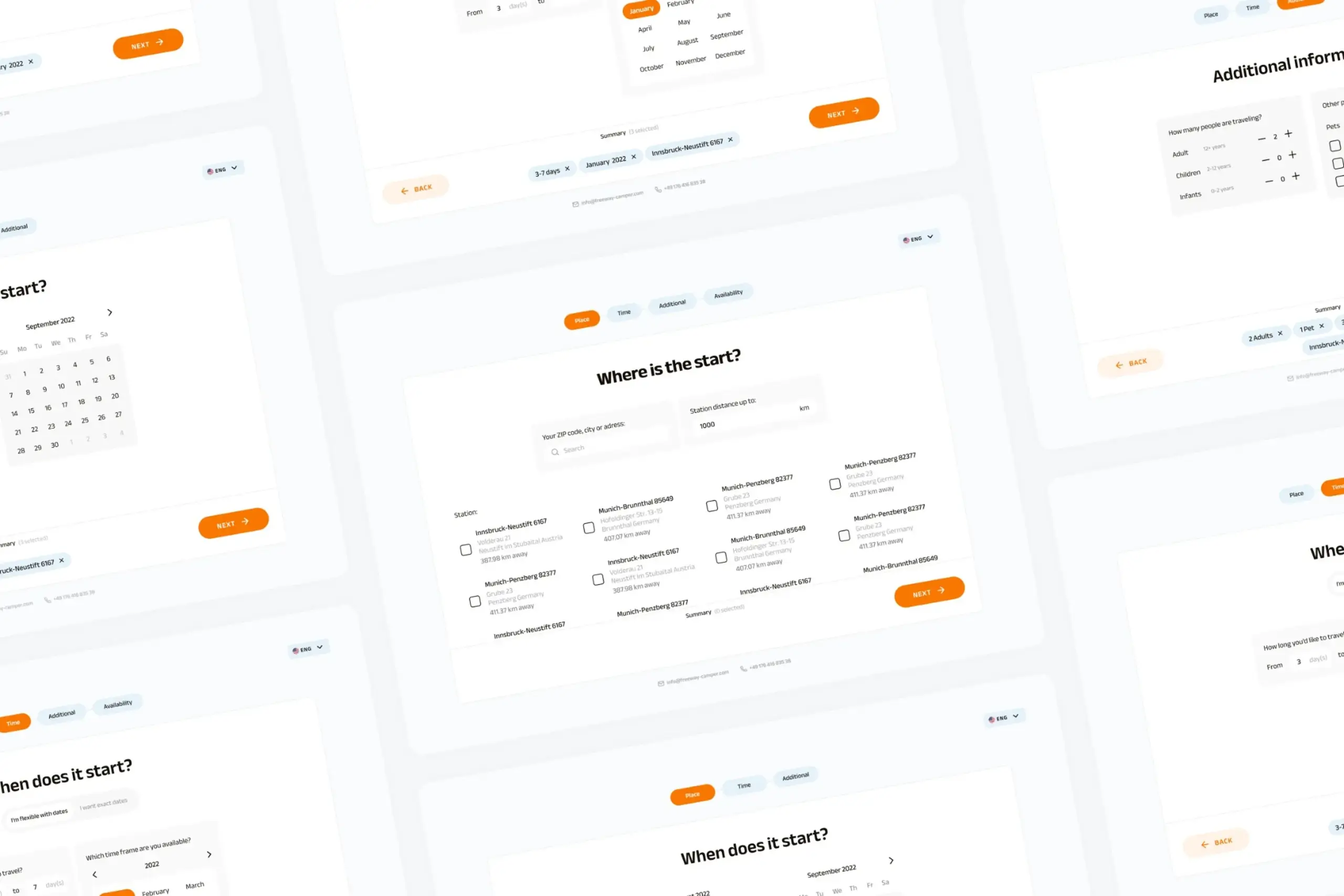
The core insight was simple: give users two paths based on how they actually plan trips.
Two booking flows
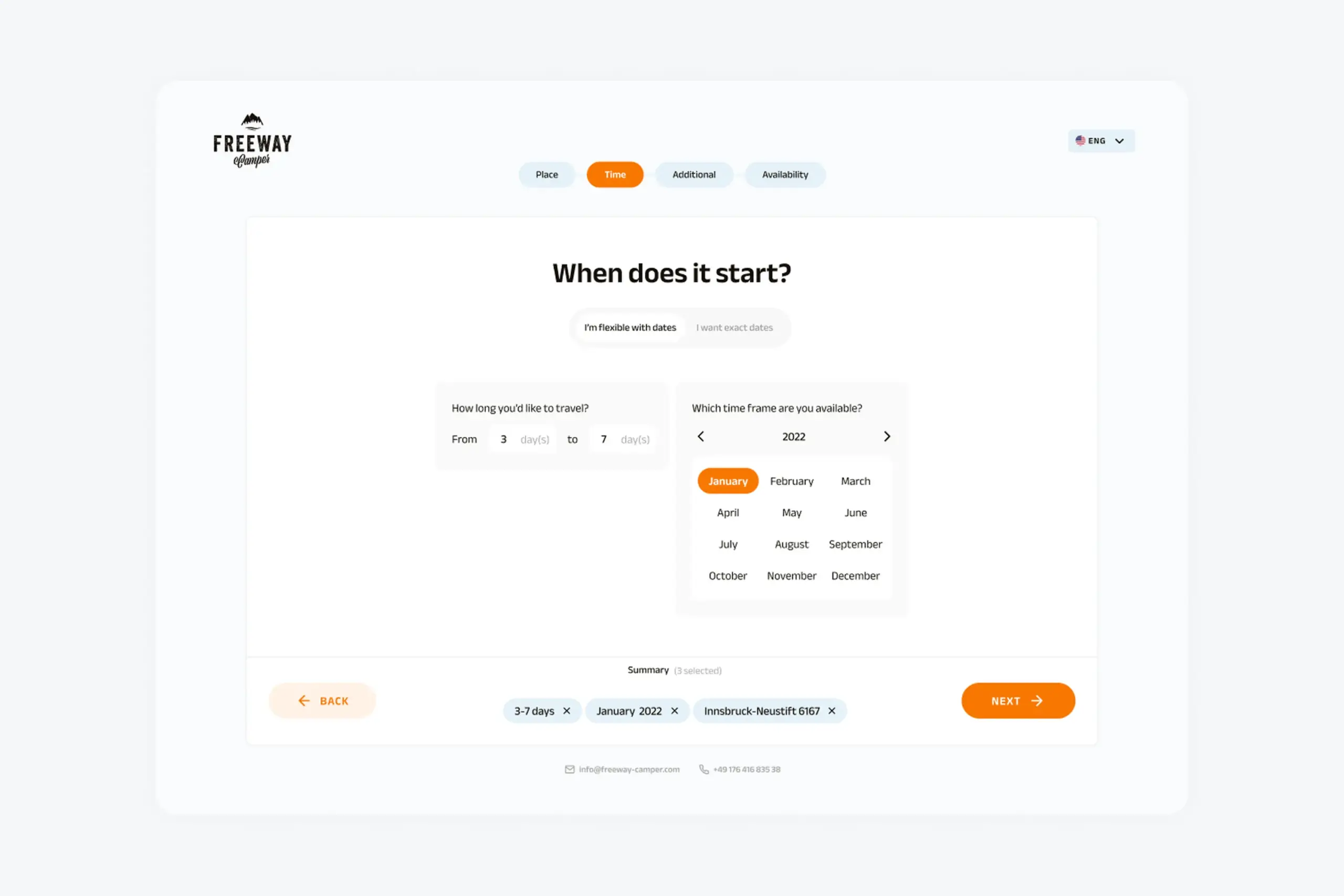
Flow 1: Flexible dates
For users who know roughly when they want to travel but don’t have exact dates locked in. This is most users.
Instead of picking specific dates, users select:
- A general timeframe (which month, which part of the month)
- How long they want to travel (3-7 days, 1-2 weeks, etc.)
- Their flexibility (“I’m flexible with my dates”)
The result: a list of campers with all their available date ranges. Users see what’s actually available and can pick dates that work.
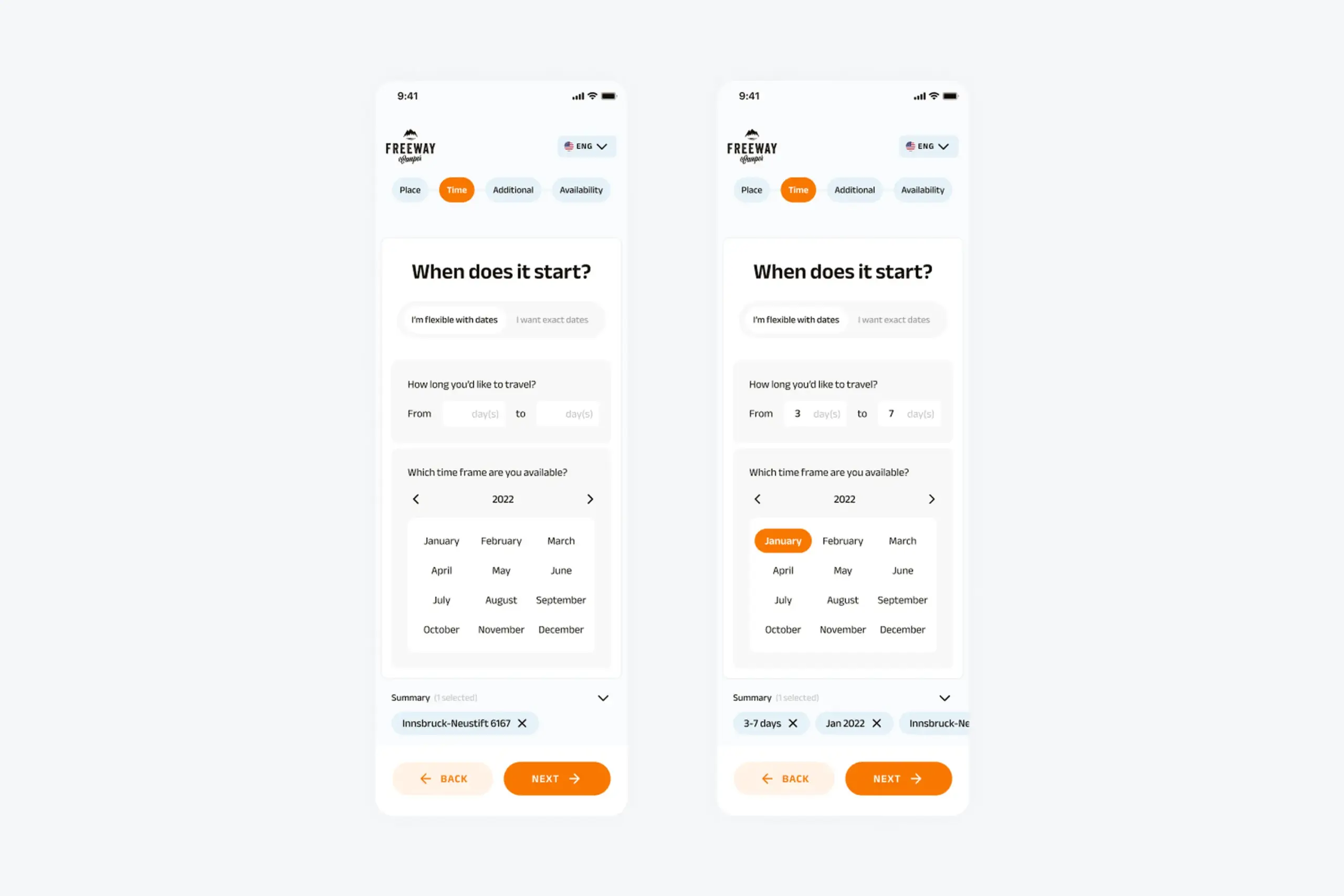
Flexible date selection lets users pick a general timeframe instead of exact dates
Flow 2: Exact dates
For users who know exactly when they’re traveling, maybe they’ve already booked time off work or coordinated with friends.
Standard calendar picker. Select start date, select end date, see campers available for exactly those days. Simpler results, already filtered.
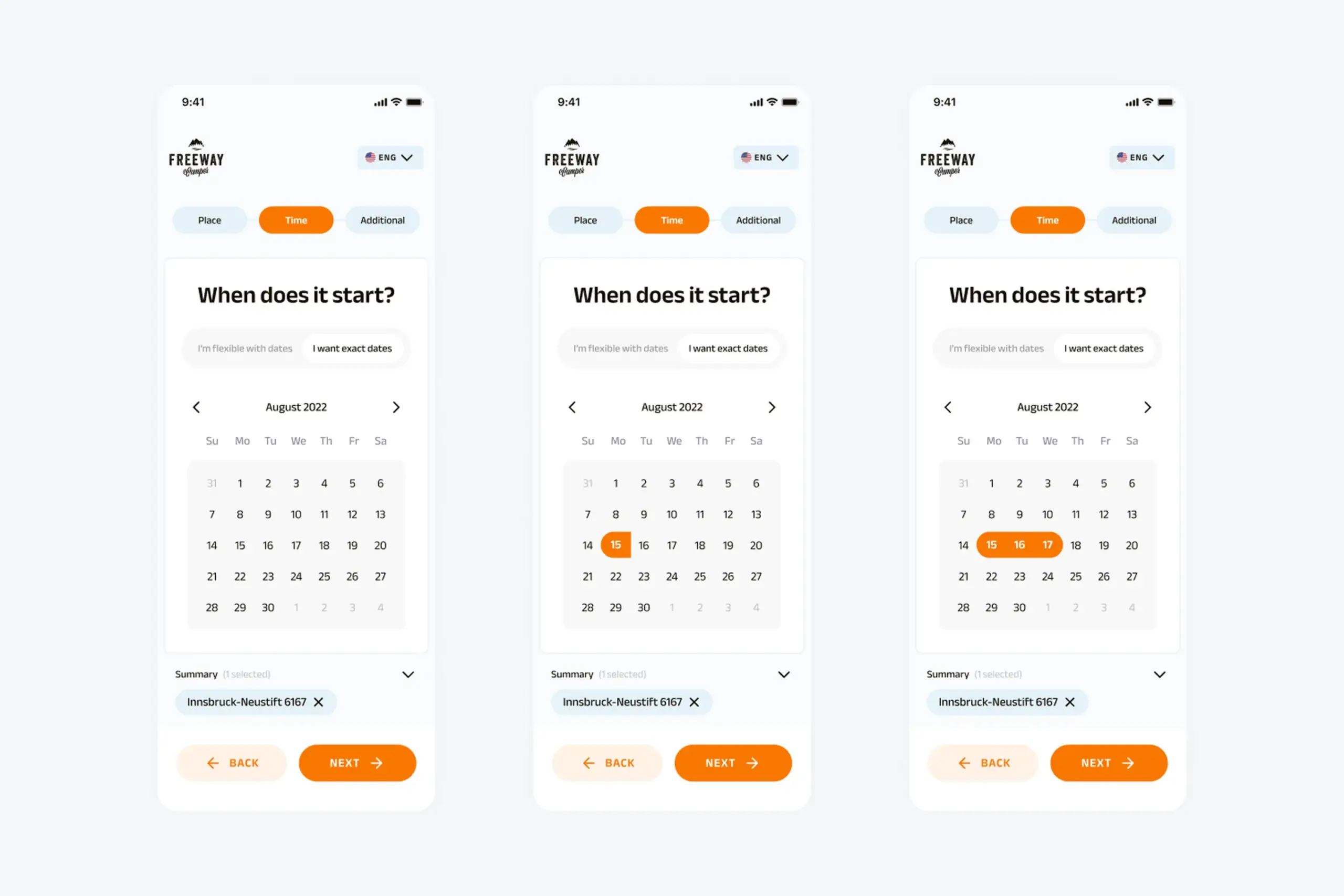
Exact date selection for users who have specific travel dates
Why two separate flows?
I considered alternatives:
- Single flow with optional flexibility toggle,but this complicated the interface and confused the mental model
- Always showing all dates, but overwhelming for users who just want specific dates
- Flexible search as fallback after “no results”, but users had already given up by then
Two distinct paths match two distinct mindsets. Users self-select into the appropriate flow.
The selection process
Both flows follow the same structure after date selection:
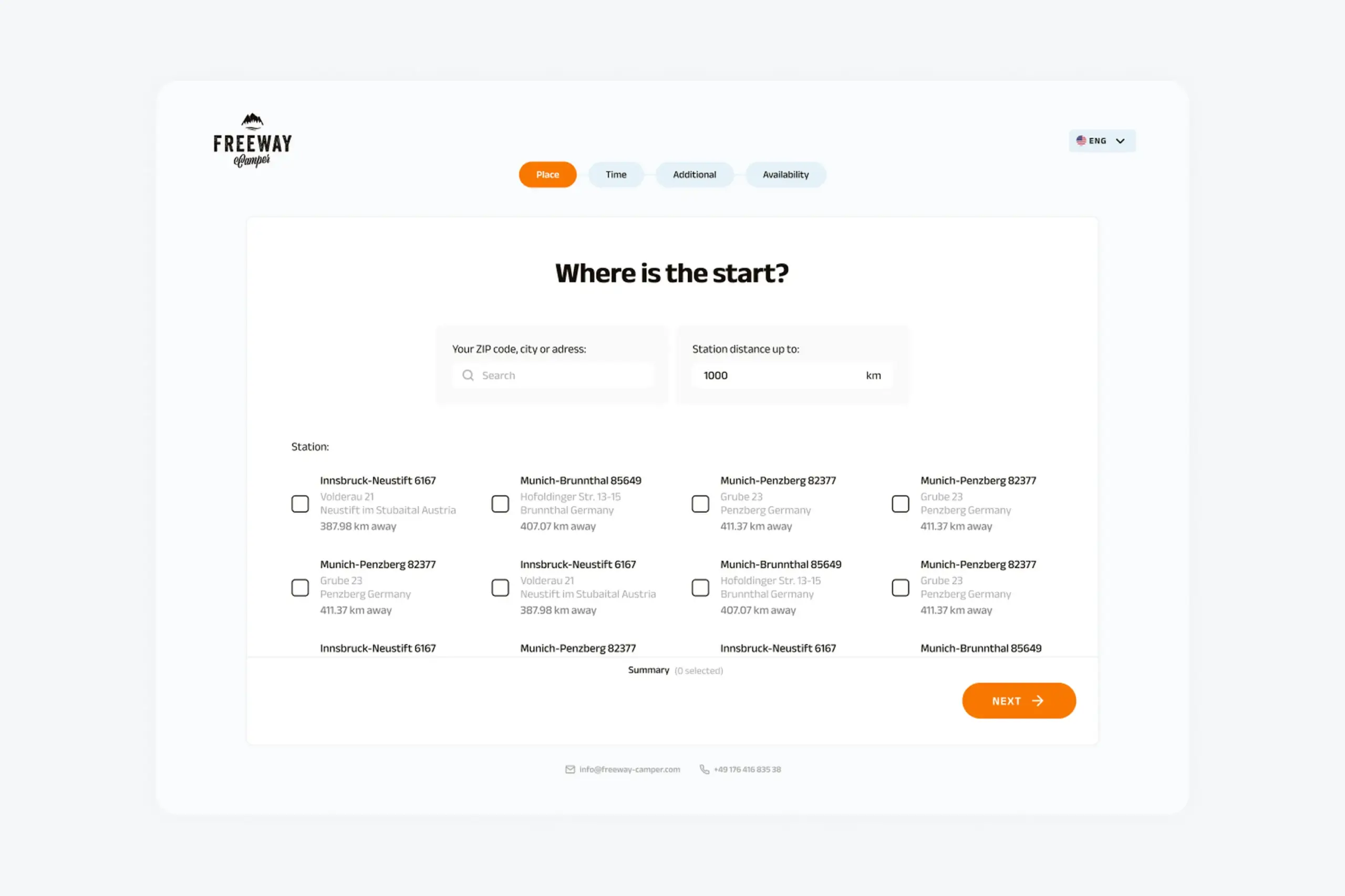
1. Pick-up location
Search for cities or browse popular locations. The app shows available pickup points with addresses. Users can filter by distance.
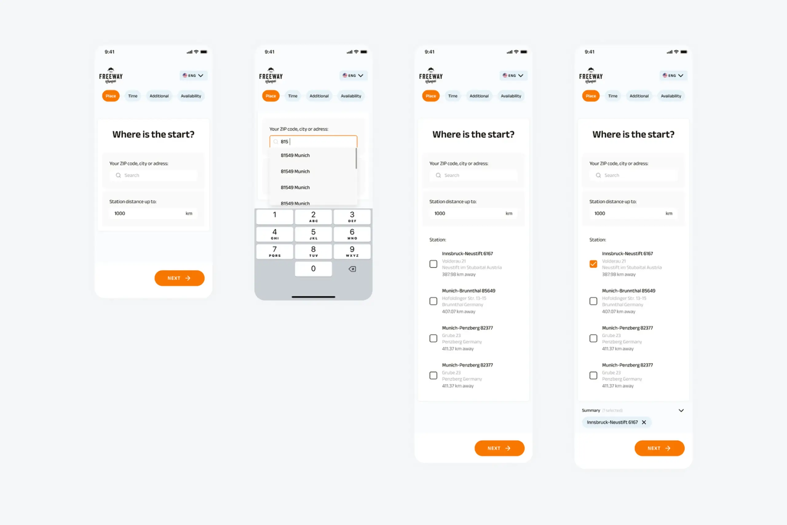
Location picker showing search and popular pickup points
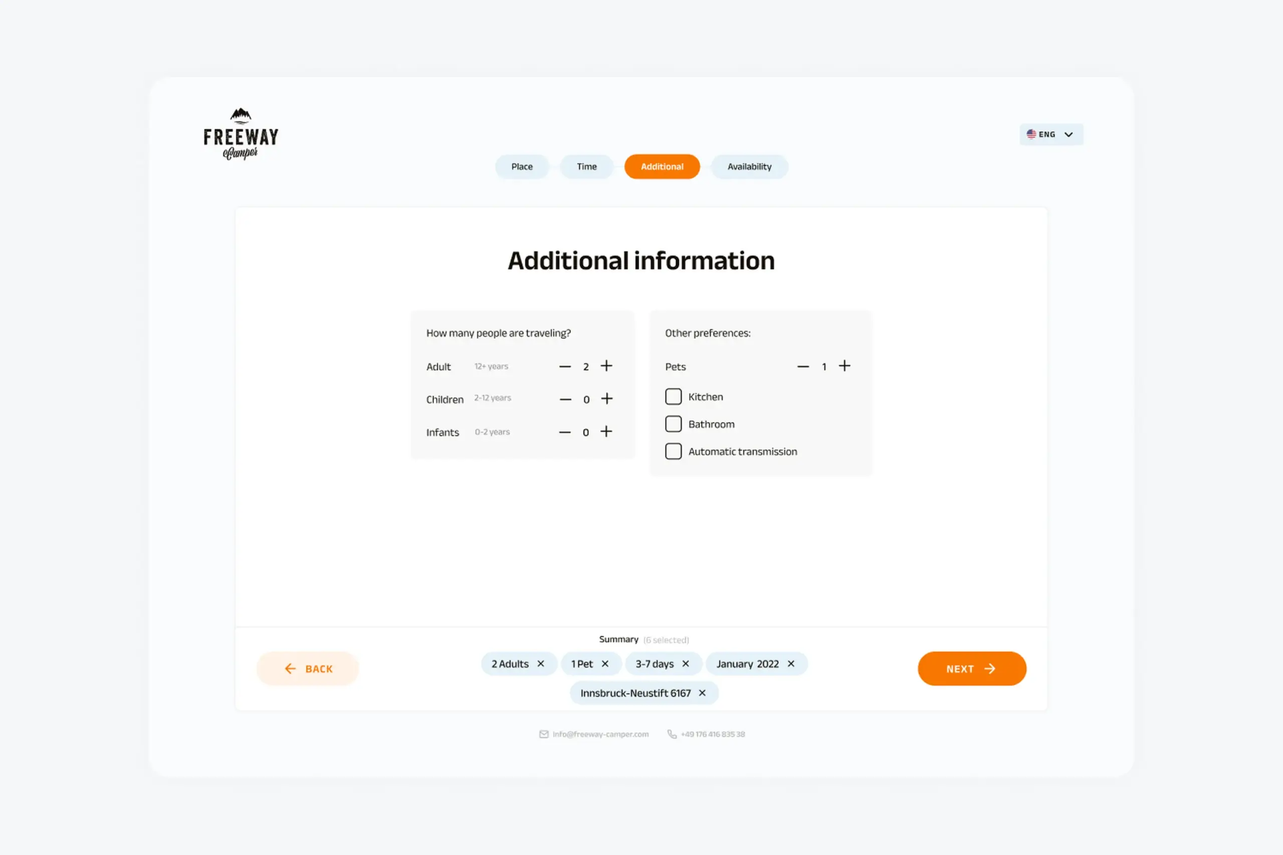
2. Additional information
Number of travelers (adults, children, infants). Preferences like pets, kitchen, bathroom, automatic transmission. This step is identical for both flows.
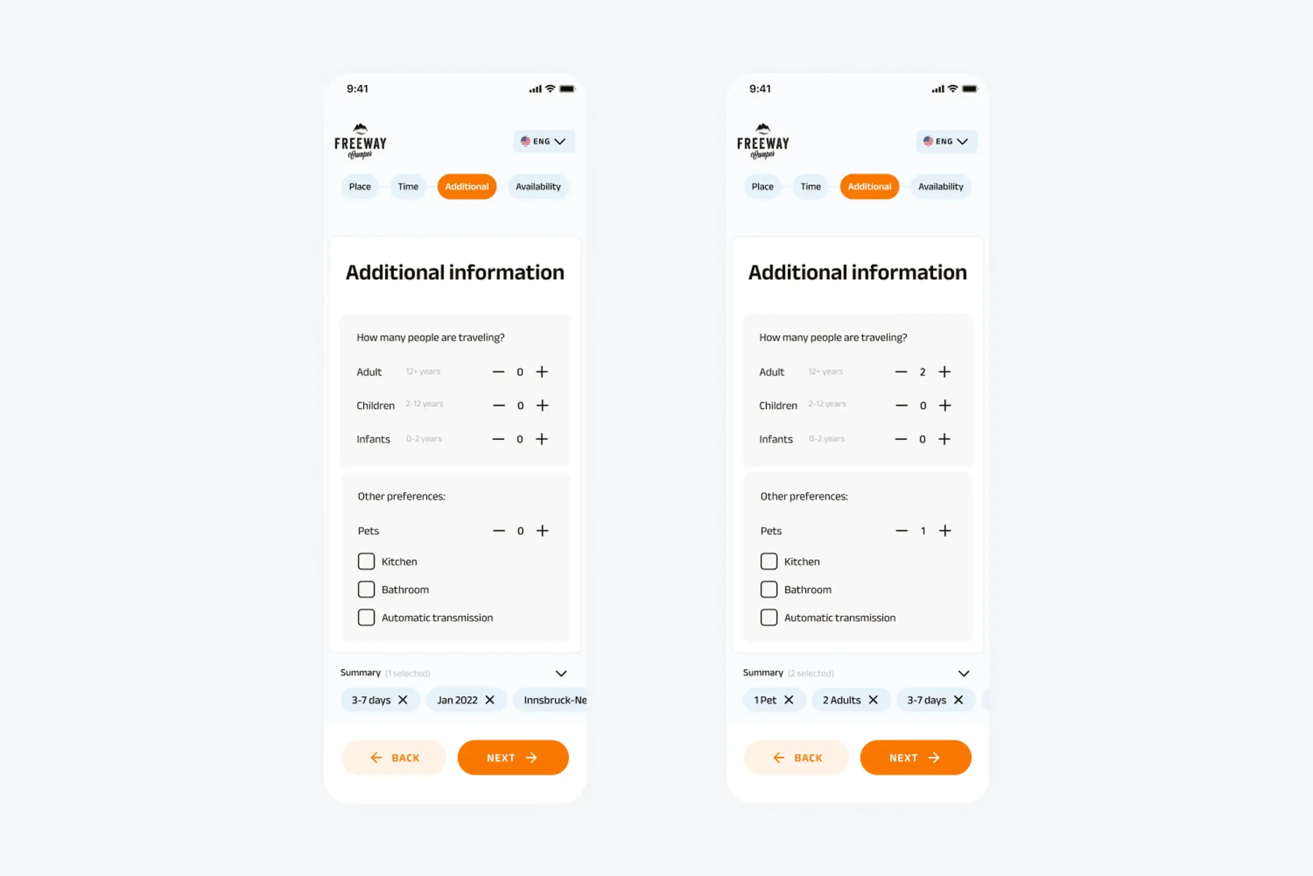
Users specify group size and camper preferences
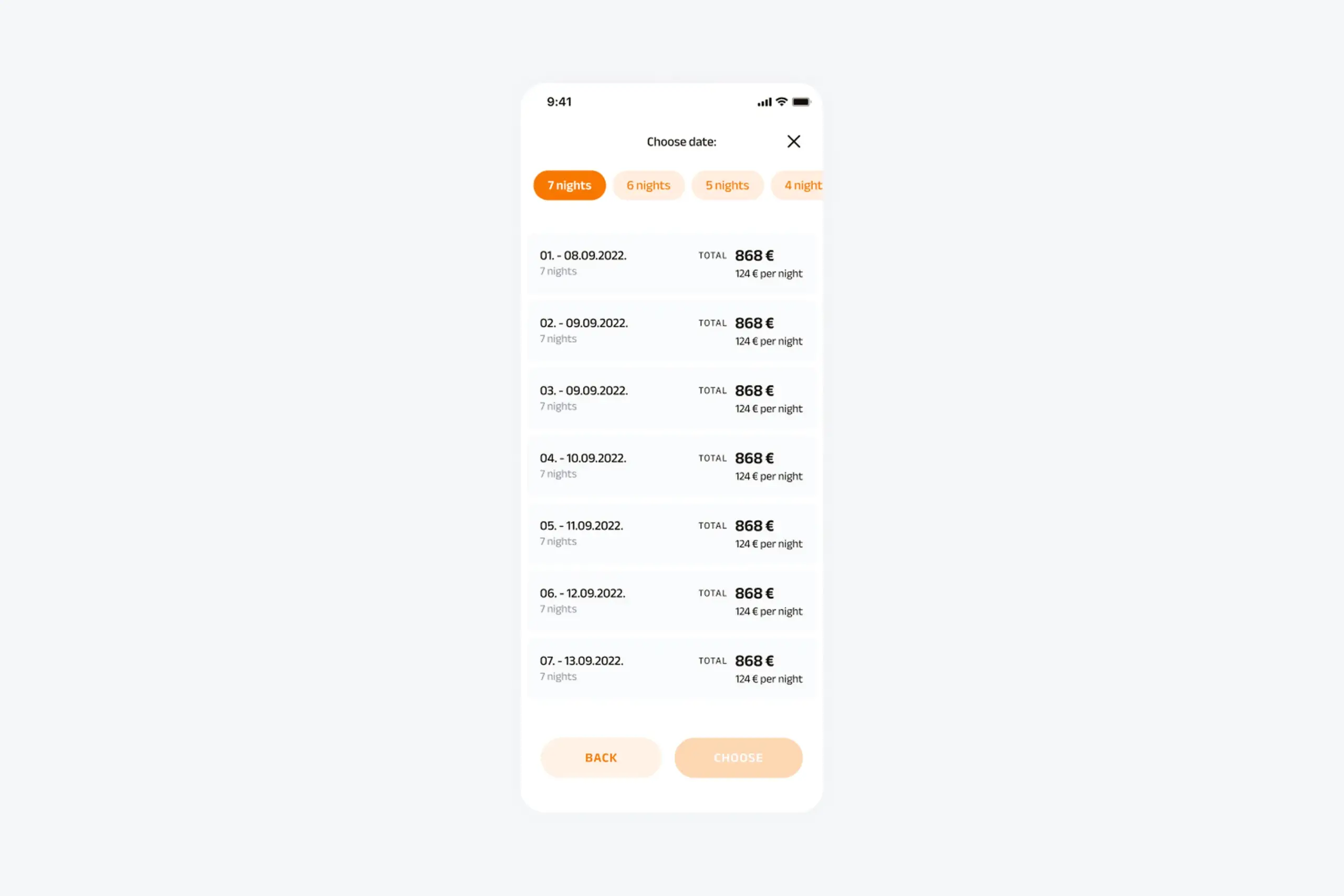
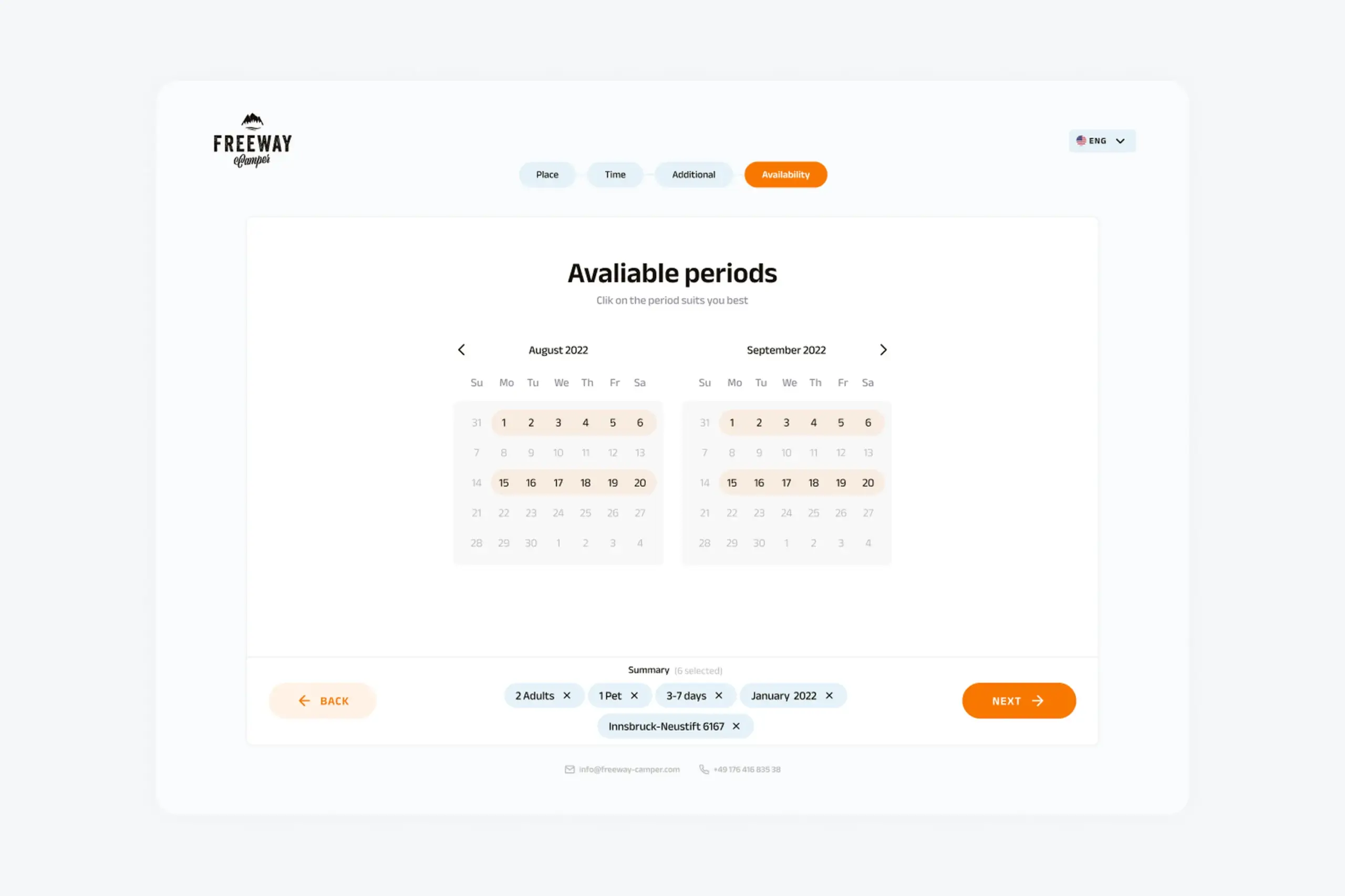
3. Available periods (Flexible flow only)
If users chose flexible dates, they now see which date ranges are actually available. Calendar shows all available periods highlighted. They can pick the period that works best for them.
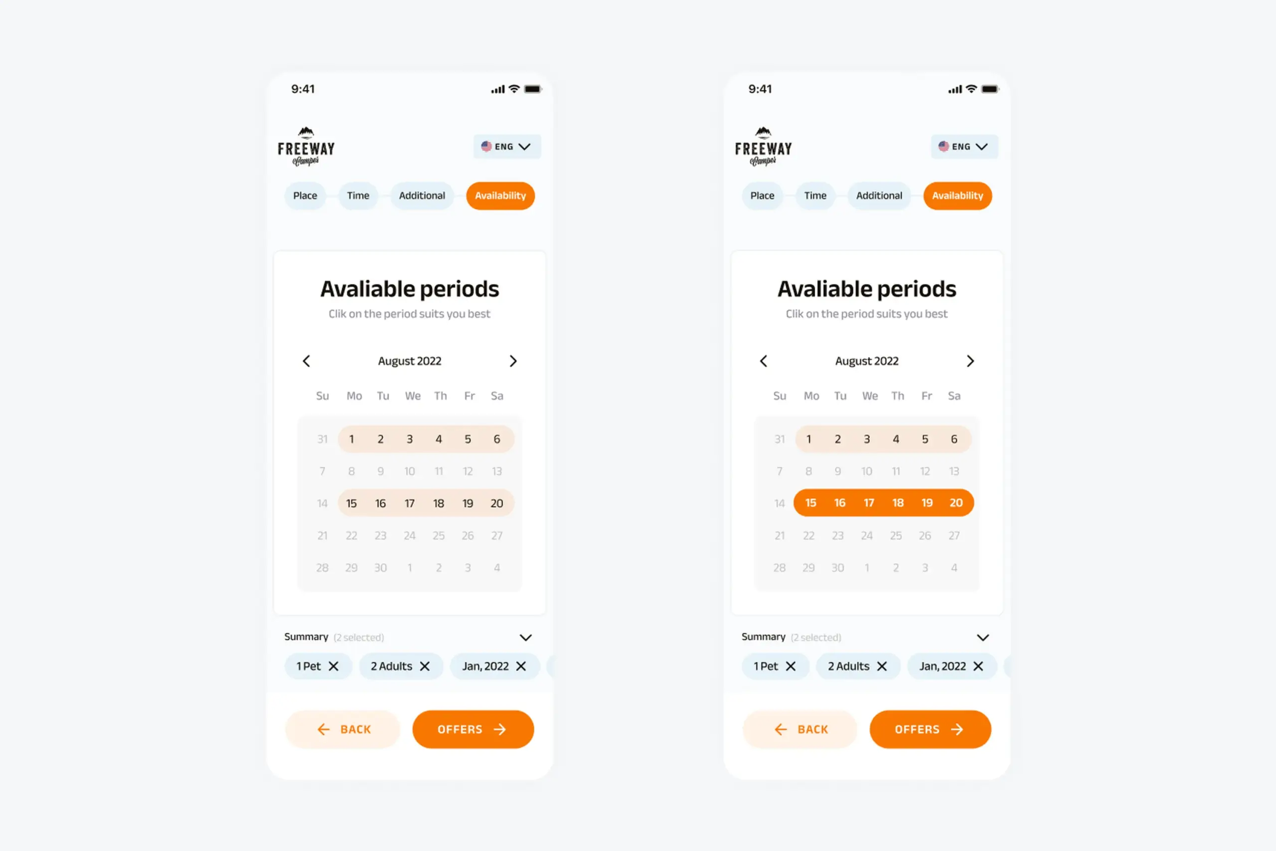
Available periods screen shows all date options for the selected timeframe
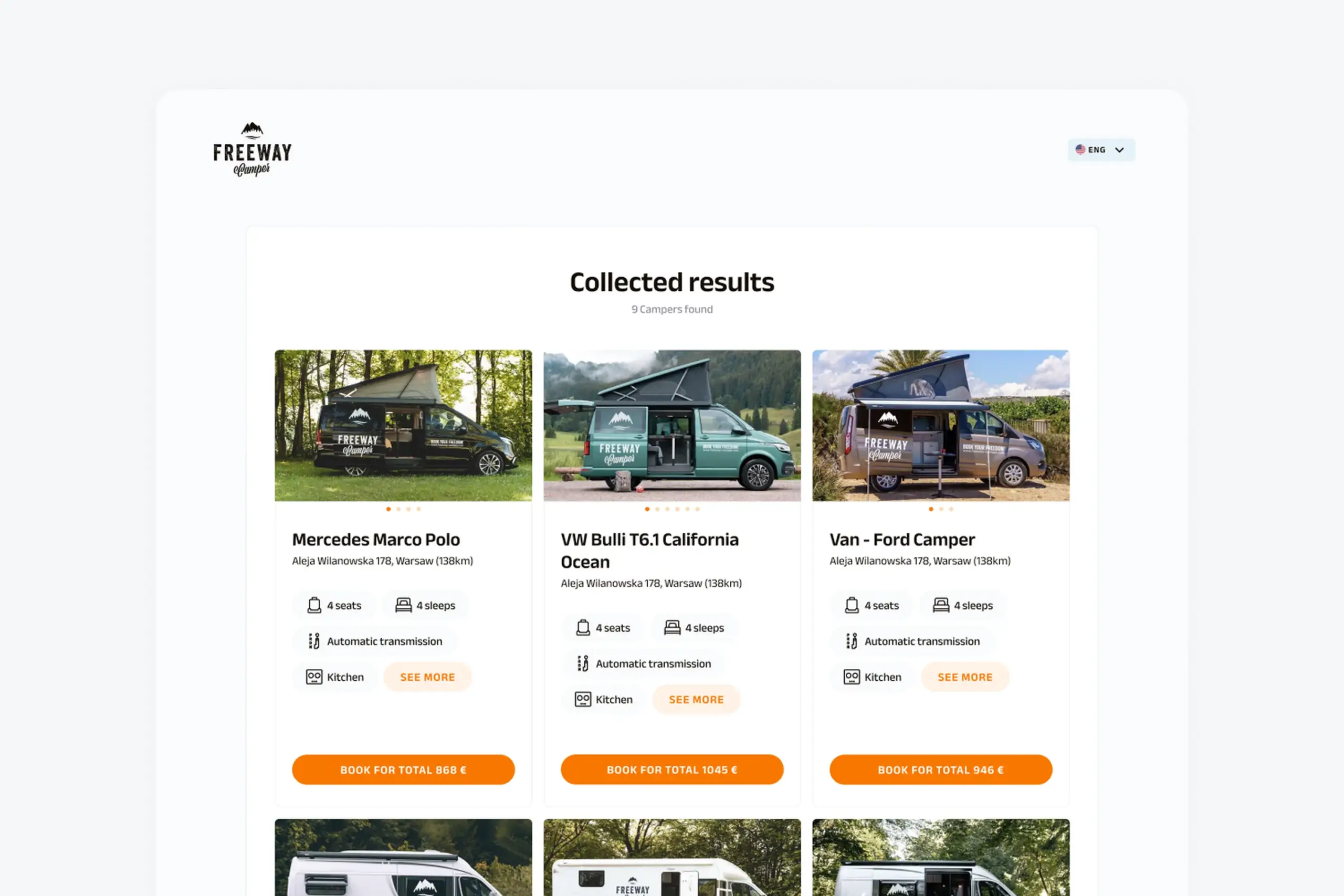
4. Collected results
Flexible dates → Campers with offered dates – Users see a list of campers, and each camper shows multiple available date ranges. Tap a camper to see the detailed list of when it’s available and at what price.
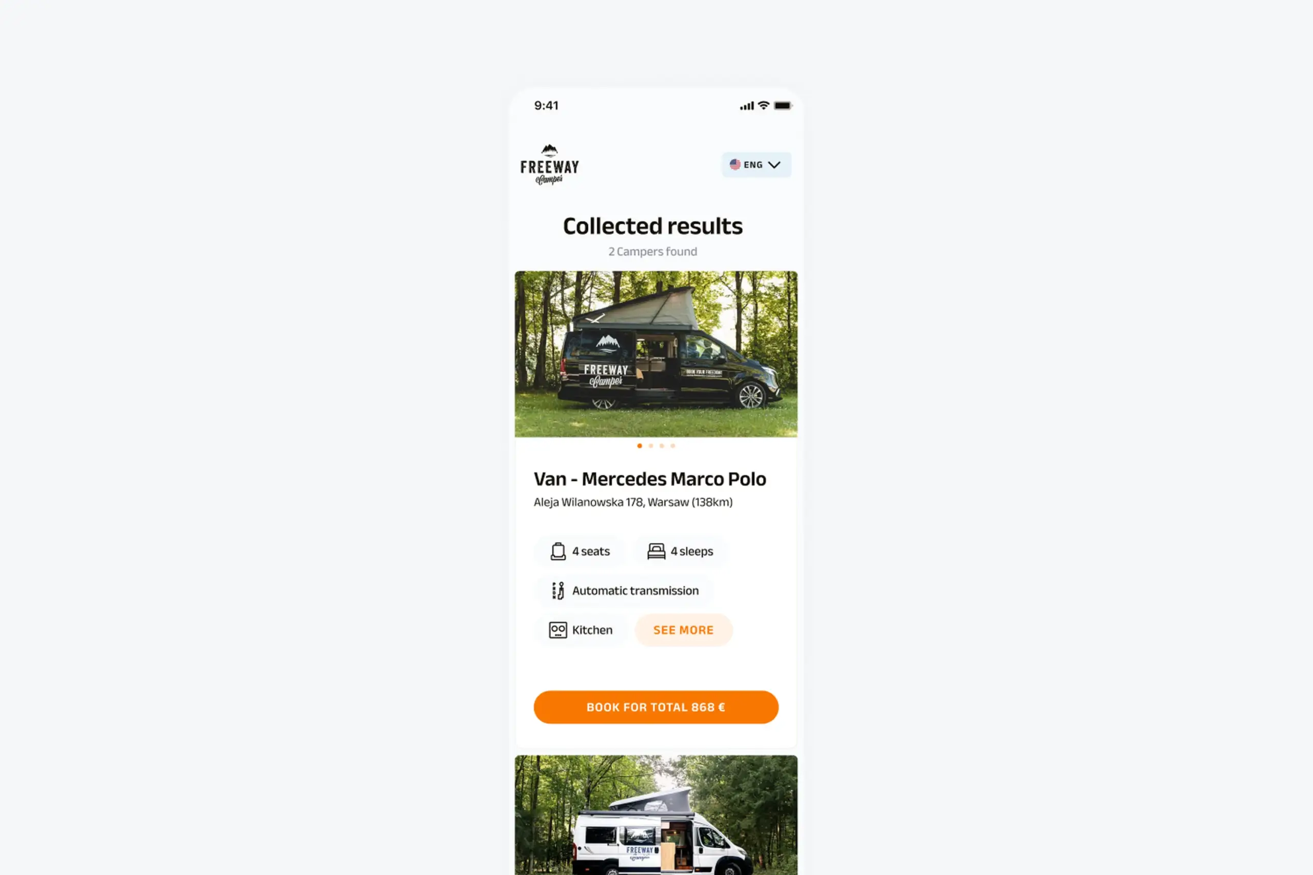
Results showing campers with all their available date ranges and pricing
Exact dates → Campers available for those dates – Users see campers that match their specific dates. Simpler results, already filtered.
Tapping a camper reveals all available dates with pricing for each period
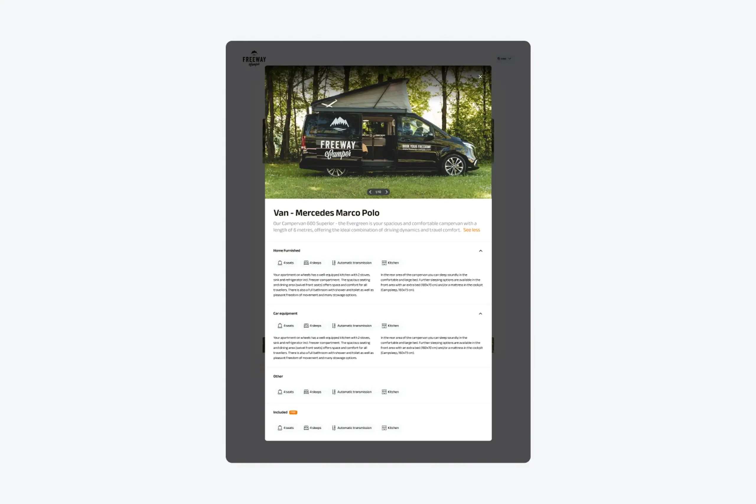
Camper Details – Tapping any camper opens full details: photo gallery, vehicle specs (sleeps, seats, transmission, length), amenities (kitchen, bathroom, etc.), full description, included features and pricing.
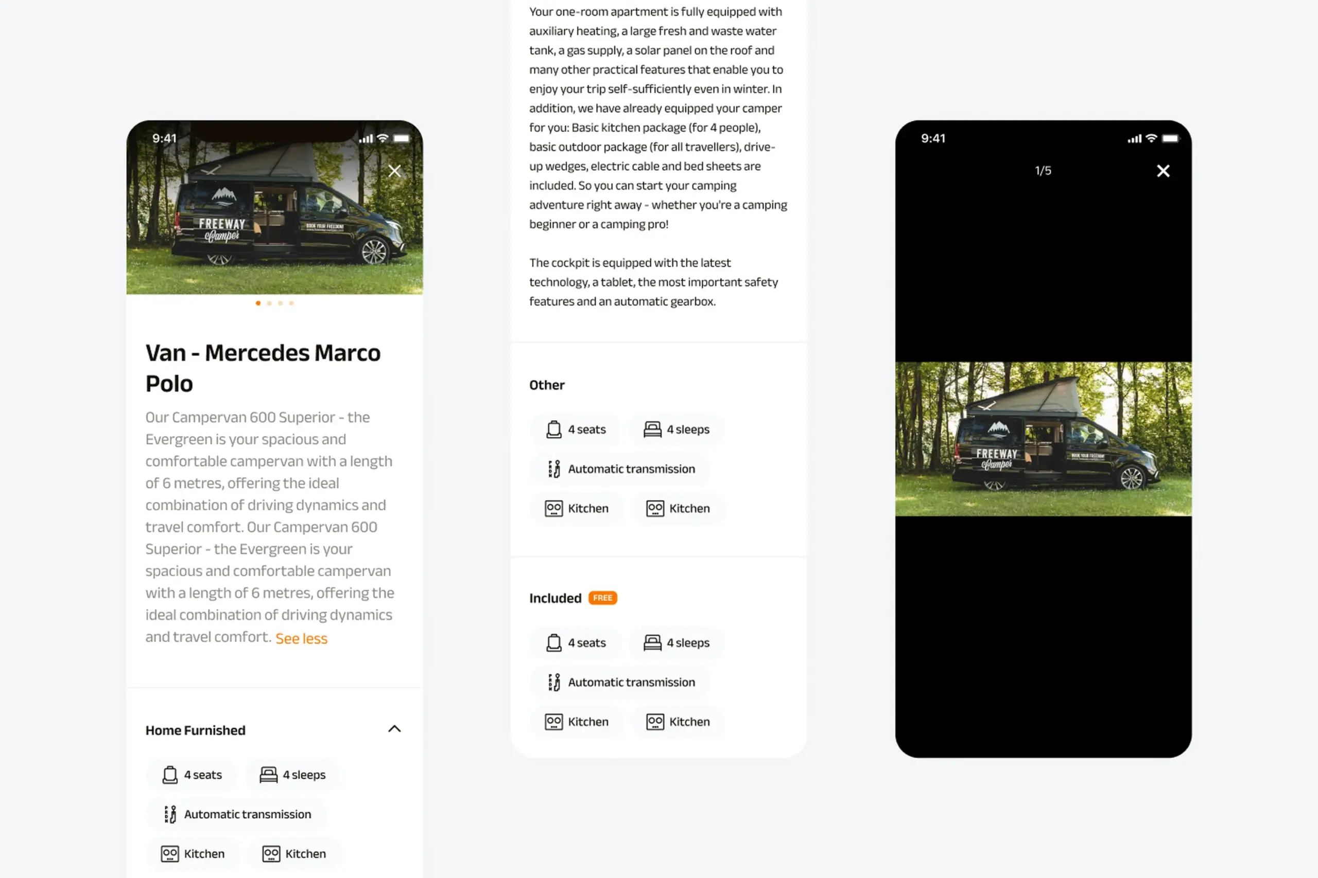
Detailed camper page with photos, specifications, amenities, and booking options
Desktop version
Everything designed for mobile needed to work on desktop too. The flows are identical, but the layouts take advantage of larger screens.
Location selection spreads horizontally with the map and list side by side.
Desktop layout showing location search with expanded view
Date selection shows a two-month calendar view for easier range picking.
Desktop calendar view allowing easier date range selection
Additional information fits on one screen without scrolling.
Desktop layout for group size and preferences
Available periods displays the calendar with clear highlighting of available ranges.
Desktop view of available booking periods with calendar highlighting
Results show multiple campers in a grid with more information visible at once.
Desktop results showing multiple campers with available dates and pricing in grid layout
Full camper details on desktop with expanded photo gallery and information
Design system
Built a complete design system to ensure consistency across mobile and desktop:
Foundation:
- Colors (brand orange, neutrals, status colors)
- Typography scale
- Icon set
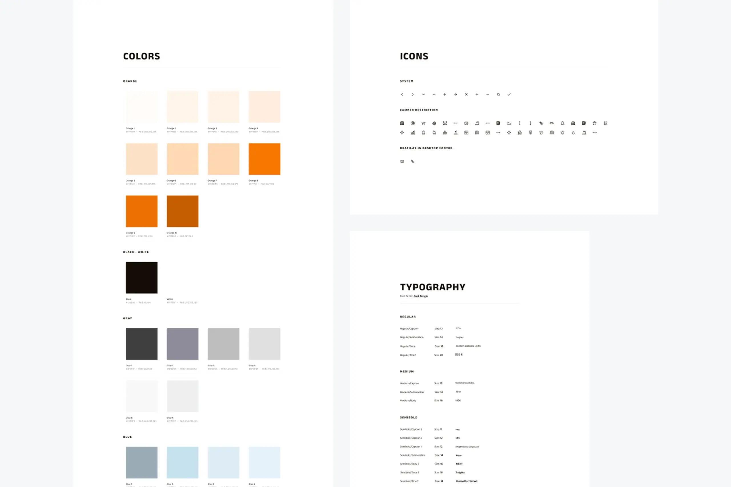
Design system foundation showing color palette, icons, and typography
Components:
- Input fields (text, dropdowns, number steppers)
- Buttons (primary, secondary, text)
- Cards (result cards, option cards)
- Headers and navigation
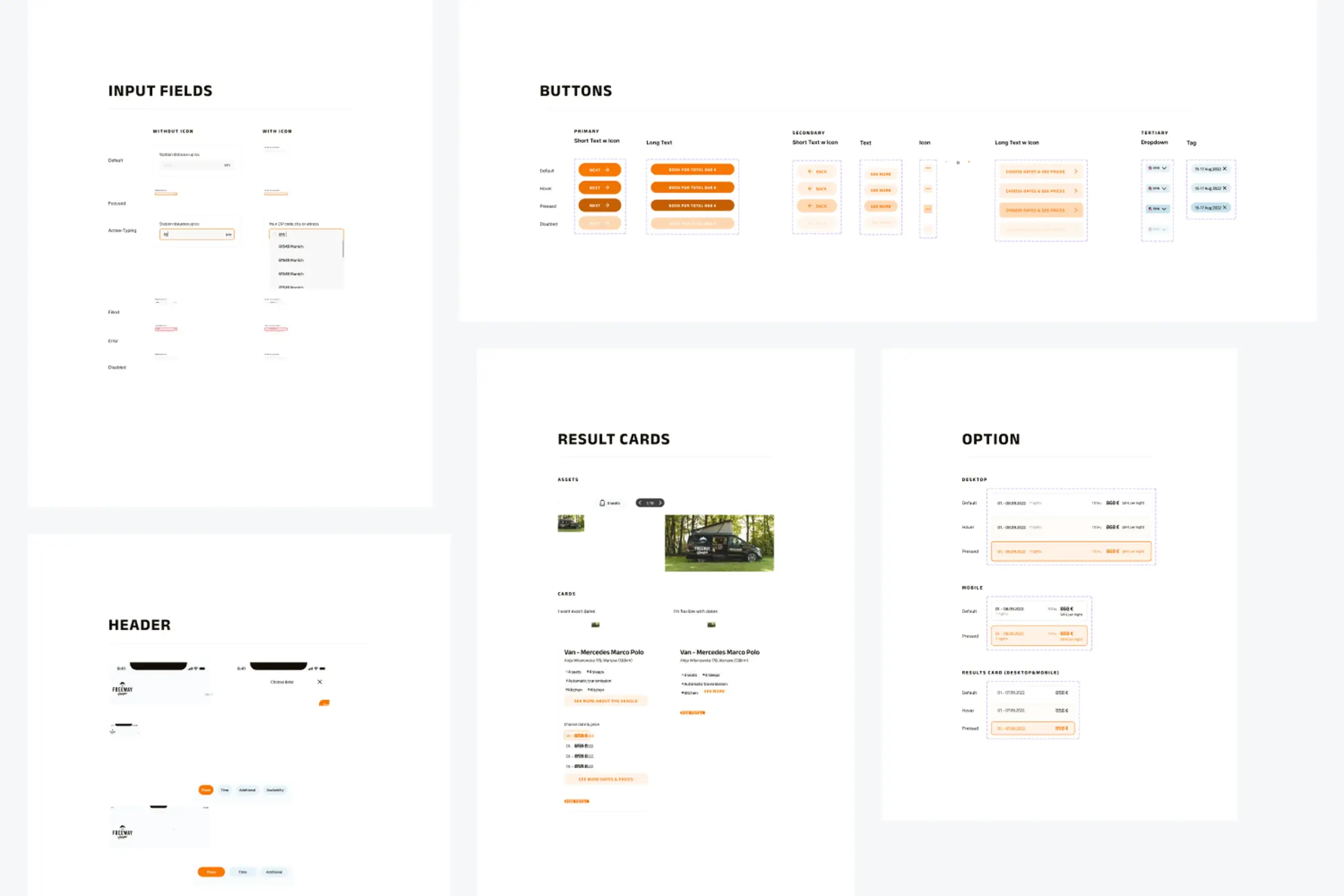
Reusable components for inputs, buttons, and content cards
Patterns:
- Progress bar for multi-step flow
- Tabs for switching views
- Checkboxes for preferences
- Calendar components for date selection
- Footer with navigation and legal links
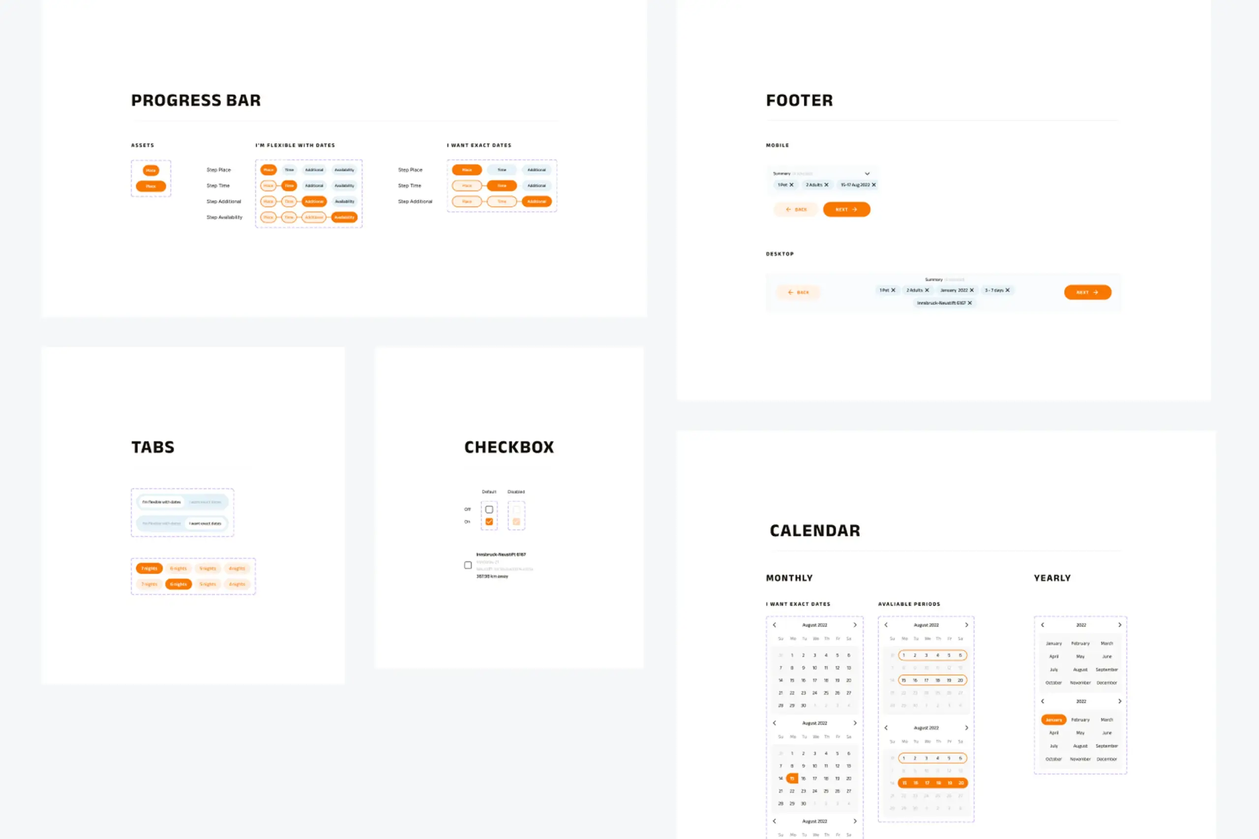
UI patterns for progress indication, navigation tabs, calendars, and footer
The process
Mobile-first: Started with mobile because that’s how most people browse when planning trips. Desktop came after mobile was solid.
Close collaboration with developer: Worked in coordination with the developer throughout. Design decisions were informed by what was technically feasible, and we iterated together on interactions.
Flow-first thinking: Before designing any screens, I mapped out the complete user flows for both flexible and exact date paths. This caught edge cases early – like what happens when a flexible search returns campers with non-overlapping availability.
Iterative refinement: The summary bar at the bottom (showing selected filters) went through several iterations. Started as a simple text summary, evolved into dismissible chips that let users modify their search without starting over.
Artifacts I created
- User interview notes and synthesis
- User flow diagrams for both booking paths
- Mobile wireframes and high-fidelity designs
- Desktop responsive layouts
- Complete design system documentation
- Component specifications
- Developer handoff documentation
The impact
For users: Actually get results instead of “no results” screens. Can search with flexible dates when they don’t have exact plans. See all available campers with their offered dates. Make informed decisions with full camper details and pricing.
For the business: Fewer abandoned searches. More bookings from flexible travelers. Mobile-first experience for on-the-go planning. Scalable design system for future development.
What I learned
About users & product:
- People plan trips with flexible dates. The original app demanded exact dates, but campers would happily shift by a few days for the right vehicle. The app was hiding inventory from willing customers.
- Two booking flows for two mindsets. “I’m flexible, show me options” and “I know exactly when I’m going” are different mental modes requiring different interfaces.
- Summary bars reduce cognitive load. Showing selected filters persistently let users modify searches without starting over or remembering what they’d chosen.
About process:
- Validate the two-flow approach with users. I based the flexible/exact split on interviews but didn’t test the actual interface distinction. Would prototype and test the concept earlier.
- Define conversion metrics upfront. Without tracking search completion rates or flexible-vs-exact usage, measuring impact is impossible.
- Document edge cases systematically. What happens when flexible search returns only one camper? When all campers are booked for the flexible period? Discovered these scenarios late.
Details adjusted for confidentiality