AR Mobile App
See how wallpaper looks in your room before you buy it. A white-label AR app where the hardest part was making room scanning simple enough for anyone to follow.
See how wallpaper looks in your room before you buy it. A white-label AR app where the hardest part was making room scanning simple enough for anyone to follow.
People want to redecorate but they can't really picture how wallpaper or paint will look on their walls until it's up. They browse catalogs, guess, and often end up returning what they bought. I designed a white-label AR app that lets you see wall decorations on your own walls through your phone camera. The first partner was Farrow & Ball, one of the biggest paint companies in the UK.
The initial idea was to build this as an SDK that other apps could integrate. Developers built it without design input. It worked technically but was completely unusable. After user research, we realised this needed to be a standalone app, not an SDK, and it needed to be white-labeled so different paint and wallpaper companies could customise it with their branding and catalog.
Before: the original SDK prototype. Technically it worked, but unlabeled controls, no onboarding, and an abstract "scan your room" instruction left users stuck.
The first version was built by developers without design input. Technically it worked. In real hands it fell apart: buttons without labels, no onboarding, no idea where to start. Integrating that into another app would have made the host app worse, not better.
For AR to work, the app needs to understand the room's dimensions: where the floor is, where the walls are, how tall they are. Early versions just said "scan your room." Users waved their phone around randomly or gave up. The instruction was abstract, the feedback was invisible.
The product needed to launch with Farrow & Ball, but also had to work as a white-label solution for other paint and wallpaper companies. Colors, typography, catalogs, and product data all had to be swappable without rebuilding the app.
Floor scanning was the hardest step. "Point at a wall" is obvious. "Scan your floor" is not.
We ran three official usability testing rounds plus many informal guerrilla tests. I also did a competitive analysis of AR apps in the home decoration space: how competitors handled room scanning, product browsing, and AR visualisation. The research showed that no one had solved onboarding well, which became our chance to differentiate.
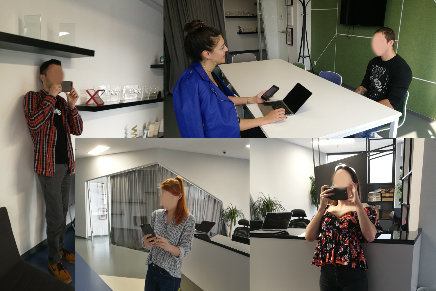
Participants testing AR room scanning across different room types, lighting conditions, and floor surfaces.
What we explored first
When we started, we had an AR SDK that was supposed to handle room measurement out of the box. Three rounds of testing told a different story. Inconsistent lighting broke it. Reflective floors confused it. Patterned carpets threw it off completely. Our first instinct was to try fixing the SDK itself, and we spent about two weeks exploring different calibration tweaks. None of them stuck. The technology simply wasn't reliable enough for real people in real living rooms. That realisation is what pushed us toward a completely different approach: a manual guided flow where the user does the thinking the camera can't.
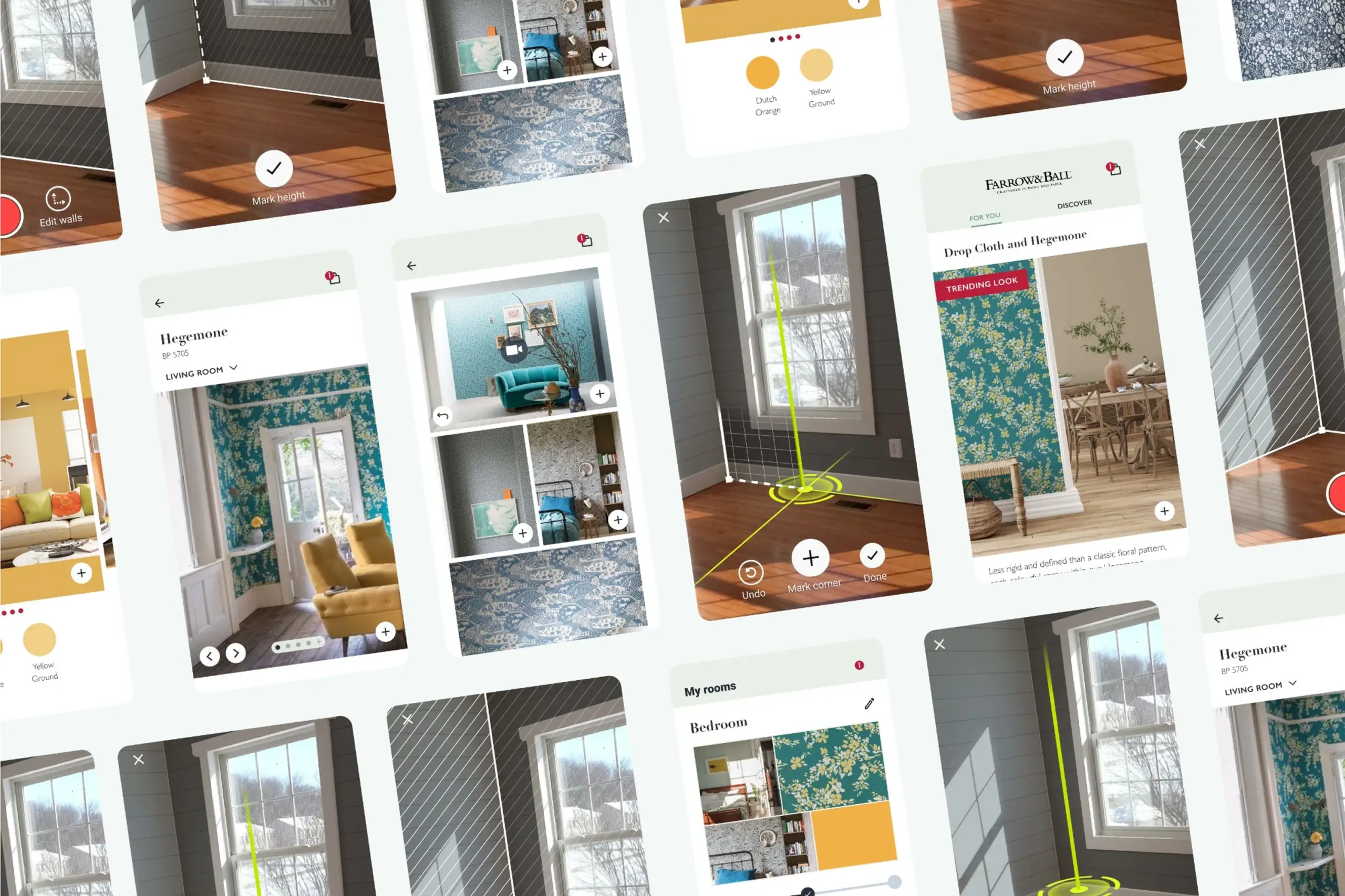
I broke the complex room-scanning process into three clear steps with feedback at every stage. Each step has its own visual language, its own success signal, and its own way of guiding users who have never done AR before.
A dark overlay dims the camera feed so the instruction area pulls attention. A short animation shows what "scanning the floor" actually looks like: slowly moving the phone while pointing at the ground. A Help button reveals a 3D animation if users get stuck.
"Scan your floor" means nothing on its own. Showing the motion makes it concrete, and the dark overlay keeps the instructions readable over any real-world background.
Users mark room corners so the app knows where the walls are. A green vertical guide helps align with the actual corner. Green because it is the colour least likely to blend with walls, floors, or furniture in real homes: red disappeared against brick and wood, blue blended into painted walls.
White icons with a faint black shadow stay readable on any background. Three expanding circles combined with a haptic pulse confirm that a corner was marked correctly, giving users the precise feedback they asked for in testing.
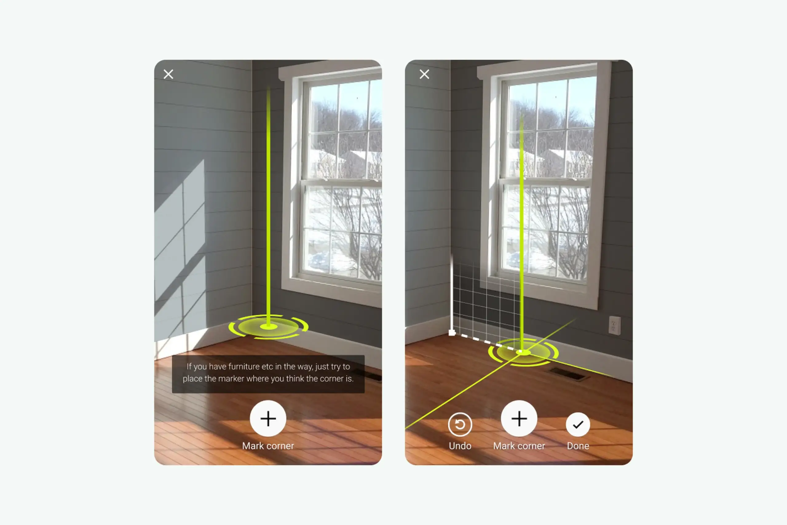
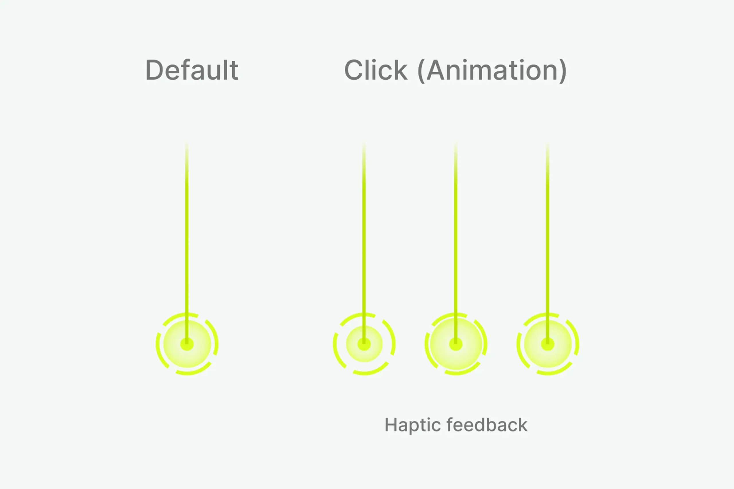
Default state, click animation, and haptic feedback for corner marking.
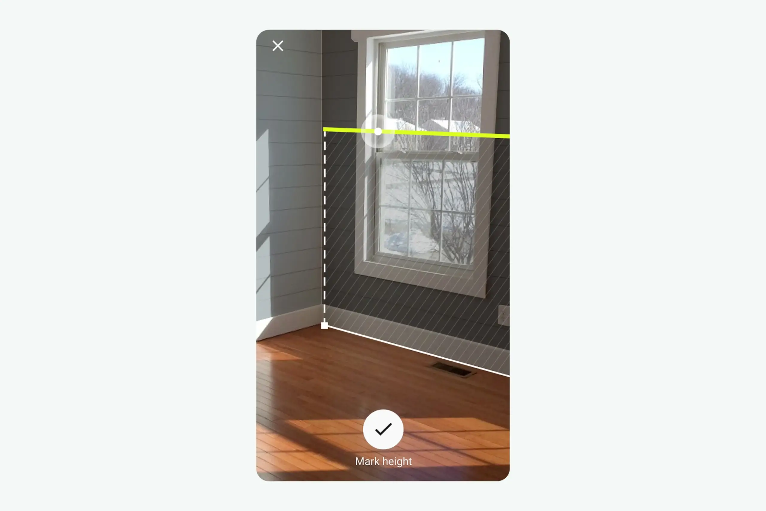
Two white circles slide along the green line as the camera moves. When the app detects the wall height, the larger circle animates and a haptic pulse fires. When the app is measuring something invisible to the user, the feedback cannot be invisible too. The pulse is the confirmation the screen cannot give.
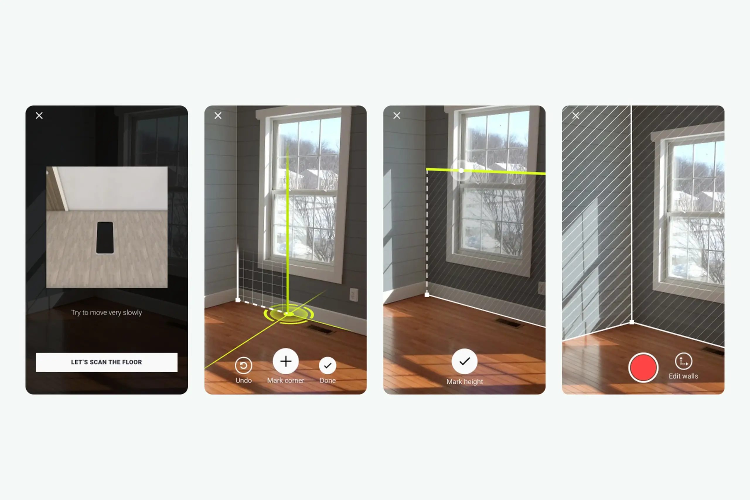
The full AR session: scan floor, mark corners, measure height, confirmation.
Three steps, each one designed around the exact moment testing showed users would get stuck:
Dark overlay, instruction animation, Help button. Users see what the motion should look like, not just read about it.
Green guide and marker, three-circle confirmation, haptic feedback. Users know exactly when a corner is placed correctly.
Sliding circles and a haptic pulse confirm an invisible detection. The phone responds so the room does not have to.
The scanning flow is the core, but the rest of the app had to support it. A curated inspiration feed gives users starting points (tap a room photo to see it in your own space via AR). A browse-and-customise view shows products with pricing and a path to purchase. A My Rooms view saves projects at three stages (create project, record room, choose products) so users can compare options without committing.
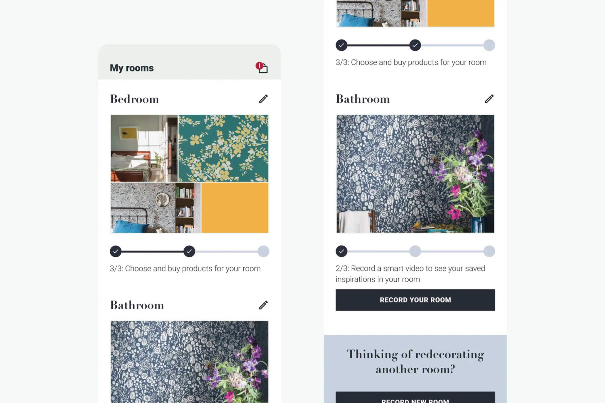
My Rooms: projects saved at three stages so users can compare decoration options.
After: the full app in action. Inspiration feed, three-step AR session (scan floor, mark corners, measure height), product browsing, and My Rooms projects all working together.
Key design trade-offs
We tested red, blue, and green marker overlays against photos of over 30 real living rooms. Red kept disappearing into brick walls and warm wood floors. Blue clashed with cool painted surfaces. Green turned out to be the colour that held up across the widest range of real home backgrounds, so that's what we went with.
The haptic feedback came from a similar place. When the phone detects a floor plane in AR, nothing visibly changes in the room. Without some kind of signal, people would just keep waving their phone around, unsure whether anything was happening. A subtle vibration at the right moment gave users that "got it" confirmation without cluttering the screen.
A major UK paint company shipped with the redesigned app. Validated that the white-label approach worked for a real, branded product launch.
The white-label architecture meant colors, type, and catalog data could be swapped per brand. Other paint and wallpaper companies could pick it up without rebuilding the app.
The hardest UX problem in the category was solved for non-technical users. Floor scanning stopped being the step where people gave up.
"Point at a wall" is obvious. "Scan your floor" is not. That one step needed the most design investment: animations, dark overlays, help buttons, progressive guidance.
I tested multiple marker colors. Red blended with brick and wood floors. Blue blended with painted walls. Green was the colour least likely to disappear against real home backgrounds.
When the app detects a wall height, nothing visible changes in the room. A haptic pulse plus a small animation told users "you did it" without cluttering the screen.
This started as an SDK. After research, we realized it needed to be a standalone app. That pivot was the thing that made the whole project work.
You cannot prototype AR without AR. Build analytics from day one so the next pivot is based on data, not guesses.
Complex technical actions only work for real users when the interface breaks them into moments the user can actually see, feel, and complete. The AR flow that users could not follow became three small, confirmed steps. The moment each step clicked, the whole category of "room scanning" stopped being scary.
The broader lesson: when the app is doing something invisible, the feedback cannot be invisible too. Haptics, animations, and progressive confirmation turned a black-box AR session into something users trusted enough to finish.
Curious about the details? Ask the AI assistant anything about this case study: the process, decisions, challenges, or outcomes.
Hi\! I can tell you all about this case study. Pick a question or type your own.
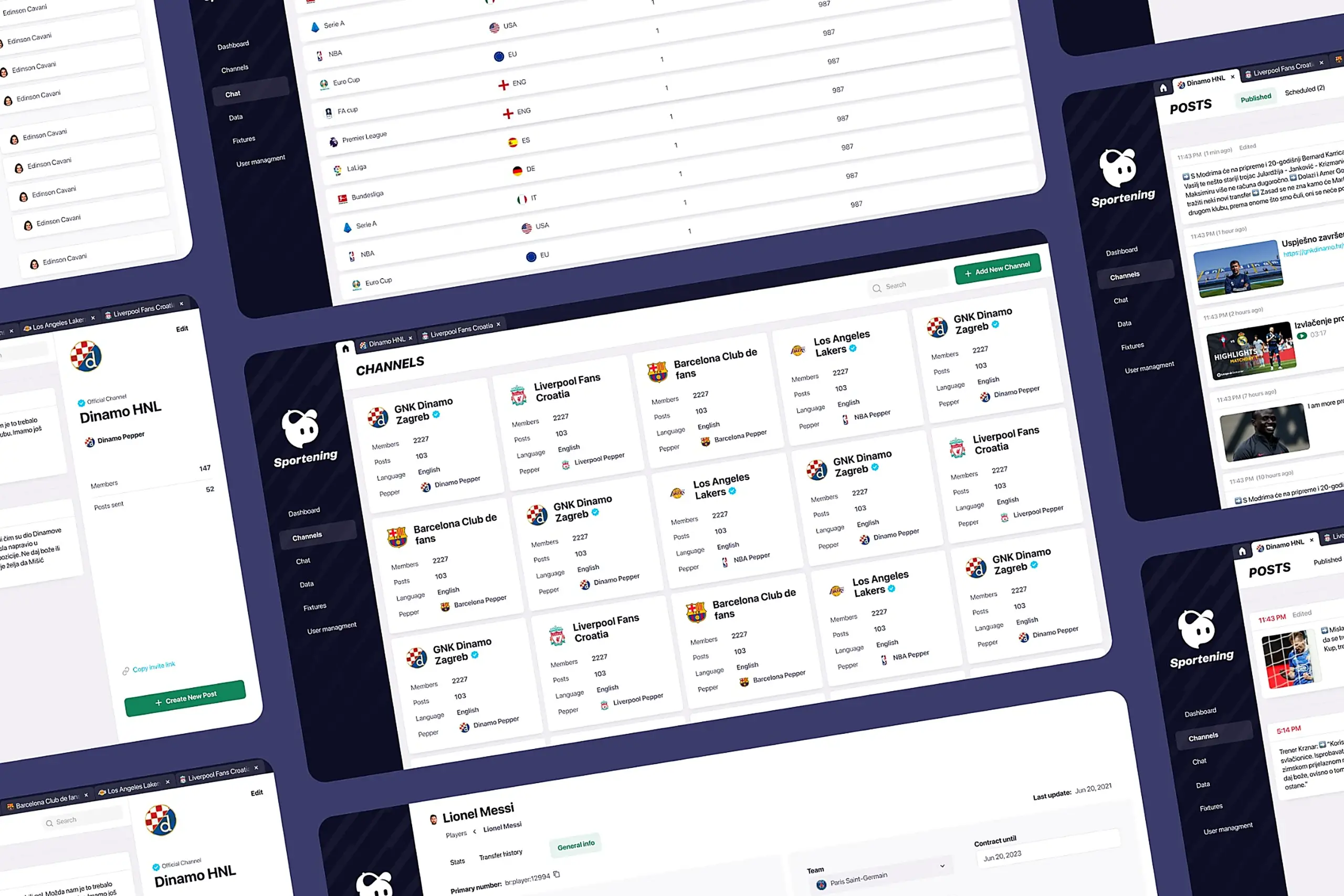
Redesigned a multi-channel CMS for a major sports app. Cut publishing time and eliminated content errors by restructuring around channel-based workflows.
View case study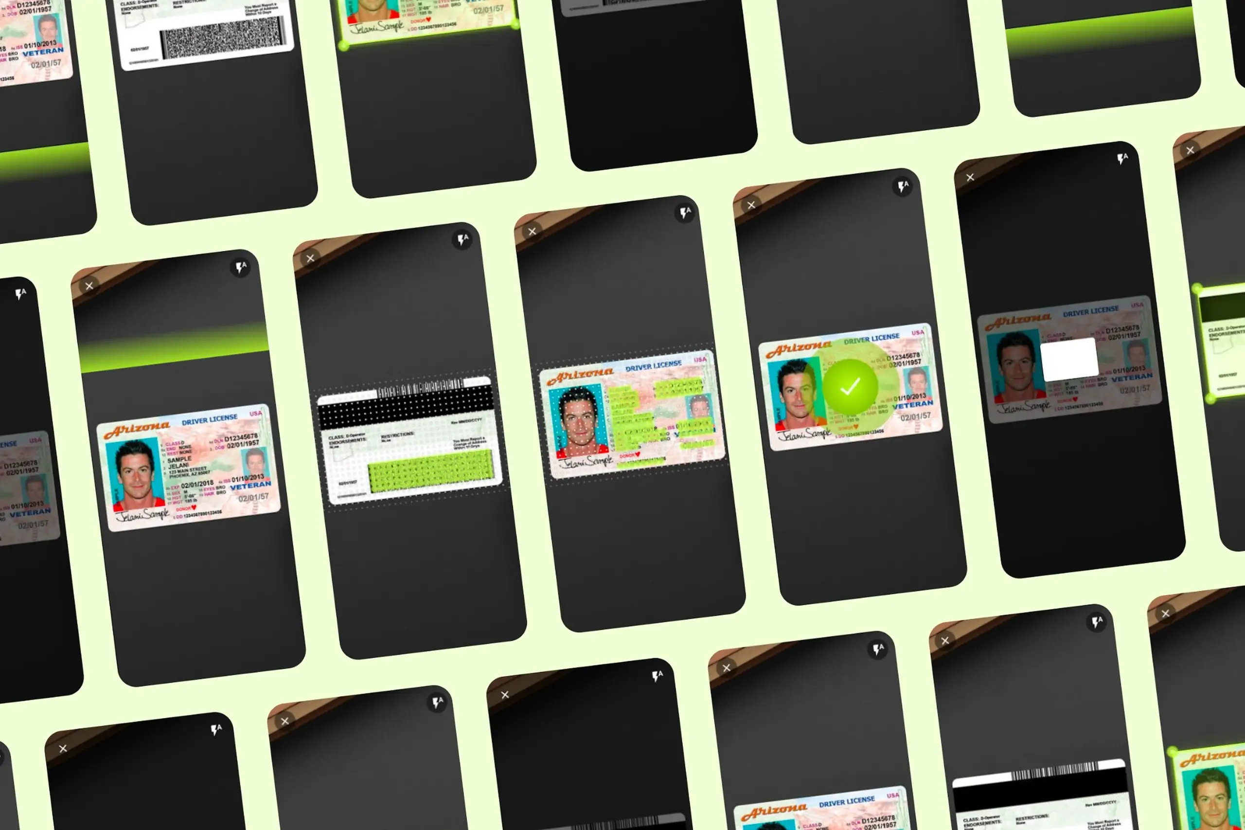
Took an SDK with a 70% failure rate and turned it around. Two rounds of usability testing, then a full flow redesign.
View case study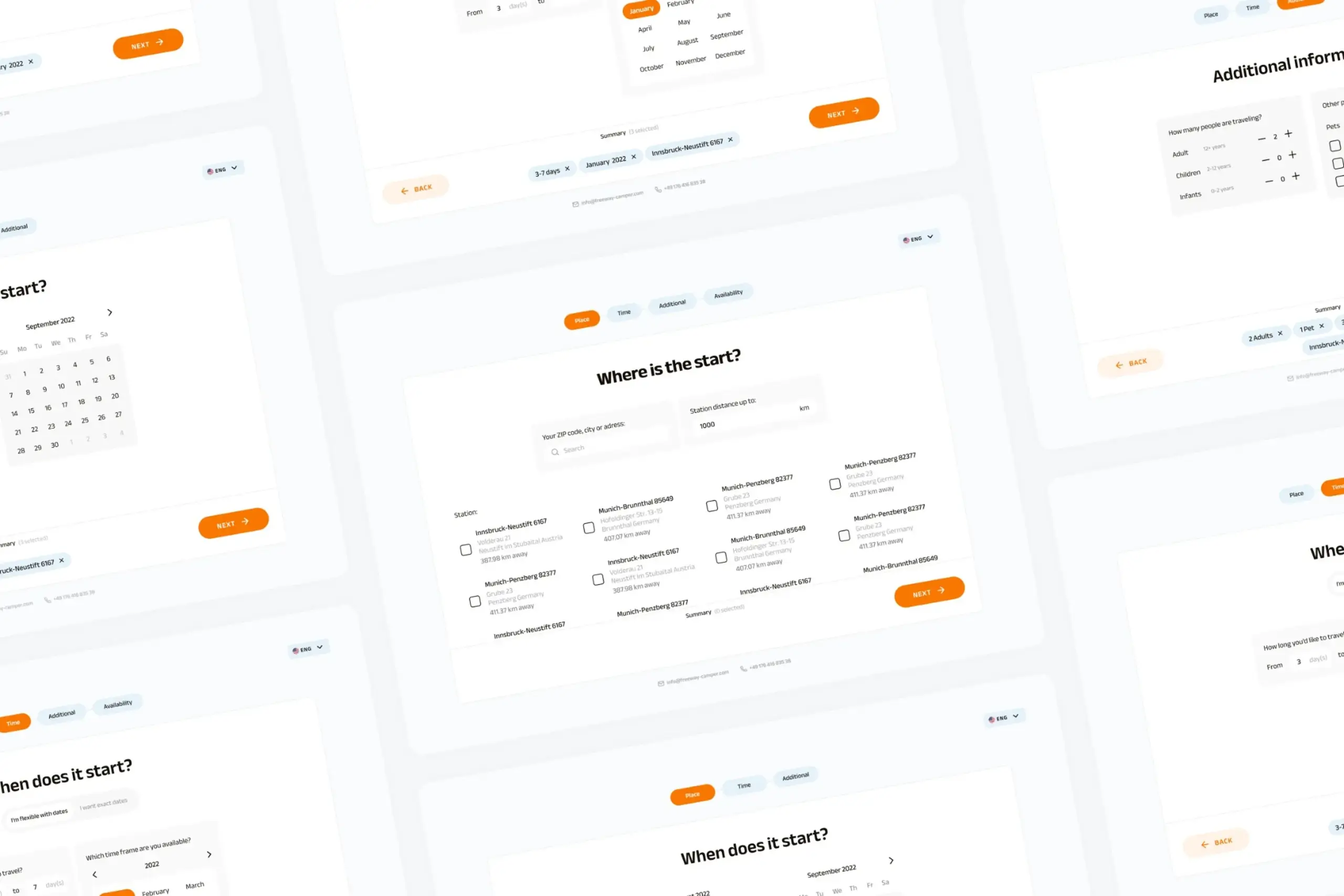
Users kept hitting "no results" because the app demanded exact dates. Redesigned the booking flow to match how people actually plan camping trips.
View case study