Responsive Reservation App
Users kept hitting "no results" because the app demanded exact dates. I redesigned the booking flow to match how people actually plan camping trips.
Users kept hitting "no results" because the app demanded exact dates. I redesigned the booking flow to match how people actually plan camping trips.
A campervan rental platform for road trips. The booking flow seemed fine on paper: pick dates, pick location, see campers. But users almost never got results. The app wanted exact dates, and people planning camping trips just don't work that way. They'd happily shift by a few days for the right camper, but the app never showed them that option. I redesigned the booking flow around how people actually plan.
The existing flow was simple: choose dates, choose location, choose travelers. But most of the time, users completed it and hit a wall. "No results." Users who would have been happy with nearby dates never saw those options, and the app silently lost them.
Before: the original booking flow. Exact dates were required, and a one-day gap meant a dead end.
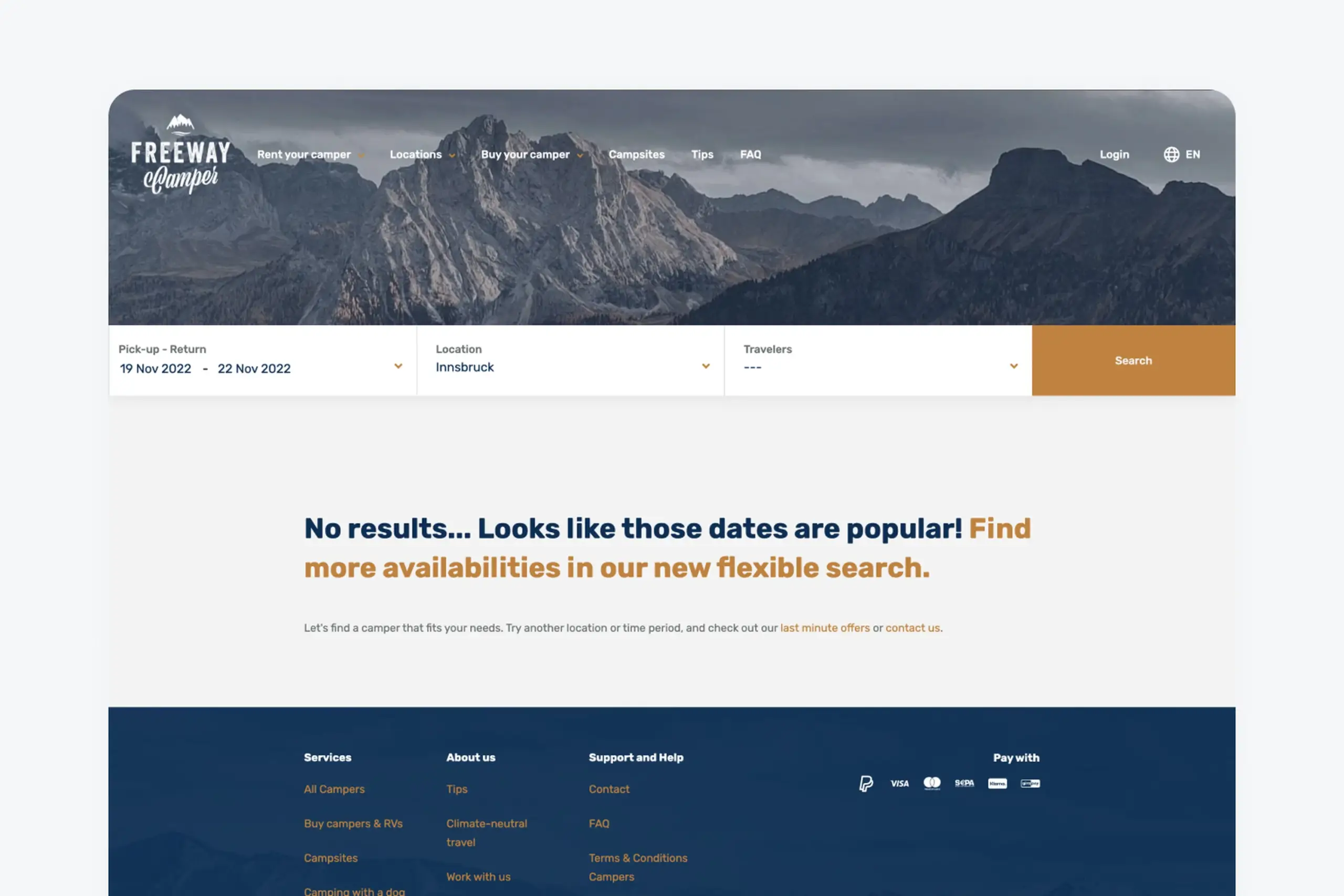
The silent "no results" screen. No nearby-date suggestions, no alternatives, no way forward even though inventory existed.
People planning camping trips usually do not have exact dates. They know roughly when they want to go: sometime in August, or a week in early summer. They would happily shift by a few days for a great camper. The app demanded a fixed start and end date or it would not search at all.
When there was no perfect match, the search returned nothing. No suggestions, no nearby dates, no alternative campers. Users who were one day off from an available booking saw an empty state and left, while the inventory was sitting right there.
Users who played around manually, trying different date combinations, would eventually find available campers. But that is work the app should do automatically. Most users will not do it. They will just leave and book somewhere else.
The app was hiding inventory from willing customers. The dates were not the problem. The flow was.
The constraint nobody mentioned
Before we even started designing, the technical team had already decided to build a responsive web app instead of going native. That one choice quietly shaped everything that came after. No push notifications for booking confirmations. No offline access to saved reservations. A tighter budget for transitions and animations. We didn't get a say in those trade-offs as designers, they were simply the ground rules. Going mobile-first wasn't some big philosophy statement, it was just the most practical path. If we could make the experience work well on a small screen, the desktop version would naturally benefit from that same simplicity.
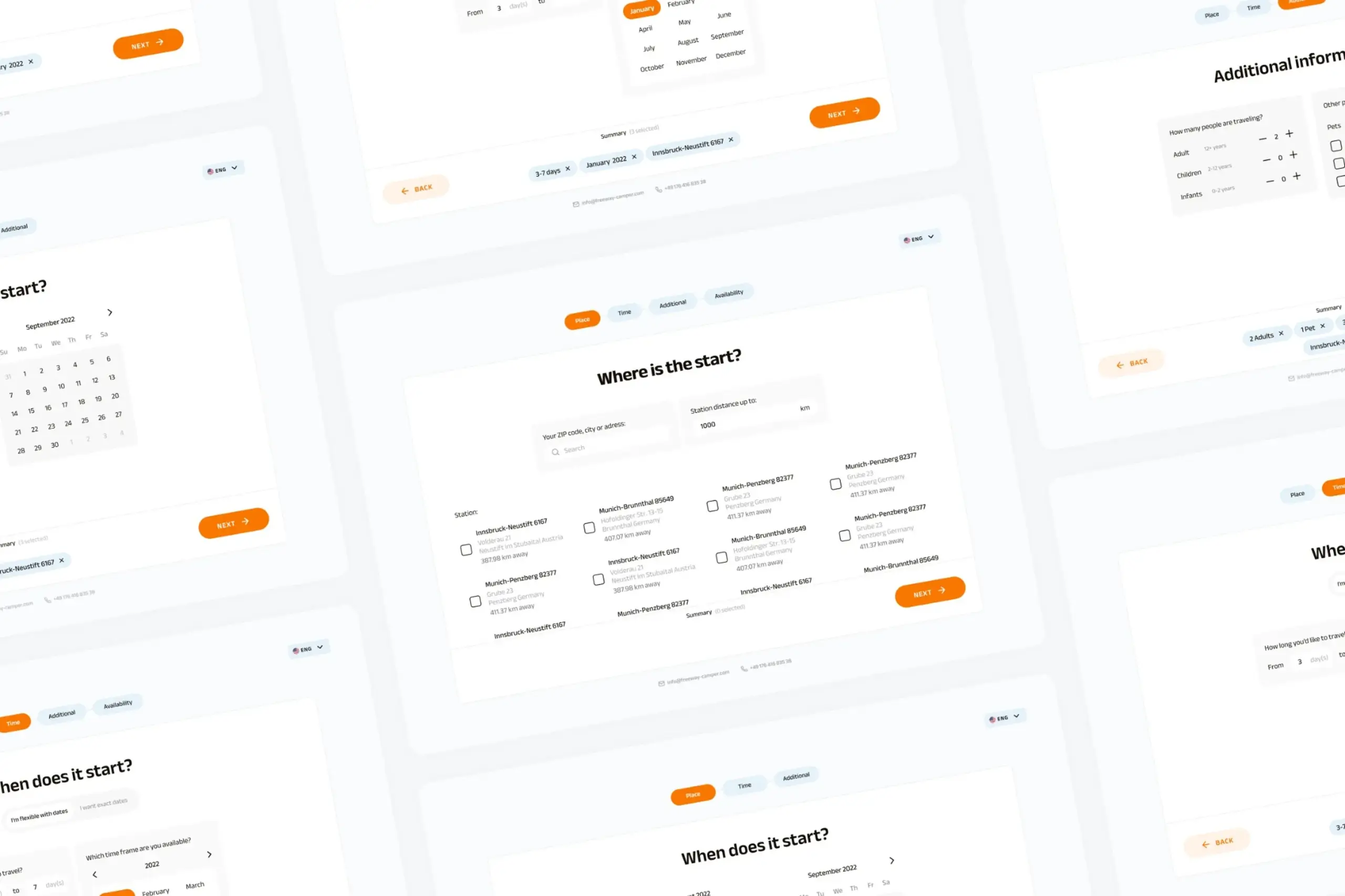
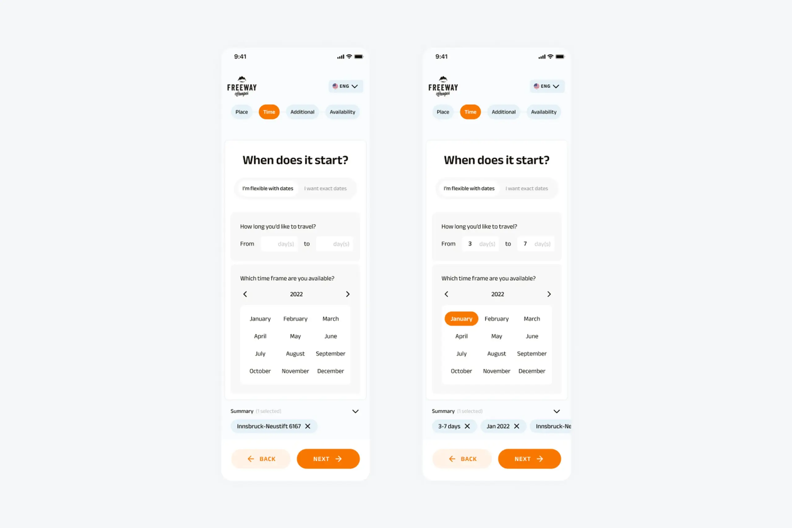
The core insight was simple: give users two paths based on how they actually plan trips. Some people know roughly when they want to go and will shift dates for the right camper. Others have exact dates locked in already. The flow should match the plan, not force the plan to match the flow.
For users who know roughly when they want to travel but do not have fixed dates. They pick a general timeframe, how long they want to go for, and how flexible they can be. The result is a list of campers along with all their available date ranges, not a binary yes-or-no.
This is the flow most first-time planners need, and the one the old app never offered. It turns "no results" into "here are your options."
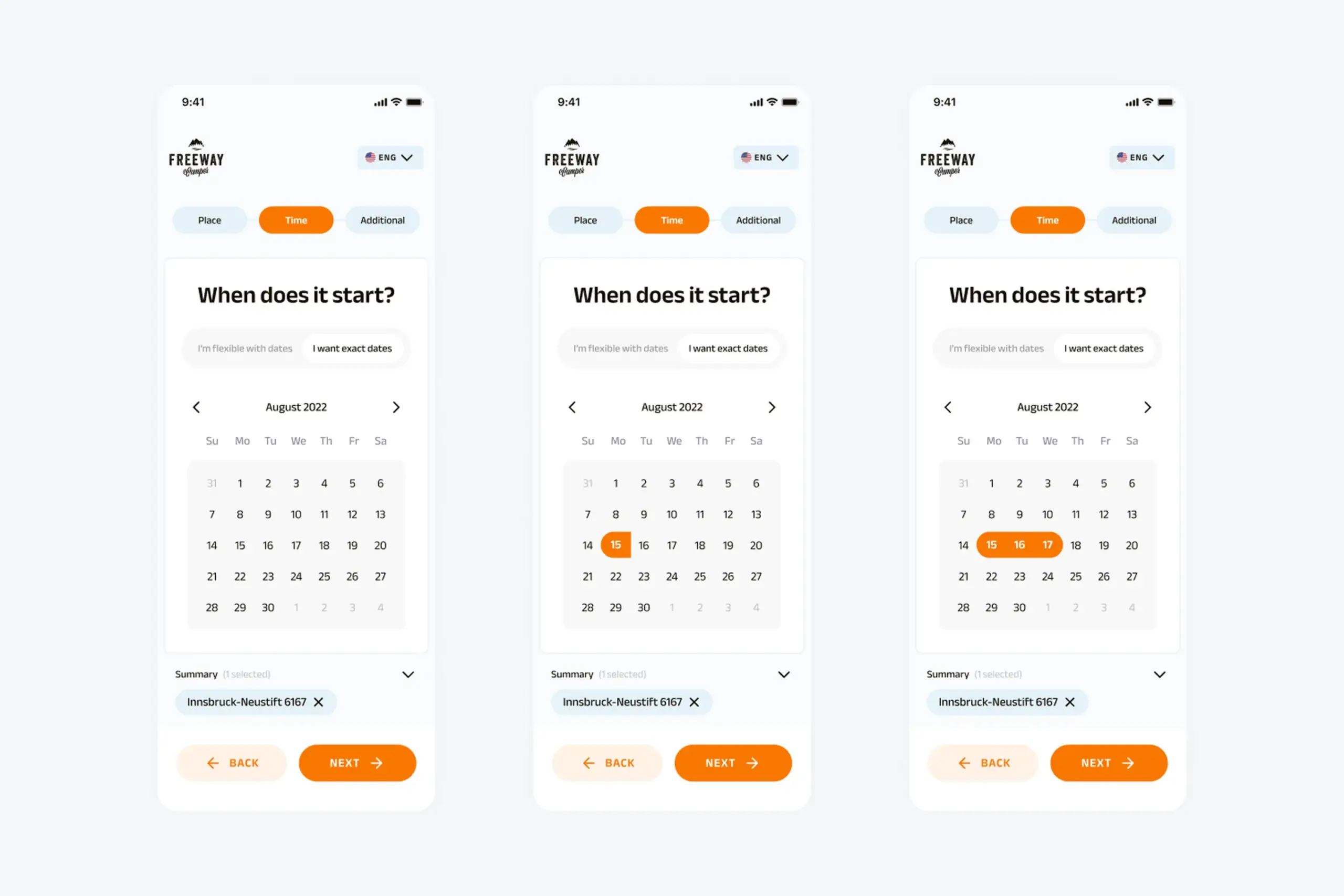
For users who already know exactly when they are traveling, because they booked time off or coordinated with friends. Standard calendar picker: start date, end date, see available campers.
This is the flow that already existed, kept for the users who benefit from it. The redesign did not remove precision, it added flexibility alongside it.
After choosing dates, both paths lead into the same shared steps: location, traveler preferences, and results.
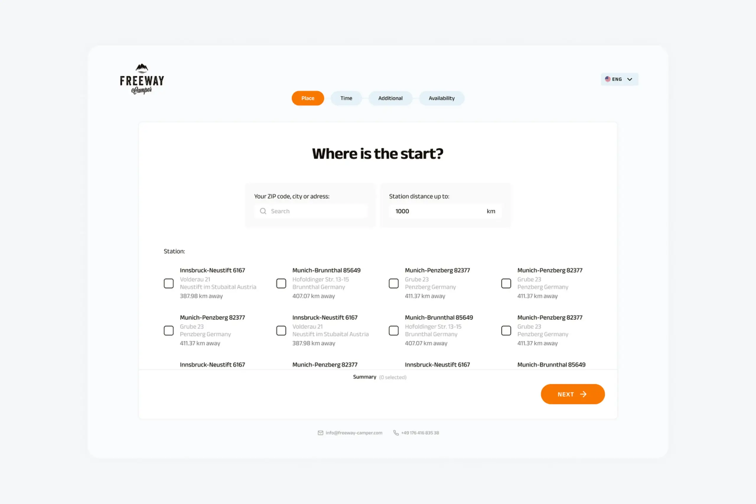
Location step: search cities directly or browse popular destinations. Same screen for both flows.
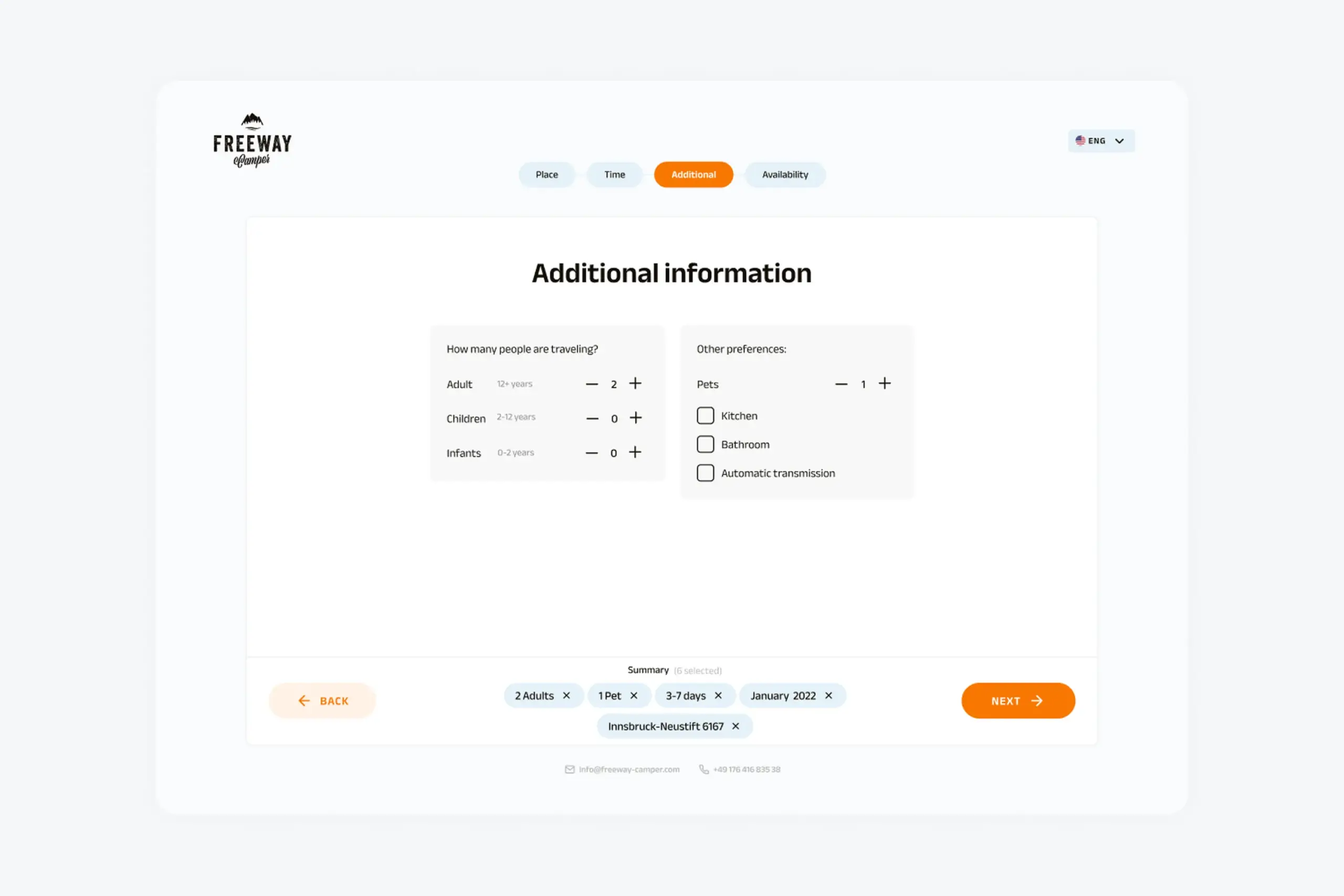
Travelers and preferences: pets, kitchen, bathroom. Preferences filter results without hiding them.
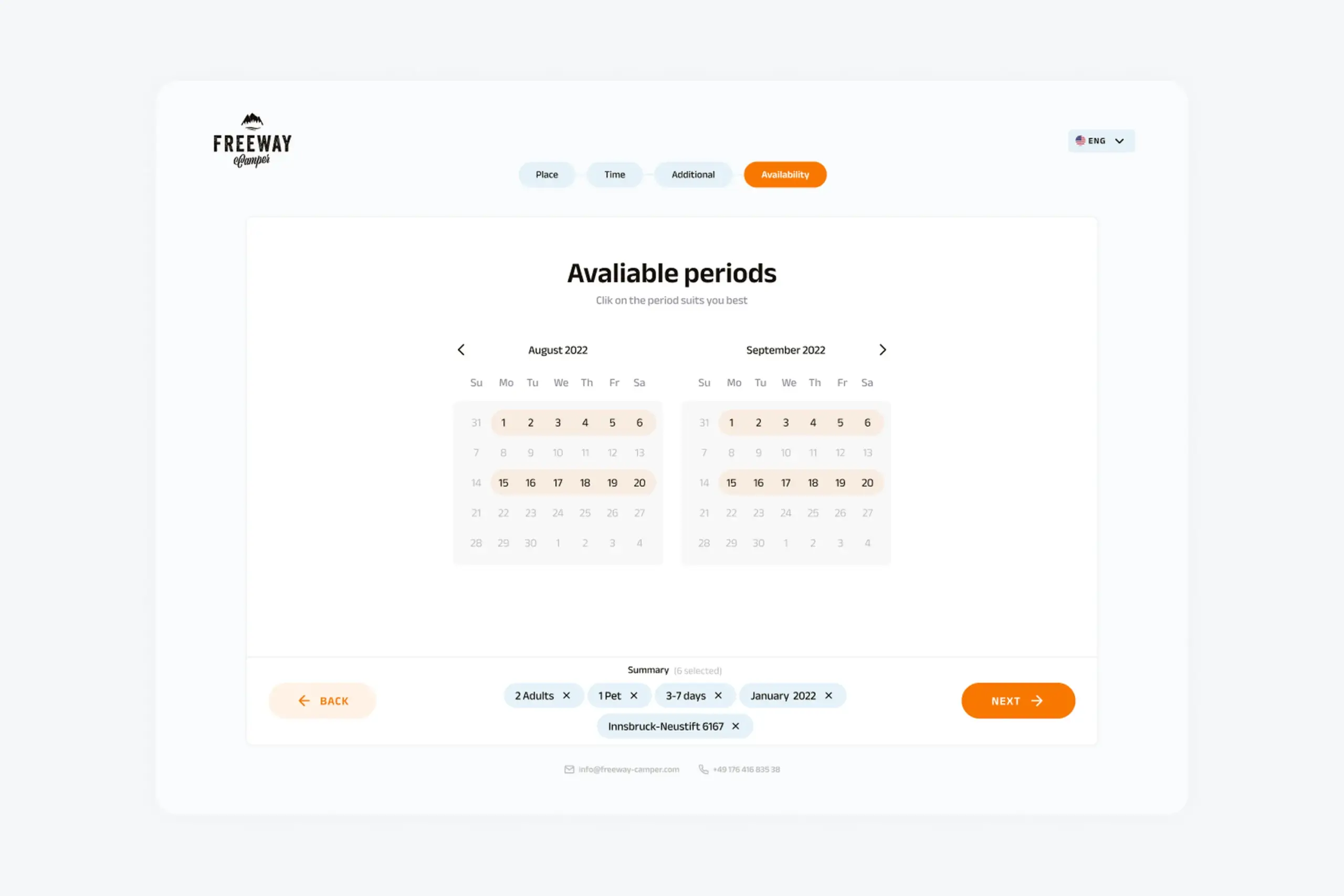
Results screen: real campers with all their available date ranges instead of a binary yes-or-no.
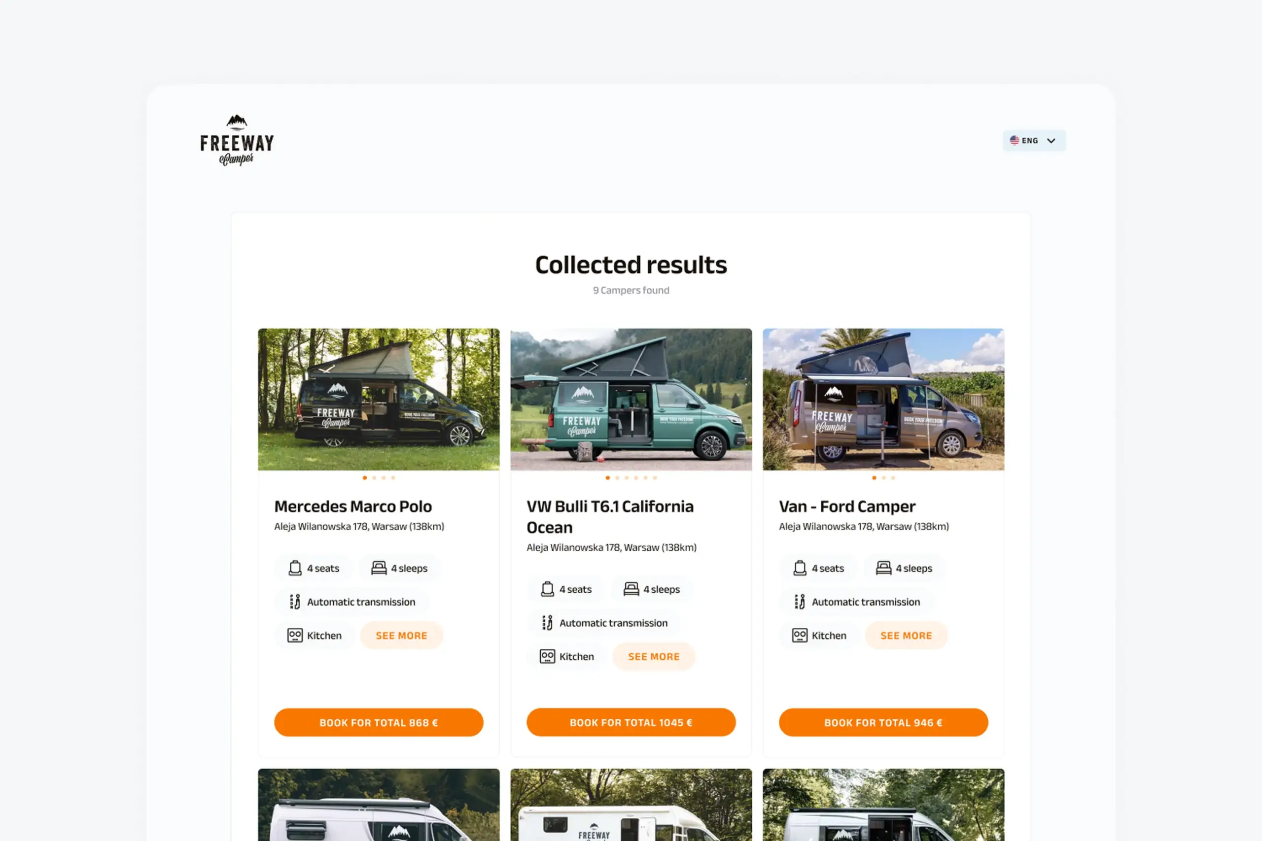
Camper details: specs, amenities, pricing, and the calendar showing availability.
Both flows converge into the same shared steps:
Flexible users choose a timeframe and flexibility. Exact users pick specific start and end dates. Both paths look native, not bolted on.
Search cities or browse popular locations. Add travelers and preferences like pets, kitchen, or bathroom.
Campers with their available periods and pricing. No more silent dead ends. If no perfect match exists, nearby options still show.
Everything designed mobile-first, then expanded to desktop. Camping plans happen on phones: at the kitchen table, on the train, during lunch. The design system covers colors, typography, input components, buttons, cards, calendar components, and progress indicators, all built to scale up to larger screens without losing the mobile hierarchy.
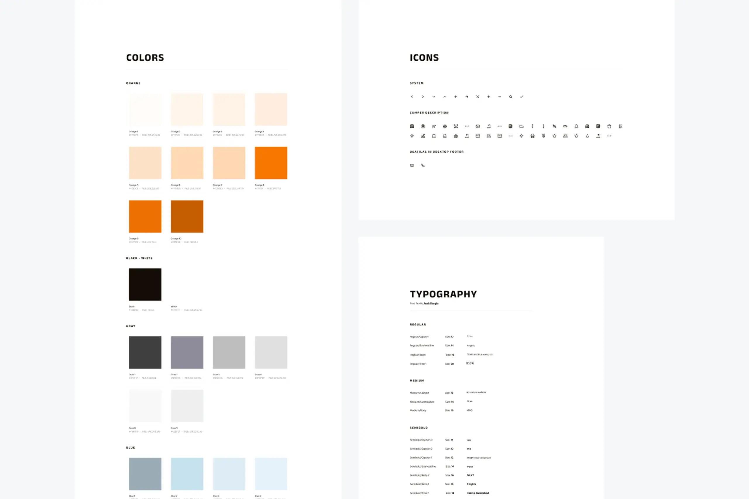
Foundations: colour, typography, and spacing scale built to hold up across breakpoints.
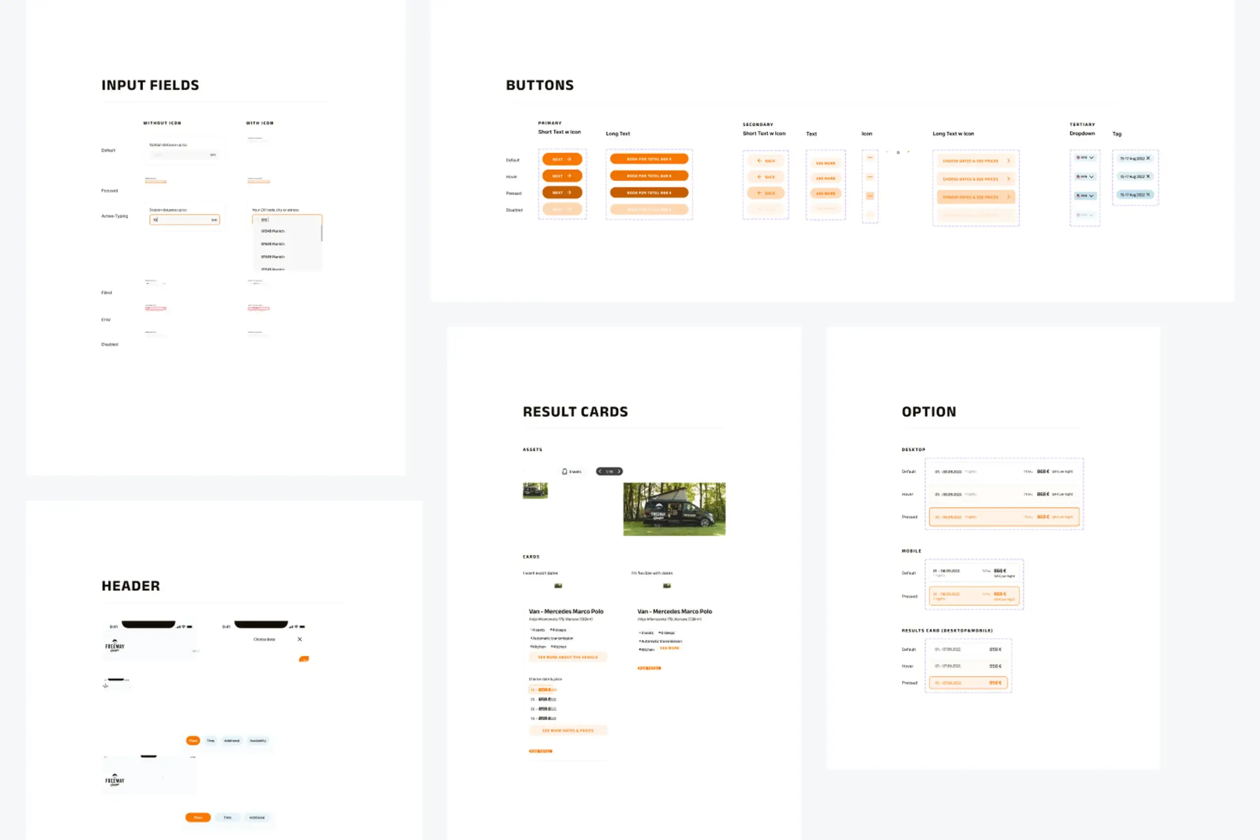
Components: inputs, buttons, cards, and calendar elements with their states.
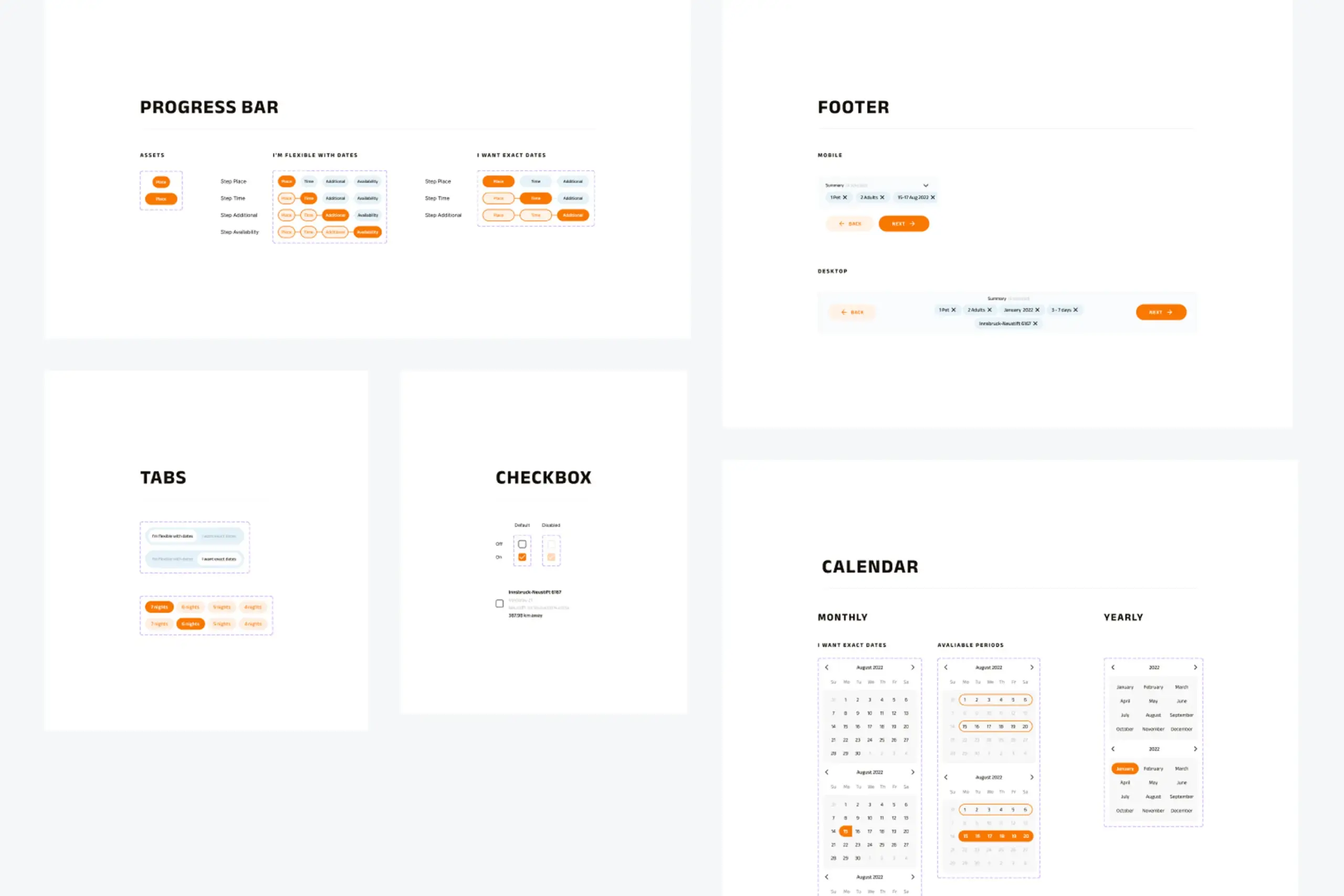
Patterns: layout, navigation, and progress indicators scaled from mobile to desktop.
Why two flows, not one
The first wireframes used a single search flow. Pick your dates, pick your location, see what's available. It seemed logical enough. But when we put it in front of actual campers, a clear split appeared. Some people plan around a place. They already know they want to go back to Krka and just need to find an open slot. Others plan around a window of time. They have a free week in August and want to see what's out there. A single flow forced one of those groups to answer a question they didn't have an answer to yet, which created friction right at the first step. Splitting the entry into two paths, one starting from location and one from dates, let everyone begin with what they already knew.
A new booking path built for the majority of users who do not travel on exact dates. No more "no results" for people who were one or two days off from a match.
Booking works on a phone from the first tap to the last. Camping plans happen on the go, so the responsive layout scales up to desktop instead of down from it.
Colors, typography, inputs, buttons, cards, calendar components, and progress indicators, all documented so future features ship with the same patterns.
Nobody plans a camping trip with exact dates locked in. "Sometime in August" or "a week in early summer" is how people think. The search should start from there, not from a rigid date picker.
The campers were available. The search just couldn't find them. When a search returns nothing, it should suggest alternatives instead of just showing an empty page.
Real planning happens on a phone at a kitchen table or on a train, not at a desk. Designing from small to large kept the flow simple and the hierarchy obvious.
I tried making one flow work for both types of planners and it just didn't. Splitting into two clean paths meant each group got something that actually fits how they think.
The app had the inventory. It just was not letting people find it.
Search flows built for databases instead of people are quietly losing customers. This redesign worked because it started from how people actually plan trips, not from what the existing search endpoint could do. The flexibility flow was not a new feature layered on top, it was the default path for the majority of users.
The broader lesson: when users keep hitting a wall, the wall is usually the interface, not the inventory. Change the flow, and the existing product suddenly performs.
Curious about the details? Ask the AI assistant anything about this case study: the process, decisions, challenges, or outcomes.
Hi\! I can tell you all about this case study. Pick a question or type your own.
Redesigned a multi-channel CMS for a major sports app. Cut publishing time and eliminated content errors by restructuring around channel-based workflows.
View case study
Took an SDK with a 70% failure rate and turned it around. Two rounds of usability testing, then a full flow redesign.
View case study
Dual-platform system: web dashboard for managers, offline-first mobile app for guards in the field.
View case study