Document Scanning SDK
An SDK for scanning ID documents through your phone camera. 70% of users couldn't complete a scan. I ran usability testing to find out why, then redesigned the whole flow.
An SDK for scanning ID documents through your phone camera. 70% of users couldn't complete a scan. I ran usability testing to find out why, then redesigned the whole flow.
This was not an app. It was an SDK that other companies integrate into their apps to capture ID documents through the phone camera, eliminating manual data entry. It shows up in mobile banking sign-ups, digital identity and age verification, insurance and credit registration, guest and visitor management, telecom subscriptions, ride-sharing onboarding, and voter registration.
That meant two audiences to design for: the client developers integrating the SDK, and the end users of those client apps. Because the SDK gets embedded into many different-looking products, the interface had to stay visually neutral, with system typography, system icons, and platform-specific visual rules for iOS and Android.
The SDK was technically sophisticated, built on computer vision and machine learning, but had a 70% user failure rate. An earlier version had been built on AR, which was dropped once it became clear Apple and Google's AR stack couldn't run smoothly on most devices. Client complaints about usability were killing adoption. I ran a formal usability study with 10 participants across 2 rounds in a dedicated testing lab, and redesigned the scanning experience between rounds.
The company was getting feedback from clients that end users could not scan their documents. I tested the SDK myself first. Tried to scan my own ID card. Failed. Then I went looking for the specific reasons it kept failing, and found five distinct problems.
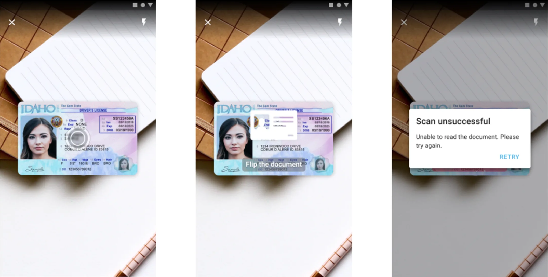
The text said "Scan the front side of a document." Users did not know if that meant the whole card or just the barcode. US driver's licenses have two barcodes, one on top and one on bottom. The instructions just said "barcode" with no indication of which one.
The instruction text appeared over the center of the screen, right where the camera feed was. It scrolled by quickly and disappeared behind camera movement. Users could not read it while positioning their document.
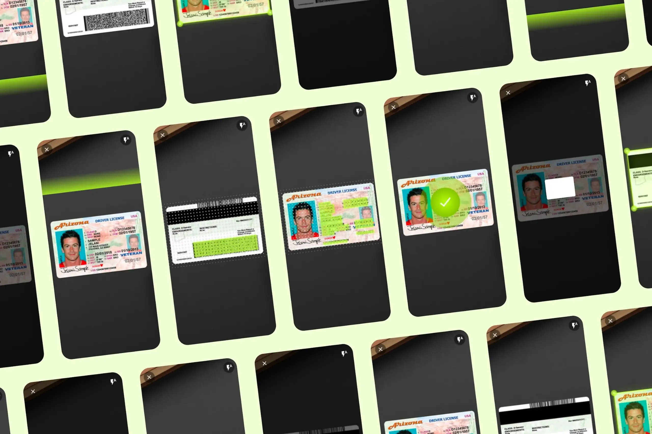
A circular animation pulsated on screen constantly. Users thought it was a button and kept tapping it. It was not a button. It was just decoration. No one knew what it meant.
When a scan succeeded, nothing clear happened. Users were not sure if it worked or if they should try again. With no confirmation, they kept scanning the same document.
Nothing on screen told users where to hold the document. They held it too close, too far, at an angle. The SDK had strict requirements the interface never communicated.
Before: the original scan screen. Pulsing circle, scrolling instructions, no frame guide.
The SDK was technically sophisticated. It just did not tell users what to do.
I set up a dedicated usability testing lab with three cameras recording from different angles: one on the phone screen from above, one on the participant's face, one on their left side. The test device was a Samsung Galaxy S9. Each session ran about 30 minutes, including pre and post-task surveys.
The test document was a US driver's license with its PDF417 barcode reduced to 25% of the original size. Worst-case conditions designed to force users into the recovery path rather than letting the SDK succeed on the first try. That was the whole point: find out what happens when the technology doesn't just work.
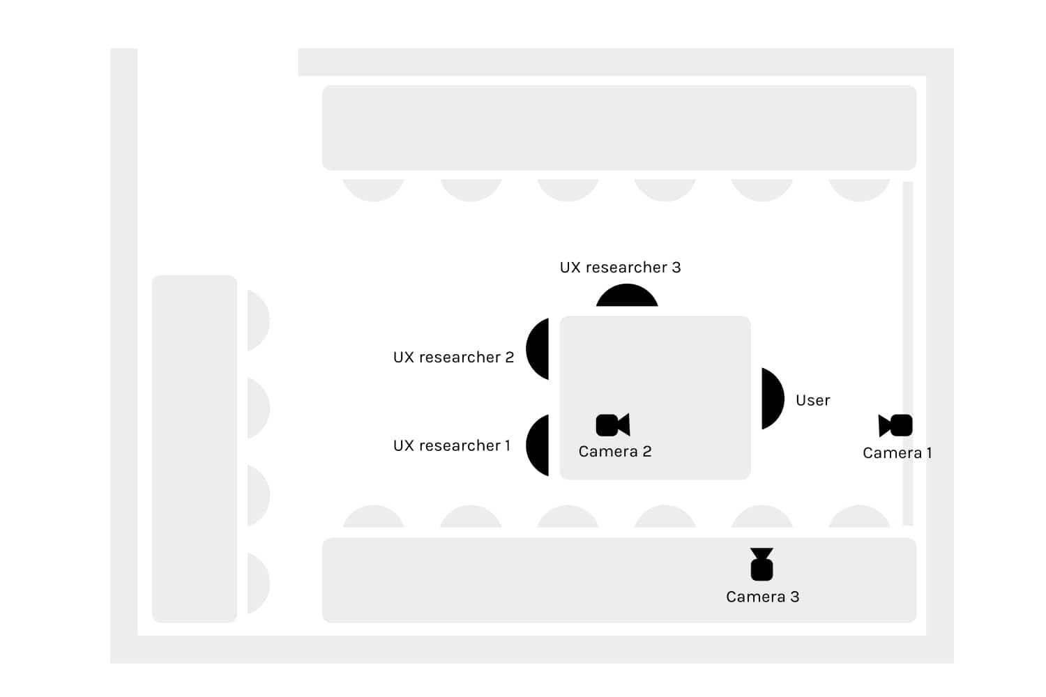
Lab ground plan: three cameras capture hands, screen, and a wider angle.
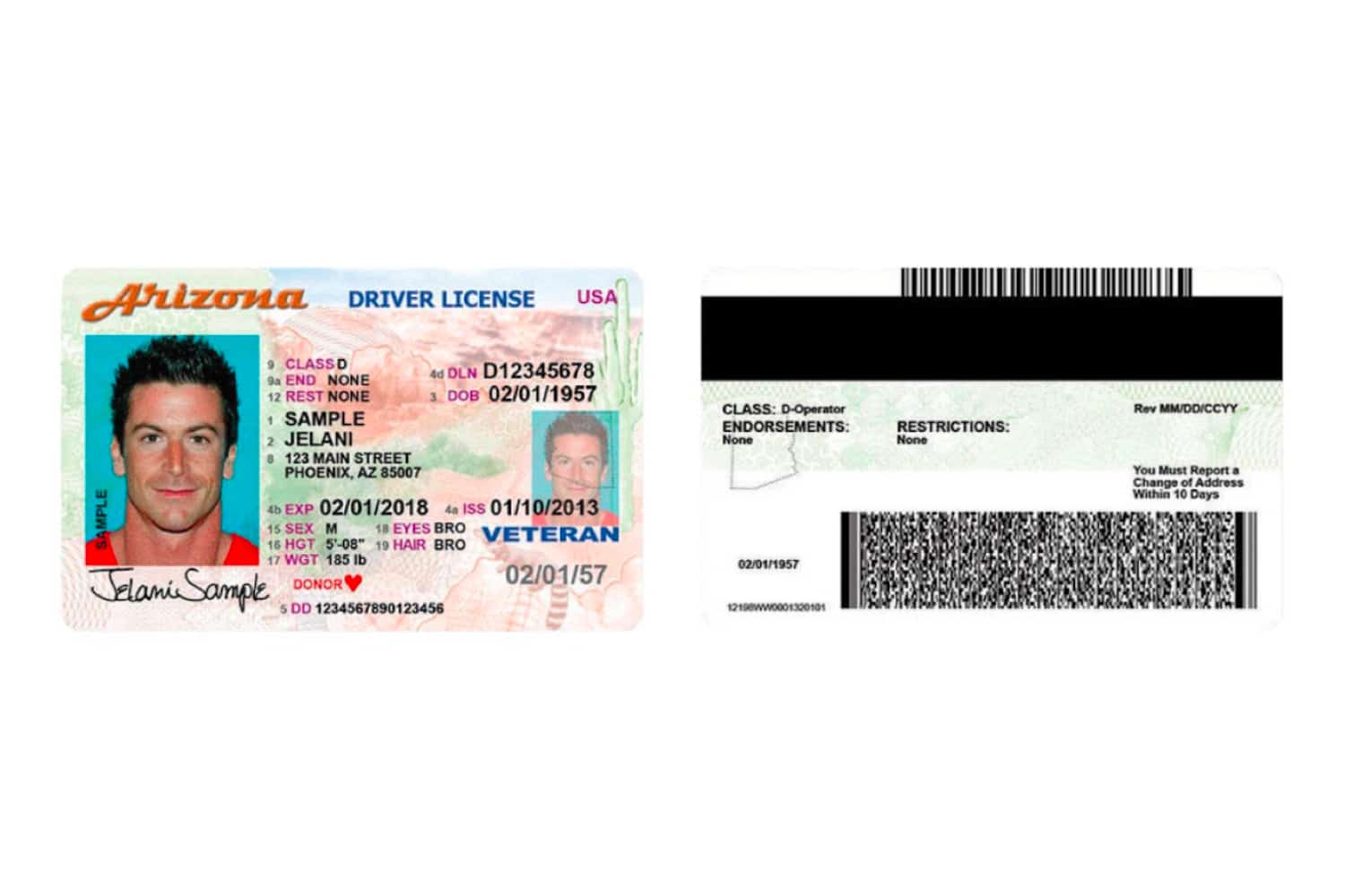
Worst-case test document: US driver's license with the barcode at 25%.
4 users, ages 18-29, all on Android, all had used mobile banking apps before. Most failed to complete a scan. They took almost twice as long as Round 2 users.
Watching the recordings made the failures obvious. Users hovered over the pulsing circle waiting for it to react. They flipped the ID card looking for the "right" barcode. They held still after a successful scan, waiting for confirmation that never came.
What Round 1 revealed
The first four participants showed us problems we genuinely hadn't expected. That pulsating circle we'd designed to mean "scanning in progress"? Every single person tried to tap it like a button. The instruction text said "Scan the front side of a document," which was technically correct but completely unhelpful in practice. People held up their document and waited, not realising they actually needed to flip it over and find the barcode. And the worst part was what happened when a scan failed: nothing. No message, no feedback. Participants had no way of knowing whether they'd done something wrong or the app had. That silence destroyed any sense of trust in the experience.
Each change addressed a specific failure point from Round 1, not a vague usability impression.
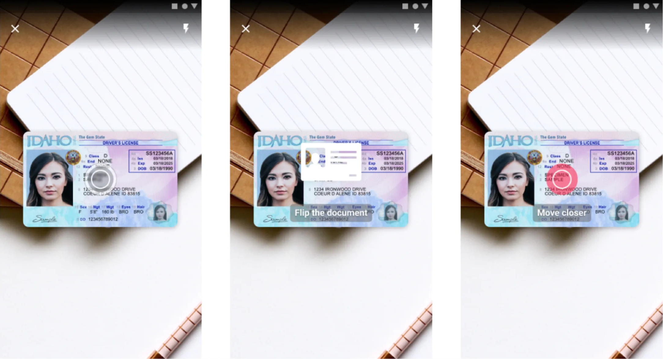
Changed the instruction text from "Scan the front side of a document" to "Scan the barcode." Created a visible, stable background strip so the text was always readable. Added a scan position frame guide so users knew where to hold the document. Removed the pulsating circle entirely. Added clear success and failure feedback after each scan.
6 users, ages 18-39, mix of iOS and Android. They still struggled with the worst-case 25% barcode, but significantly less. Users understood what to do immediately. The frame guide eliminated positioning confusion. Success feedback gave them confidence to move on instead of re-scanning.
Task completion was about twice as fast as Round 1. Most importantly, users could explain what they were doing while they did it. The interface stopped being a puzzle.

A short walkthrough of the final flow: specific instructions, document frame guide, no fake button, clear success feedback.
Three phases, each one informing the next:
Run usability tests with real participants and worst-case documents. Three cameras capture hands, screen, and document position together.
Five targeted changes mapped to the five failure points: clearer instructions, frame guide, no fake button, success feedback, stable text background.
Same lab setup, new participants, same worst-case documents. Compare task time, success rate, and user comments to Round 1.
"I would scan this now, but I'm missing a tick to tell me I'm sure I scanned this." User, Round 1 testing
Why these specific fixes
Every change we made for Round 2 came directly from watching a specific failure happen, not from running through a usability heuristics checklist. We didn't try to redesign the pulsating circle. We just removed it, because any circular animation sitting near the camera view was going to look tappable. We added a positioning frame because people clearly needed to see where to hold their document, not just read about it. And the background strip behind the instruction text solved something we only noticed during real testing: glossy documents were reflecting light and washing out the text on bright surfaces.
Dropped from 70% to rare. Users understood what to do immediately instead of guessing, and the frame guide eliminated most positioning failures.
About twice as fast in Round 2 as Round 1. Clearer instructions and success feedback removed the "am I done?" hesitation.
Usability complaints dropped. Adoption improved. The SDK the technical team had built finally worked for the end users who had to use it.
I tried scanning my own ID card first. Couldn't do it. That told me a lot before I even started recruiting test participants.
Two rounds were essential. The first round surfaced the big, obvious failures. We fixed those, then the second round showed us the subtler problems hiding underneath.
A pulsating circle looks like "tap me" to users. If a UI element moves, users will try to interact with it. Motion is interaction by default.
When a scan worked but nothing happened on screen, users just kept scanning the same document. Success feedback isn't a nice-to-have. Without it, people don't know they're done.
Testing small, twice, with the right worst-case document beats one big study.
Sophisticated tech does not save a confusing interface. The SDK was technically excellent. Users still failed because the screen never told them what to do. Five small interface changes did more for adoption than any model improvement could have.
The bigger lesson: usability testing is not about confirming that your design is good. It is about finding out where it breaks, and fixing exactly those things. Round 1 found the breaks. Round 2 confirmed the fixes.
Curious about the details? Ask the AI assistant anything about this case study: the process, decisions, challenges, or outcomes.
Hi\! I can tell you all about this case study. Pick a question or type your own.
Redesigned a multi-channel CMS for a major sports app. Cut publishing time and eliminated content errors by restructuring around channel-based workflows.
View case study
Users kept hitting "no results" because the app demanded exact dates. Redesigned the booking flow to match how people actually plan camping trips.
View case study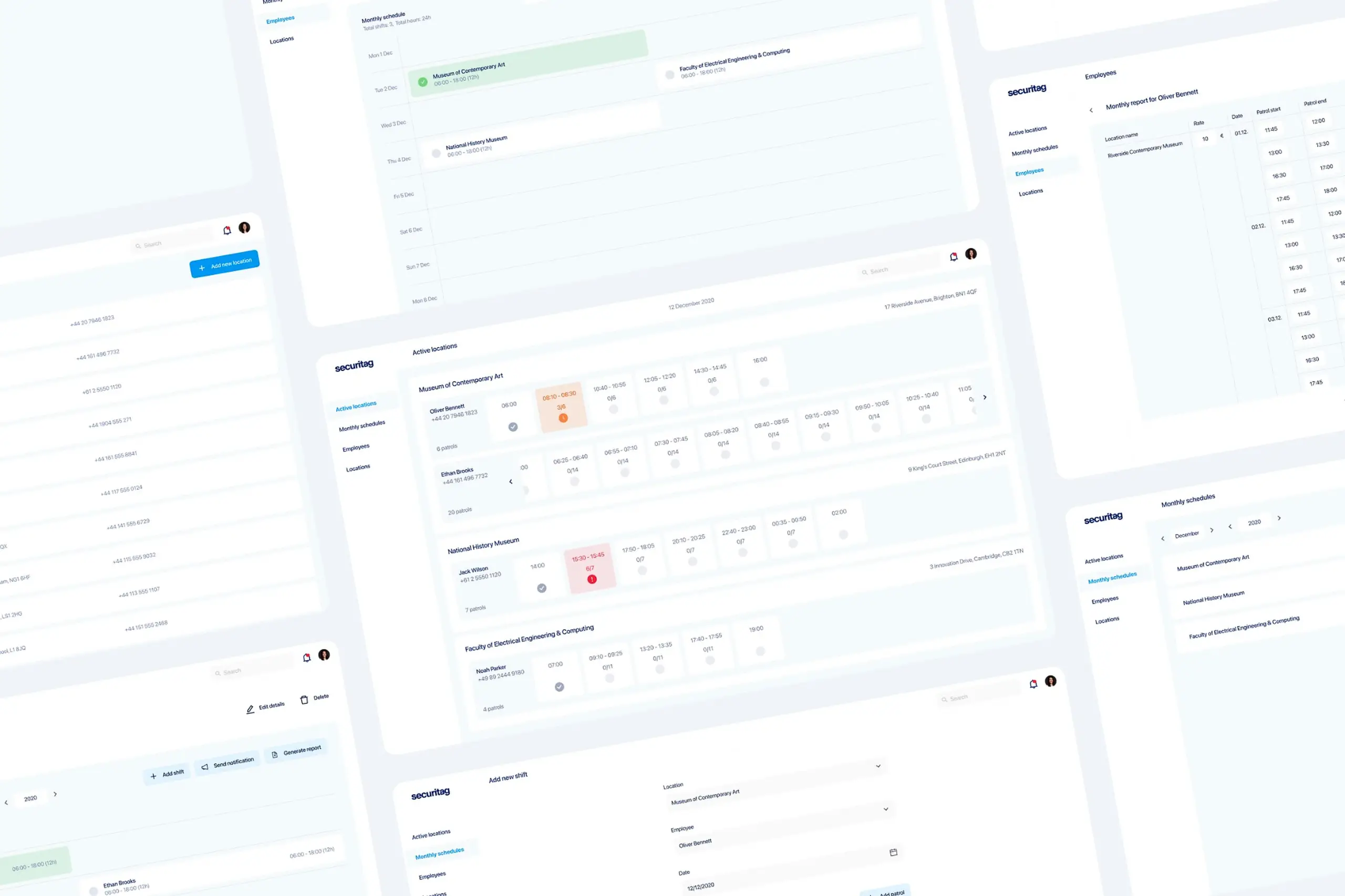
Dual-platform system: web dashboard for managers, offline-first mobile app for guards in the field.
View case study