Enterprise CMS Platform
Making content publishing fast and foolproof for sports teams. I redesigned a CMS around how content creators actually work instead of how engineers organize data.
Making content publishing fast and foolproof for sports teams. I redesigned a CMS around how content creators actually work instead of how engineers organize data.
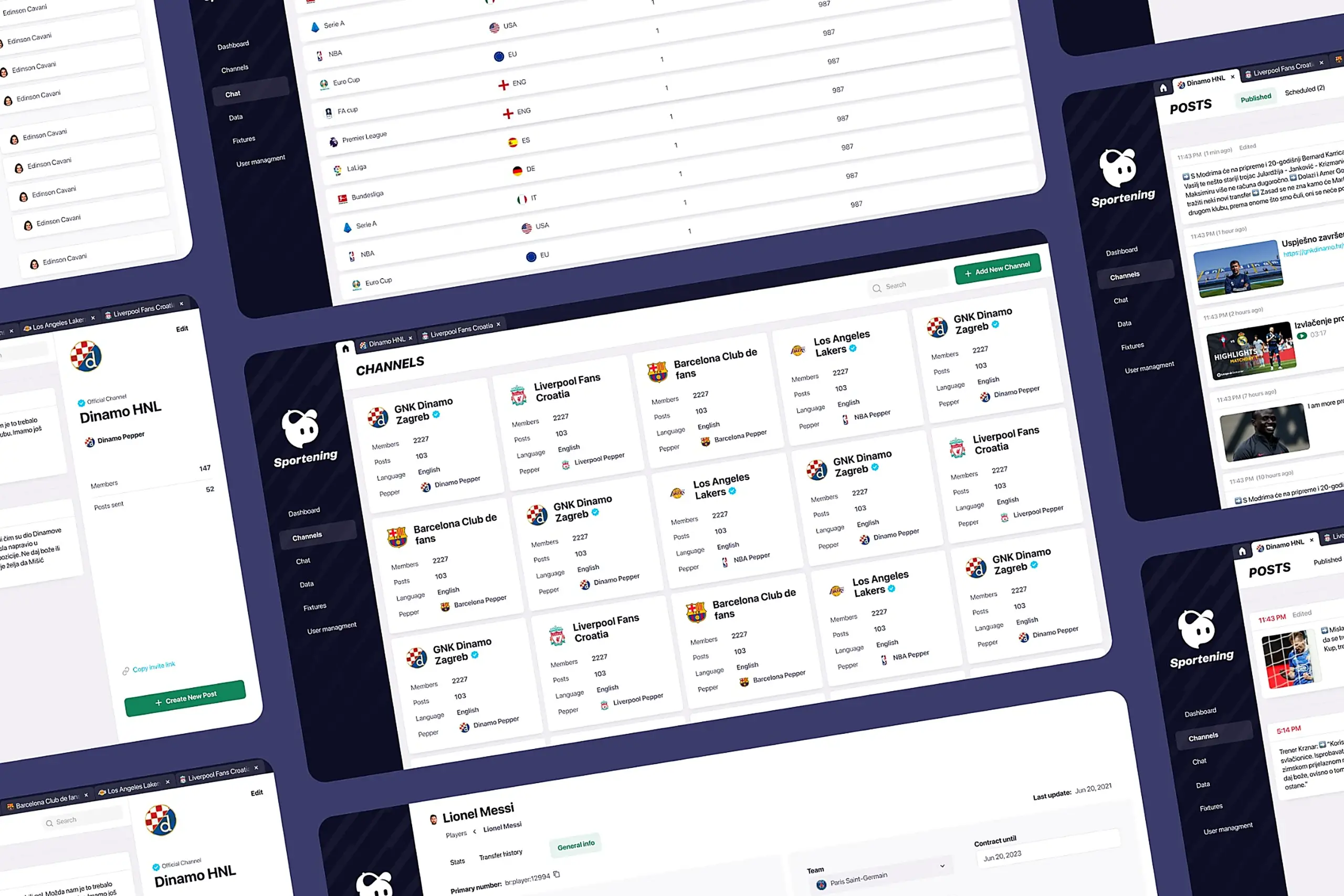
Content creators managed 12 professional sports clubs across multiple countries, publishing 50+ pieces of content daily. Match updates, breaking news, lineup changes, transfer announcements. The CMS organized everything by content type, but the creators thought in teams. They'd think "I'm working on Barcelona today," not "I need to find the Articles section." I redesigned the whole thing around how they actually work.
Content creators at a mobile sports app were drowning in a CMS that fought them at every turn. The old system was built around content types. The navigation showed "Articles," "Videos," "Images," "Match Data." But content creators don't think this way. They think: "I'm working on Barcelona today."
They'd publish breaking news to the wrong club channel because finding the right destination required navigating through content-type menus, then filtering by team, then double-checking they hadn't selected the wrong club with a similar name.
Content creators work from stadiums during matches, from press conferences, from airports. When breaking news happened, they'd either wait until they reached a desktop or publish through awkward workarounds. Sometimes they'd text colleagues to publish on their behalf.
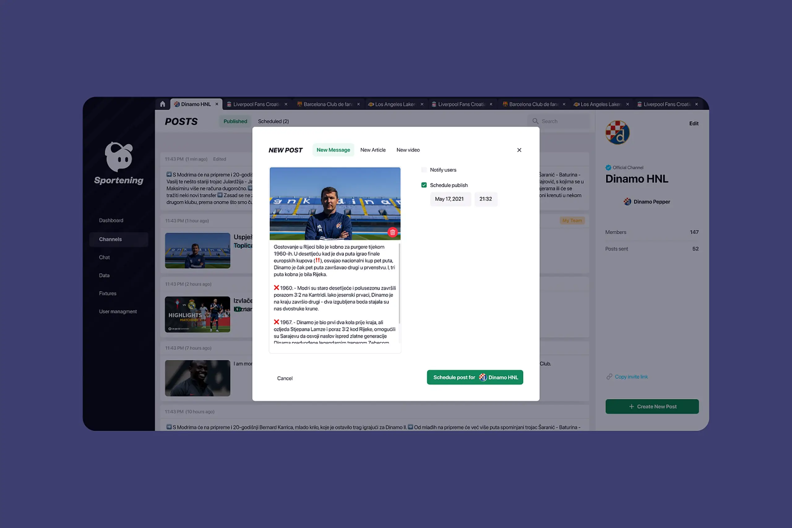
Creators scheduled posts with no idea what was already queued. No preview, no calendar view, no way to see if their post would collide with someone else's. They'd queue match-day content and only discover conflicts when angry users complained about duplicates.
External partner teams logged into the same interface as internal power users. They saw dozens of features they couldn't access. Training took weeks. "Why can't I click this?" support tickets flooded the help desk.
A walkthrough of the original CMS before the redesign. You can see how content-type navigation, buried scheduling, and the one-size-fits-all interface forced creators into workflows that didn't match how they actually worked.
Content creators don't think in Articles, Videos, or Images. They think: "I'm working on Barcelona today."
Before touching a wireframe, I spoke with the people who live in this tool every day. I wanted to understand their actual workflows, not the workflows the old interface forced them into.
The approach that failed first
Our first set of wireframes kept the original navigation structure. Articles, videos, galleries all stayed as top-level tabs, and we just added a team filter on top. The thinking was that creators mainly needed better filtering tools. That assumption didn't survive the first round of feedback. When creators sat down with the wireframe, they immediately looked for their club name, not the content type. Their mental model wasn't "I want to write an article." It was "I need to post something for my team." Once we saw that pattern, we scrapped the content-type tabs completely and rebuilt the whole navigation starting from the club level.
Research pointed to five specific problems. Each got its own design answer, tested against the workflows creators actually use.
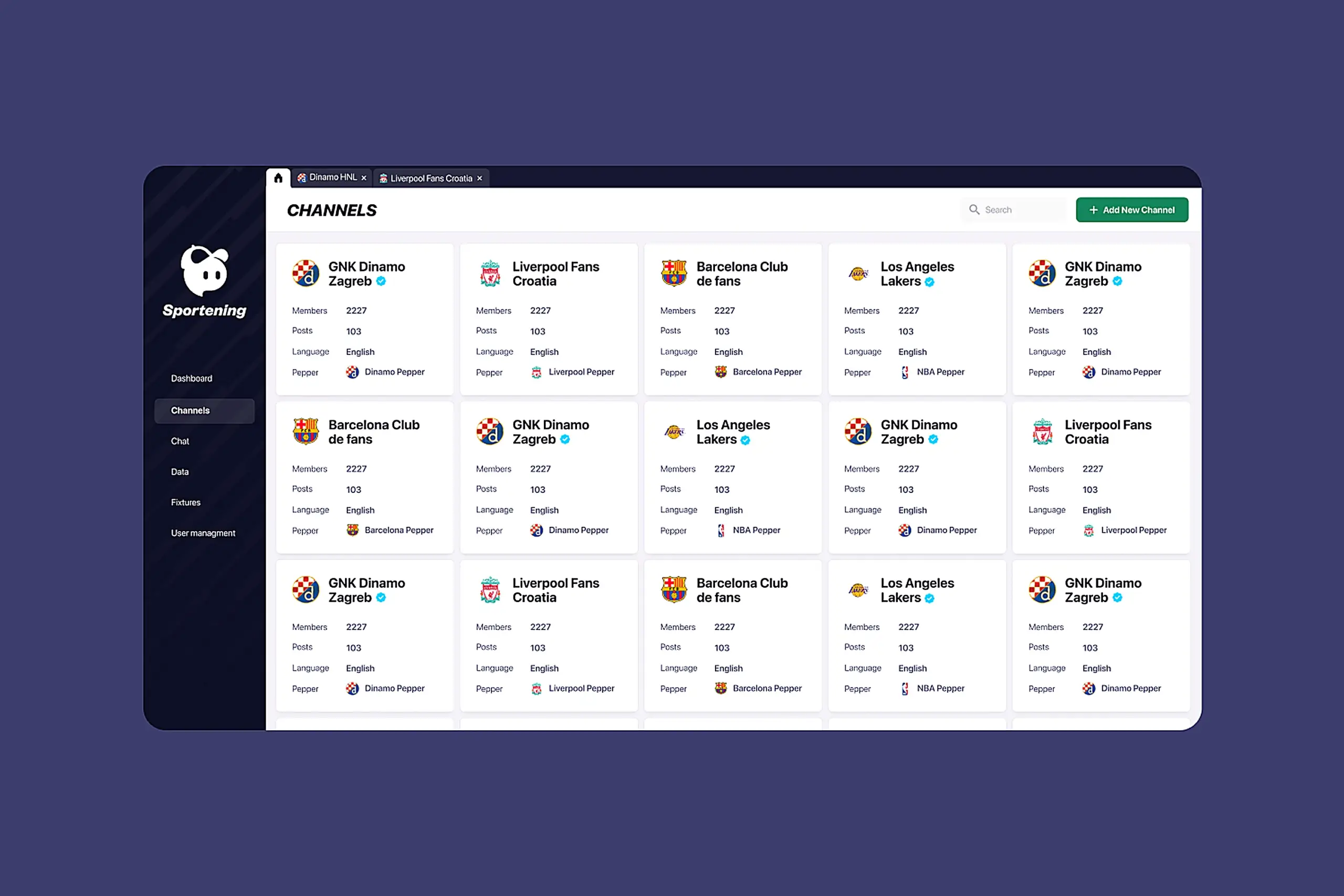
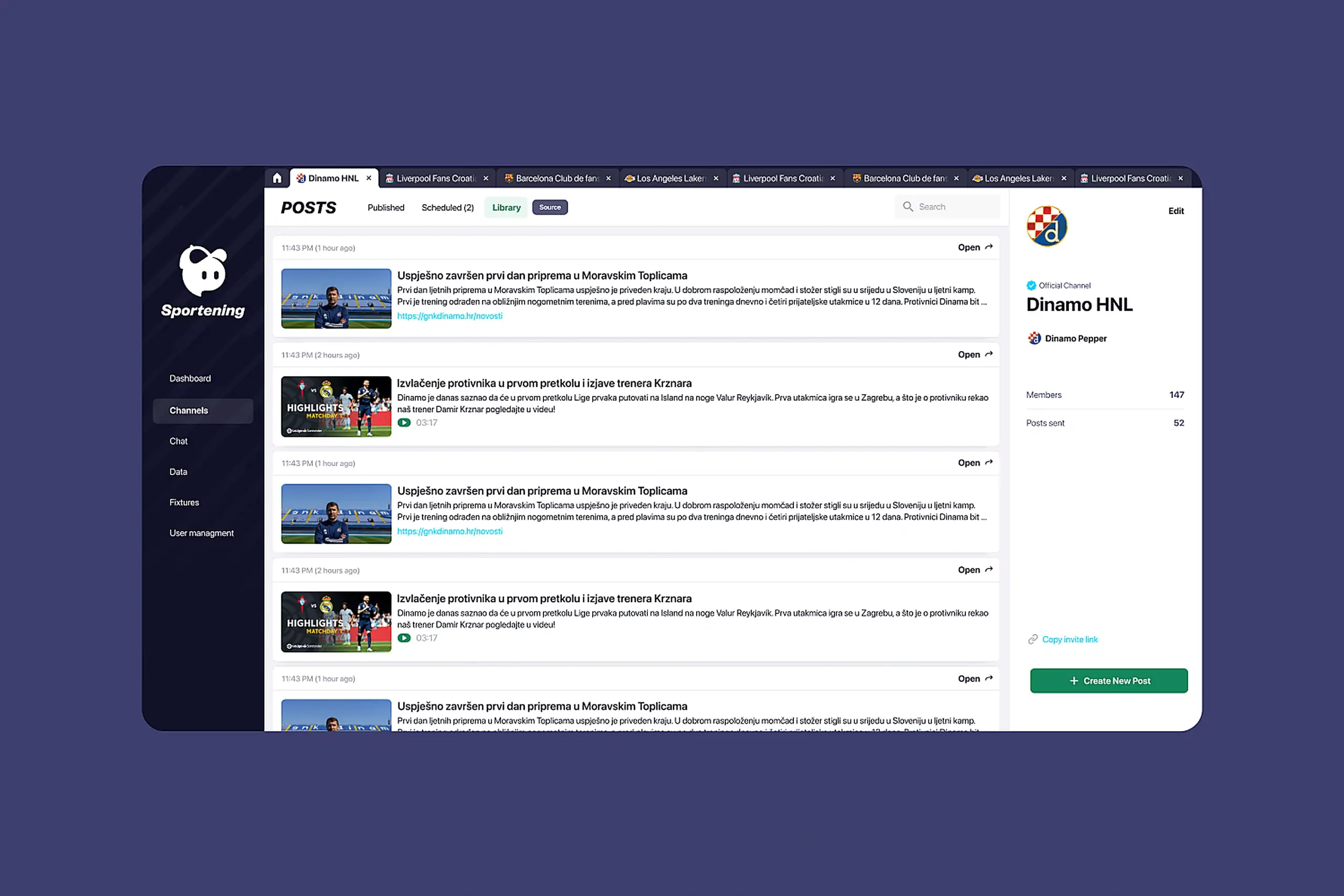
I restructured the entire CMS around teams instead of content types. When you open the CMS, you see clubs: Barcelona, Liverpool, LA Lakers. Click one, and you're in that team's workspace with everything scoped to that club: articles, videos, scheduling, library.
Early wireframes kept the content-type tabs but added a team filter at the top. User feedback was immediate: "So I still have to click Articles, then filter to Barcelona, for every single task?" The mental model was wrong. I scrapped that approach and rebuilt navigation from the team level down.
I redesigned scheduling as a core workflow, not an afterthought. The system now shows a preview of content before it publishes, scheduling history and upcoming posts in calendar view, edit and delete controls for scheduled content, and clear visual states: draft, scheduled, published.
Calendar view over list view was deliberate. Creators think in time: "What's going out on match day?" A list sorted by date required scanning and mental math. A calendar shows density at a glance: Saturday packed, Sunday empty.
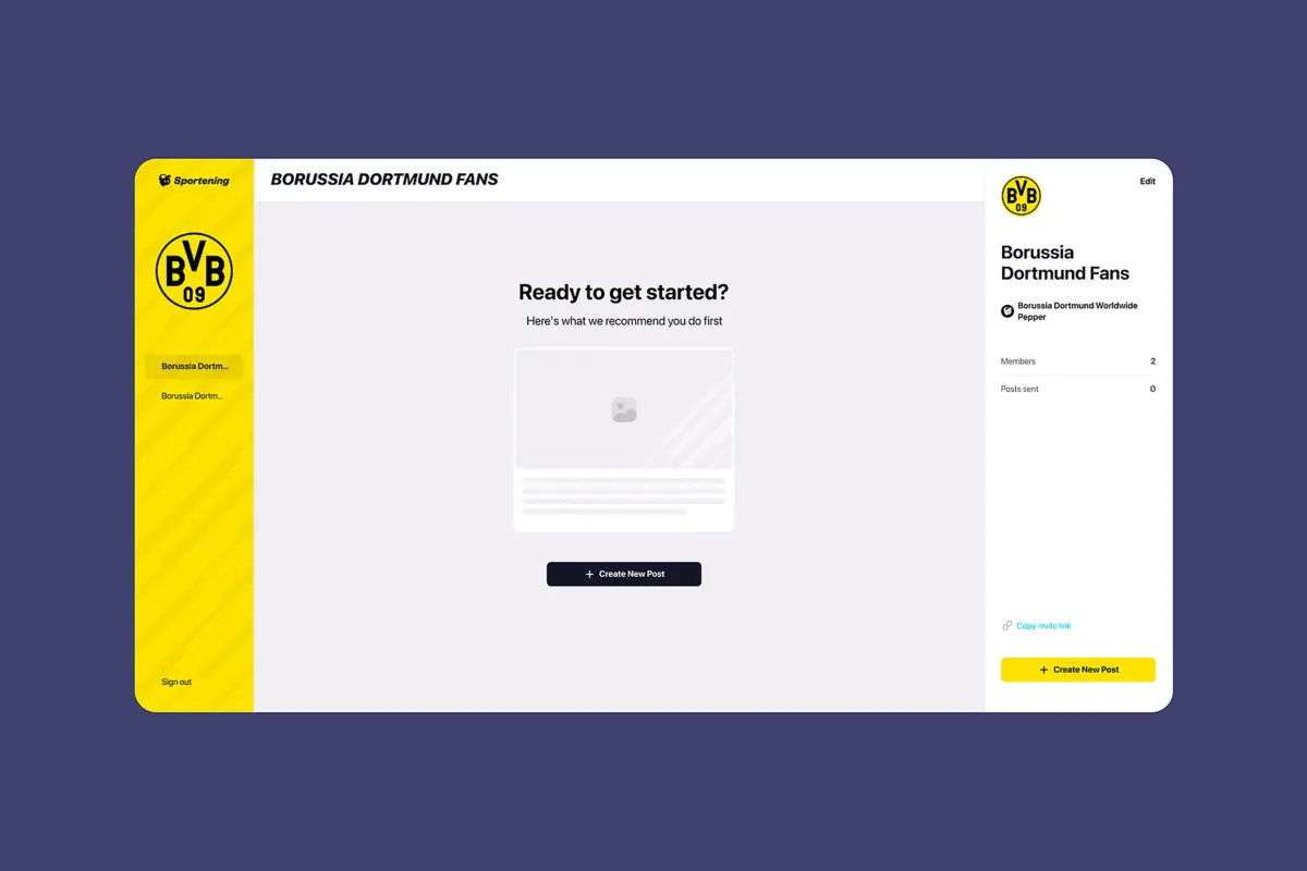
Partner teams saw the same overwhelming interface as power users. I designed role-based experiences. Internal creators get the full toolset: all channels they manage, all features, bulk operations, advanced scheduling. Partner clubs get a simplified view: only their channel, streamlined feature set, cleaner interface with less visual noise.
Hiding buttons wasn't enough. The layout still felt complex with empty spaces where buttons should be. I redesigned the partner experience from scratch: different hierarchy, simpler navigation, focused on their three core tasks. Training time dropped. Permission support tickets disappeared.
The old library was so bad that content creators manually searched the internet for every image. No clear organization by team, no way to tell which images were approved, slow and inaccurate search, buried upload flow.
What I built: a library scoped to each channel, so Barcelona's library shows Barcelona assets. Curated internet sources automatically scraped per club. Manual upload for custom assets. Search that works across filenames and tags. Clear licensing indicators. It became one of the most-used features in the product.
I designed every feature for phone use from day one. Content creators' most critical moments happen away from desks: match updates from stadiums, breaking news from press conferences, schedule changes from airports. Responsive adaptation would have treated mobile as a second-class experience. Mobile-first meant the phone layout drove the desktop layout, not the other way around.
Key mobile decisions: bottom navigation for thumb reach, the full publishing flow accessible on phone, scheduling works completely on mobile, and the library is browsable and usable on small screens.
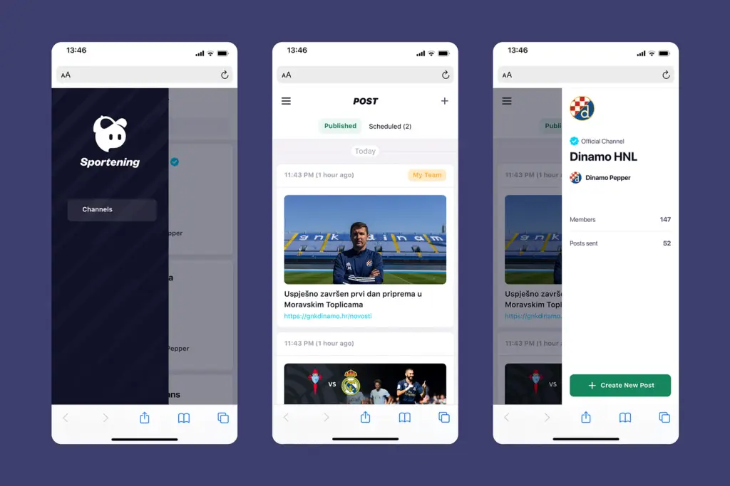
The full publishing flow, library, and scheduling all work on phones
Working without a baseline
One thing we didn't see coming was the complete lack of analytics on the old CMS. There was no data on how long tasks took, how often people got lost, or where they dropped off. So when we finished the redesign, we couldn't put hard numbers on the improvement. Creators told us it was faster and easier, but we had no before-and-after metrics to back that up. It taught me something I carry into every project now: set up your success metrics before you start designing, not after.
Daily occurrence became rare. Channel-first navigation eliminated the guesswork of picking the right destination.
Dropped from weeks of guided onboarding to self-service. Role-based interfaces removed the complexity partners never needed.
Went from impossible to full functionality. Creators can now publish from stadiums and press conferences without workarounds.
Putting teams first in the navigation solved most of the problems on its own. Creators think "Barcelona today," not "Articles, then filter by Barcelona." Once the interface matched how they think, the errors mostly went away.
You can't train people out of making mistakes under pressure. Scheduling previews and clear status indicators prevented errors that training never would have.
Content creators work from stadiums and press conferences. Desktop-only would have failed regardless of how polished the interface was.
I wish I'd written down more decisions as I made them. Reconstructing the reasoning later for handoff and this case study was way harder than it should have been. Now I write things down as I go.
The interface makes sense immediately
Enterprise tools fail when they're organized around how engineers store data instead of how people do their jobs. This redesign worked because it started from the users' mental model and let everything else follow. Channel-first navigation wasn't a clever feature. It was the whole premise.
User feedback summed it up: "The interface makes sense immediately." That's the goal for any enterprise product. The less time people spend fighting the tool, the more time they spend doing the work.
Curious about the details? Ask the AI assistant anything about this case study: the process, decisions, challenges, or outcomes.
Hi\! I can tell you all about this case study. Pick a question or type your own.
Took an SDK with a 70% failure rate and turned it around. Two rounds of usability testing, then a full flow redesign.
View case study
Users kept hitting "no results" because the app demanded exact dates. Redesigned the booking flow to match how people actually plan camping trips.
View case study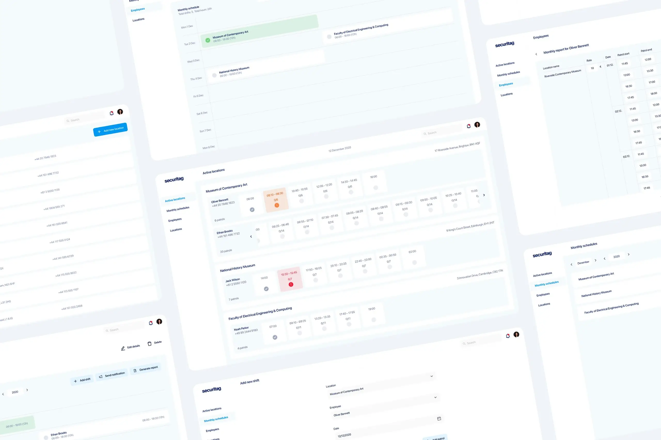
Dual-platform system: web dashboard for managers, offline-first mobile app for guards in the field.
View case study