Security Guard Management System
Turning chip-scanning tours into a system that actually works. I designed a web dashboard for managers and an offline-first Android app for guards.
Turning chip-scanning tours into a system that actually works. I designed a web dashboard for managers and an offline-first Android app for guards.
Security guards protect physical locations like warehouses, offices, and construction sites. They walk scheduled tours and tap hidden chips to prove they checked each spot. But the old system was so unreliable that guards had started working around it, and managers were spending hours every day just trying to verify that tours were actually happening. Schedules lived in Excel. Payroll was manual. I designed two connected tools to replace all of that.
The existing system was technically functional but unusable in practice. Guards carry a phone with a chip scanner. Hidden chips are placed throughout facilities: behind doors, under tables, by the bar. Guards tap each chip during their tour to prove they physically visited each location. The old system gave no visibility into active tours, so managers had to physically visit locations or call guards to verify tours were happening.
Scans often did not register. Offline mode did not work properly. Guards could not tell if their taps were recorded, so they developed workarounds: tearing chips off mounts, collecting them, tapping them all at once. Not malicious fraud, just a rational response to a broken system.
Managers had no way to see active tours in progress. Verifying that guards were actually walking their routes meant driving to locations or calling them. Hours every day spent on work that should have been automatic.
Different security levels (Shift Manager, Intervention Police, Guard, Security Officer, Associate, Fireman) had different hourly rates. Schedules lived in Excel. Payroll calculation was manual and error-prone.
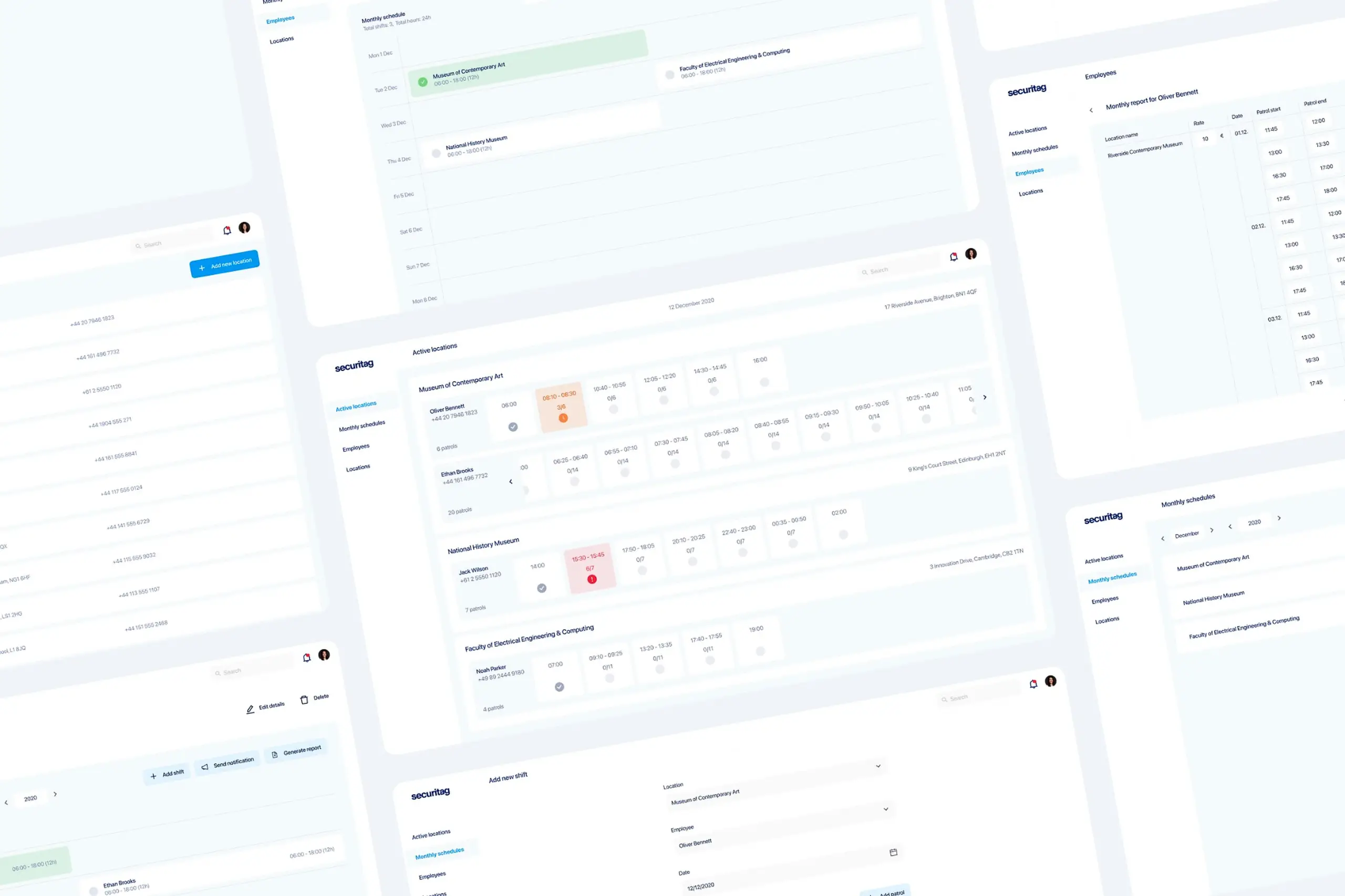
Functional but minimal. Generic Bootstrap-style components, no real-time visibility, no mobile support, and a printable Excel-style schedule. Each screen shows one of the pain points in action.
Old login screen. Generic, branded but uninviting.
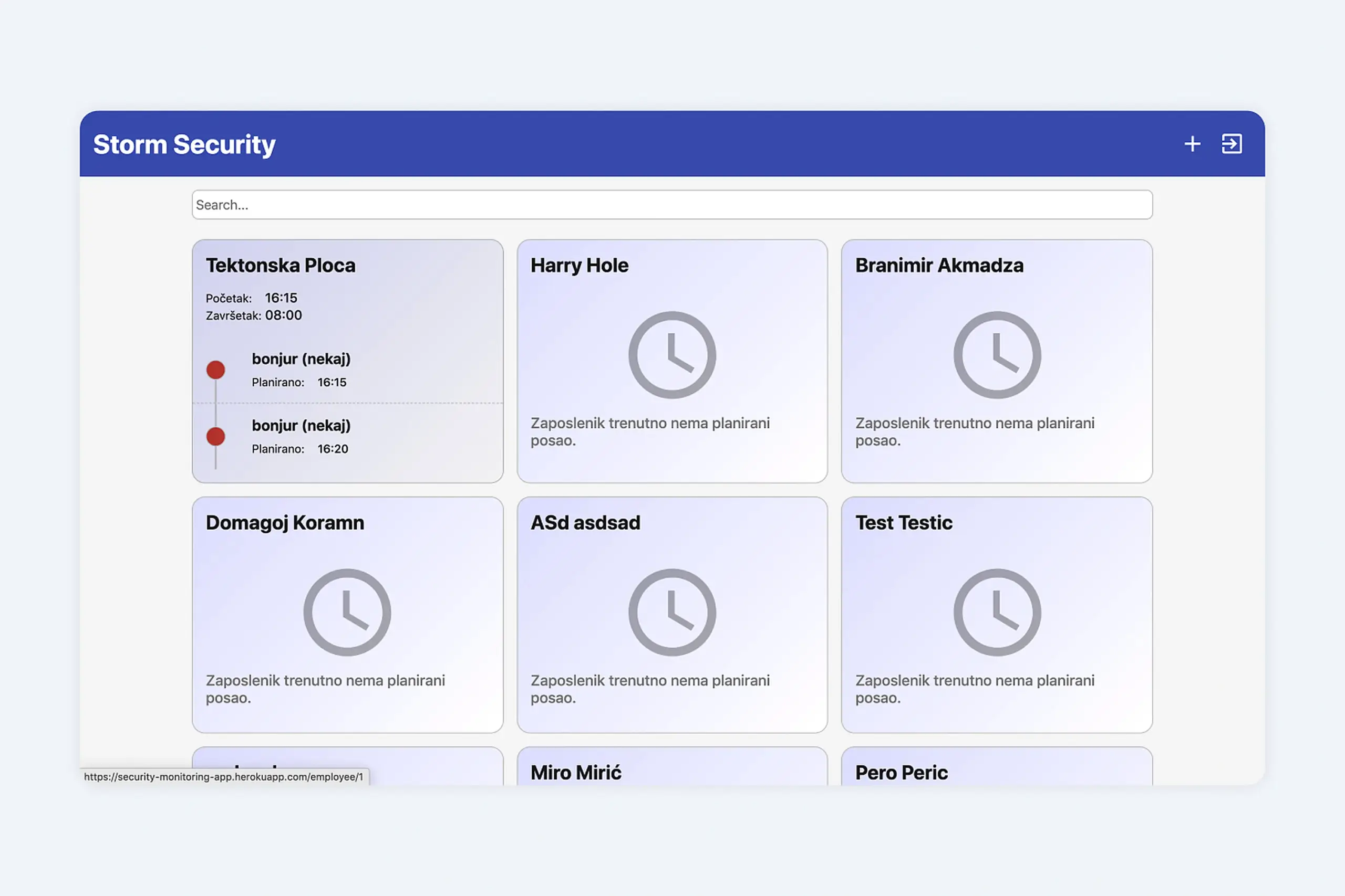
Old employee dashboard. No real-time tour data, just a wall of static cards.
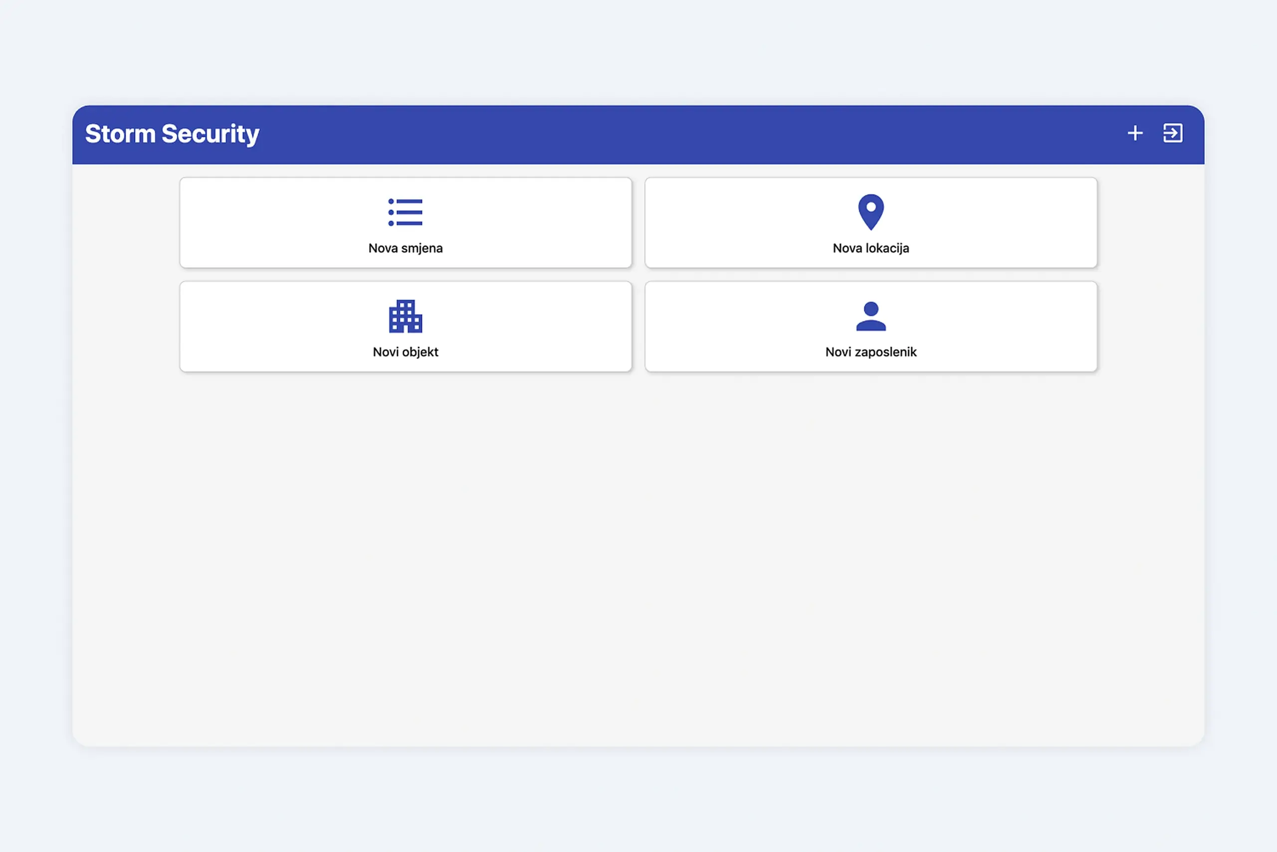
Adding a shift, location, or employee. Four buttons, no context, no flow.
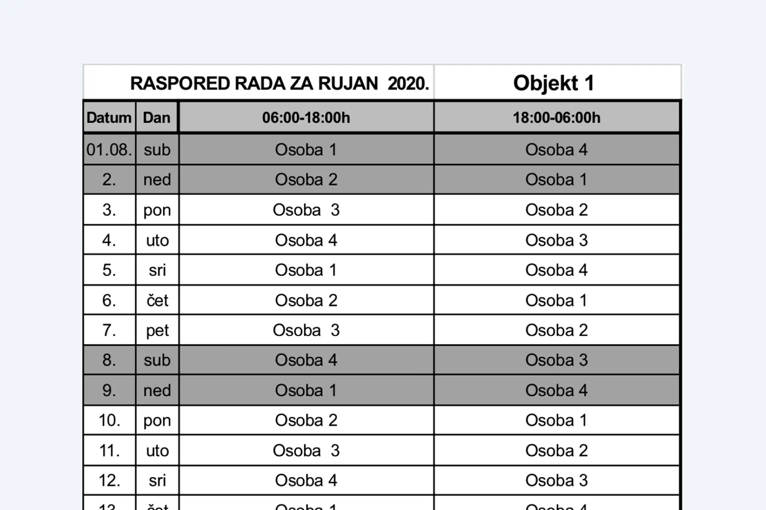
The monthly schedule lived in a printable spreadsheet. Payroll was manual.
Guards were not cheating the system. They were working around a system that did not work.
Before designing anything, I interviewed two shift managers and two security guards to understand the real workflow: how they actually used the existing system, where it failed, and what they needed from a replacement.
Constraints that shaped every decision
Four interviews might sound like a small number, but these weren't quick chats. The two shift managers walked us through a full week of scheduling edge cases, covering overlapping shifts, last-minute replacements, and underground patrol routes where phones completely lose signal. The two security guards showed us their actual daily workflow, including the paper notebooks and workarounds they'd come up with because the existing system kept failing them. After those conversations, the design constraint was obvious: this had to work for people who find smartphones stressful, in buildings where internet simply doesn't reach.
Managers sit at desks looking at dashboards. Guards are on their feet in basements with no signal. One interface for both would have been a compromise that worked for neither, so I designed two separate tools connected by the same backend.
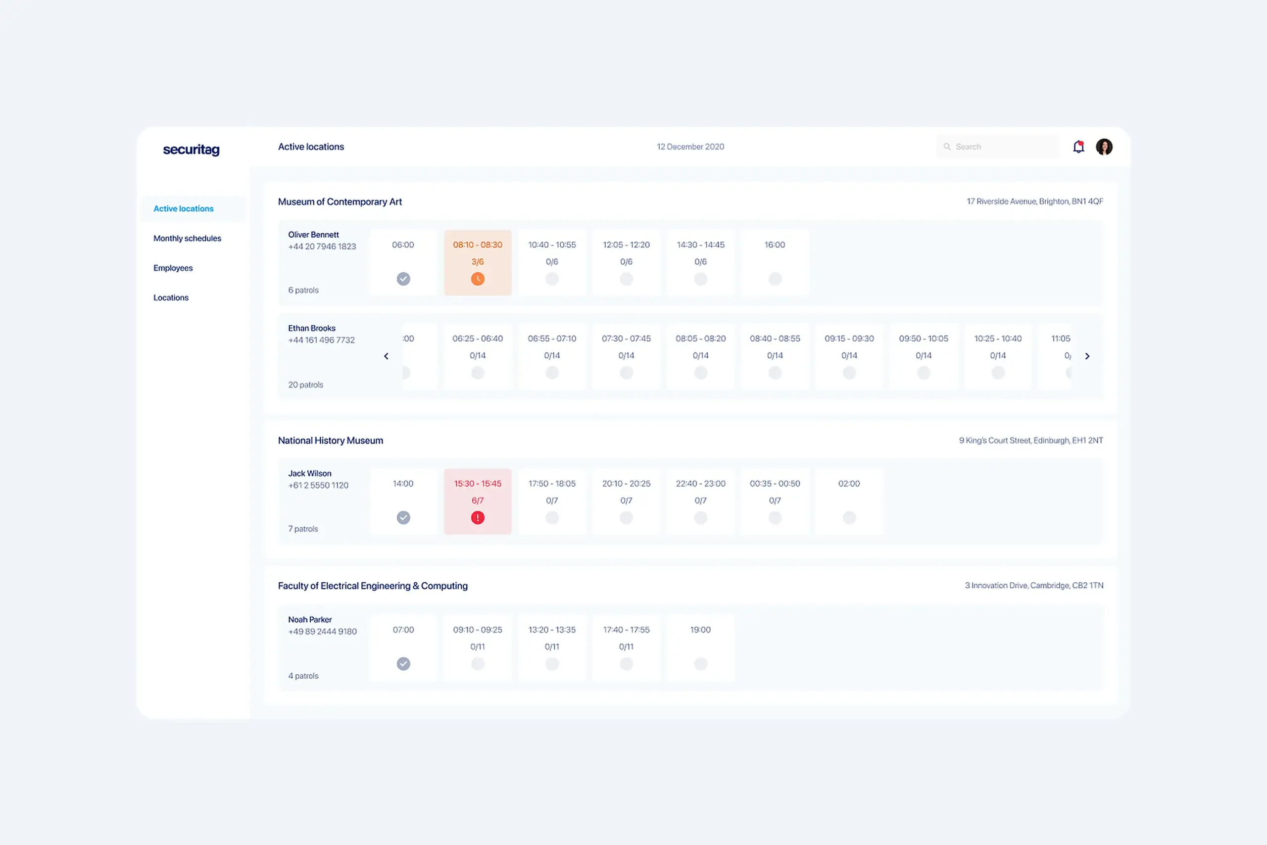
Managers get at-a-glance visibility: which guards are currently on tour, real-time chip scan progress, and instant alerts when something is wrong (guard has not moved in 10 minutes, chip scanner offline, schedule conflict).
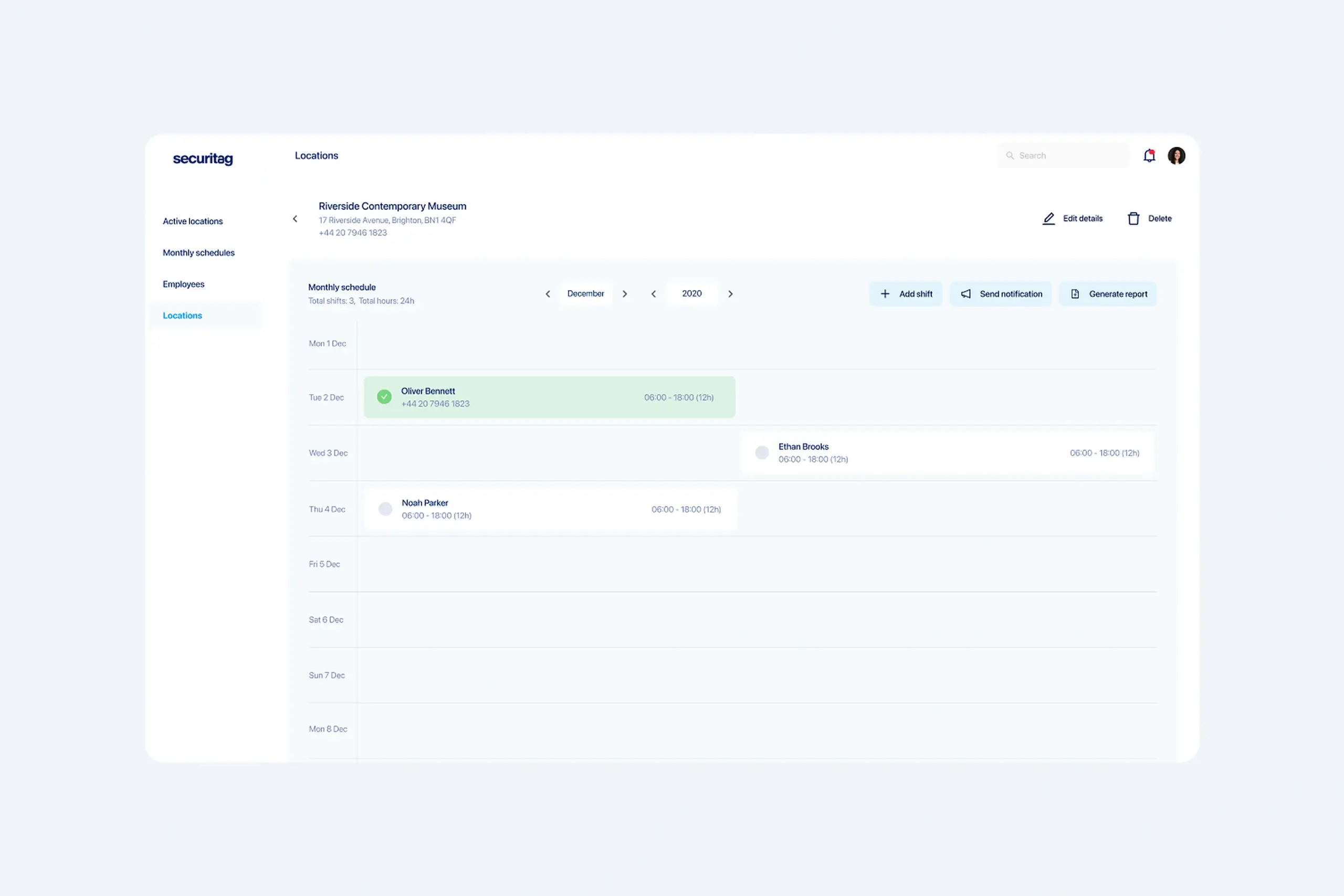
Schedules, hourly rates per security level, and monthly payroll calculations all live in the same place. What used to take days of spreadsheet work now exports in one click.
Important context: the guards using this app are not tech-savvy. Many had never used a smartphone app for work before. That shaped every interface decision. The app had to be very simple, with no hidden menus, no clever gestures, no assumptions about digital fluency.
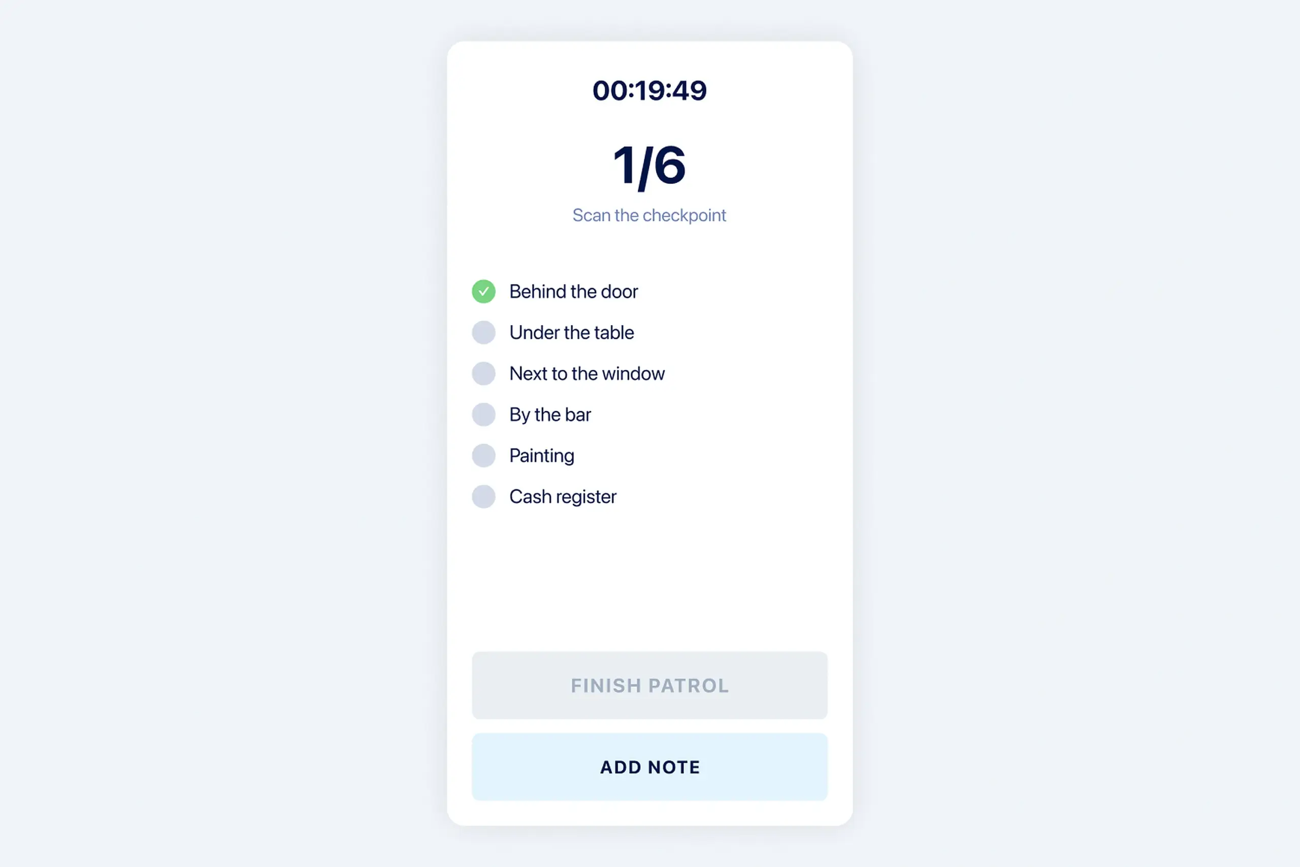
Guards are on their feet, moving through facilities, often in poor lighting. The app needed to be dead simple. I designed a timer counting up, the list of all chips to scan, checkmarks for completed scans, and clear Start and End Tour actions.
Key design decision: immediate visual confirmation after each scan. The old system’s biggest failure was uncertainty. When a guard taps a chip, they see a checkmark on the chip list, the timestamp recorded, and the progress bar advance. No wondering if it registered.
Guards work in underground garages, basements, areas with poor signal. Scans save locally with timestamp and location. When connection returns, data syncs to the dashboard. The timestamp shows when the scan actually happened, not when it synced.
The app keeps working even when signal drops. Guards complete their tours normally. When they reconnect, all data syncs in the background. Managers see real-time updates as guards move through the facility, and also see completed historical data if a guard was offline.
Dashboard: all active locations and live tour progress
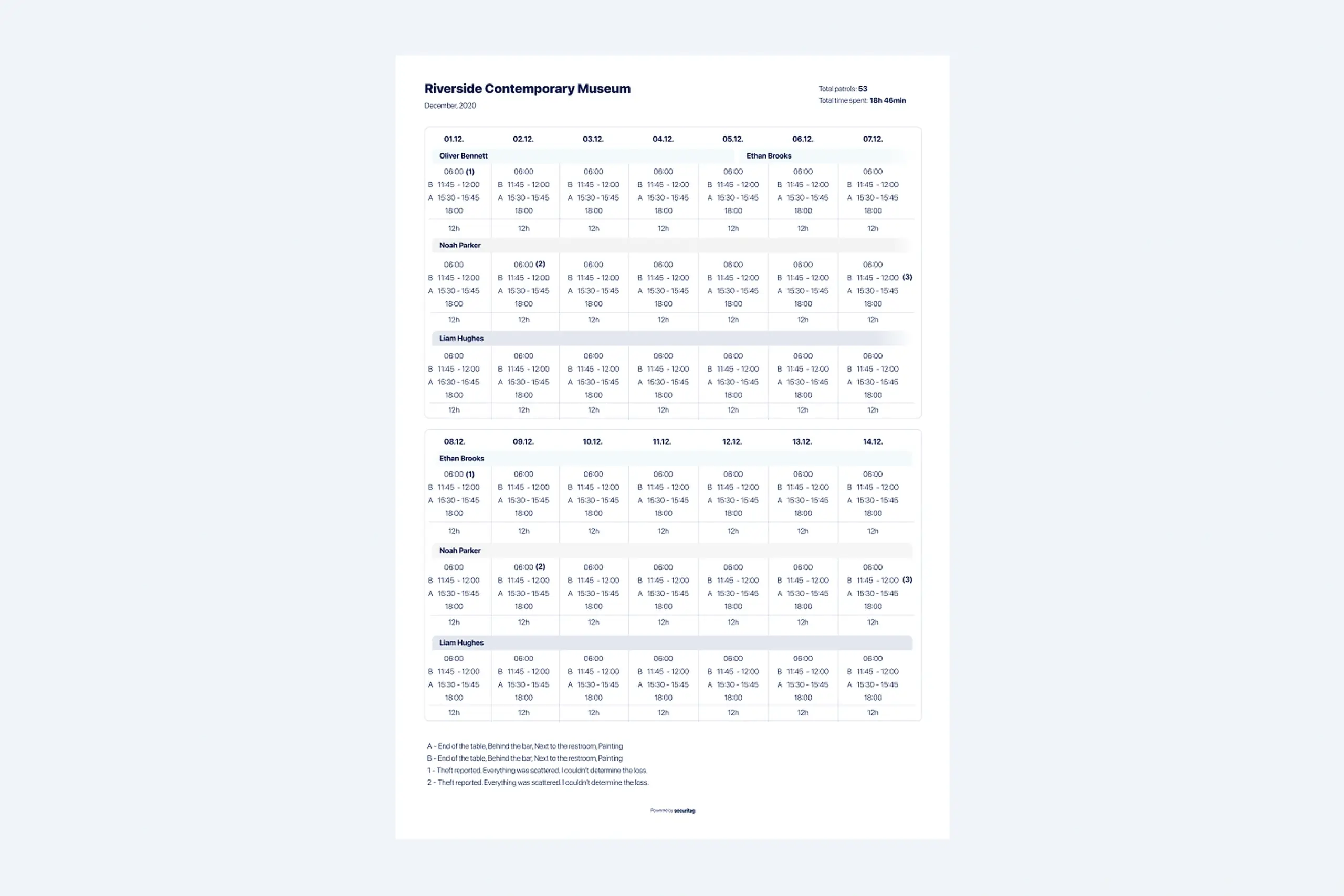
Printable monthly report replaced days of spreadsheet work
The flow that used to be confusing now works in three steps:
Guard opens the app, picks the location and route. Timer starts. The list of chips to scan is shown in order.
Each tap shows immediate confirmation. Scans save locally with timestamp, even with no signal. Progress bar advances.
Guard ends the tour. Data syncs to the dashboard when signal returns. Manager sees the full report with timestamps.
Why two apps instead of one
The original brief assumed a single app for everyone. But once we talked to both sides, it became clear that managers and guards have completely different jobs with zero overlap. Managers live in schedules, locations, and coverage gaps. Guards think step by step: where do I go next, what do I check there, how do I prove I showed up. Trying to squeeze both into one interface would have meant either a complicated role switcher or a watered down compromise that frustrated everyone. Building two focused apps let each group get exactly the experience that matched how they actually work.
Dropped from hours per day to minutes. Live dashboard replaced drive-bys and phone calls. Managers see tours happening in real time.
Workarounds disappeared once the system gave reliable feedback. Guards trust the app, so they use it the way it was designed to be used.
Monthly reporting went from days of spreadsheet work to a one-click export. Hourly rates per security level calculate automatically.
The guards weren't cheating out of laziness. The system was so unreliable that collecting chips and scanning them all at once was the only way to get the job done. Once the system worked properly, the workarounds stopped.
Offline mode isn't something you add later. When half your users work in basements and garages, the whole system needs to assume the connection will drop. We built around that from day one.
Managers need dashboards with density and oversight. Guards need checklists with certainty. A single interface would have compromised both.
I interviewed guards and managers but never actually walked a full tour with a guard myself. I think shadowing them would have shown me things the interviews missed. Next time I'd do that.
Plan for user distrust during system transitions. A good design alone is not enough if people have been burned before.
Frontline tools fail when they are designed for the office instead of the field. This redesign worked because it took the field seriously: poor lighting, no signal, long tours, real distrust. The mobile app and the manager dashboard were designed together, but neither one tried to be the other.
The bigger lesson: trust is the real product. Guards trust the app, so they use it. Managers trust the data, so they stop driving around to check. Once the system works, the workarounds go away on their own.
Curious about the details? Ask the AI assistant anything about this case study: the process, decisions, challenges, or outcomes.
Hi\! I can tell you all about this case study. Pick a question or type your own.
Redesigned a multi-channel CMS for a major sports app. Cut publishing time and eliminated content errors by restructuring around channel-based workflows.
View case study
Took an SDK with a 70% failure rate and turned it around. Two rounds of usability testing, then a full flow redesign.
View case study
Users kept hitting "no results" because the app demanded exact dates. Redesigned the booking flow to match how people actually plan camping trips.
View case study