Data-Driven Logo Design Tool
Designers and clients argue about logo choices based on gut feeling. I built DesignersTool, an app that recommends colour, shape, and typography based on survey data from 267 real people.
Designers and clients argue about logo choices based on gut feeling. I built DesignersTool, an app that recommends colour, shape, and typography based on survey data from 267 real people.
Designers and clients argue about logo choices all the time. "Make it bigger. Make it more fun. Make it more serious." Everyone has opinions, nobody has data. I wanted to change that. I surveyed 267 people about how they connect colours, shapes, and typefaces to specific emotions, built a database from their answers, and designed a cross-platform app that gives designers actual numbers instead of gut feeling.
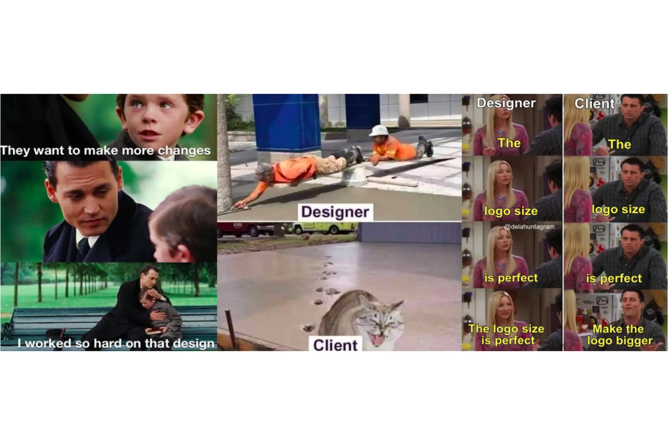
There's an eternal conflict between designers and clients. Designers work hard on a logo, clients want changes that don't make sense. Both sides argue on gut feeling.
I wanted to give designers evidence instead of opinions. If I could prove that specific colours, shapes, and typefaces carry specific emotional associations for specific demographics, designers would have numbers to back up their decisions, and clients would have something concrete to trust.
I also researched the market: Designmantic, Free Logo Services, Graphic Springs, Tailor Brands, Smashing Logo. None of them connect colour, shape, and typography to the target audience with real survey data. The gap was there. That became my brief.
The mission: give designers data so they can say "the research shows this" instead of "I think this looks good."
A visual identity has three basic parts: colour, typography, and shape. I needed to understand how people actually connect each of these to emotions, and whether those connections shift across demographics.
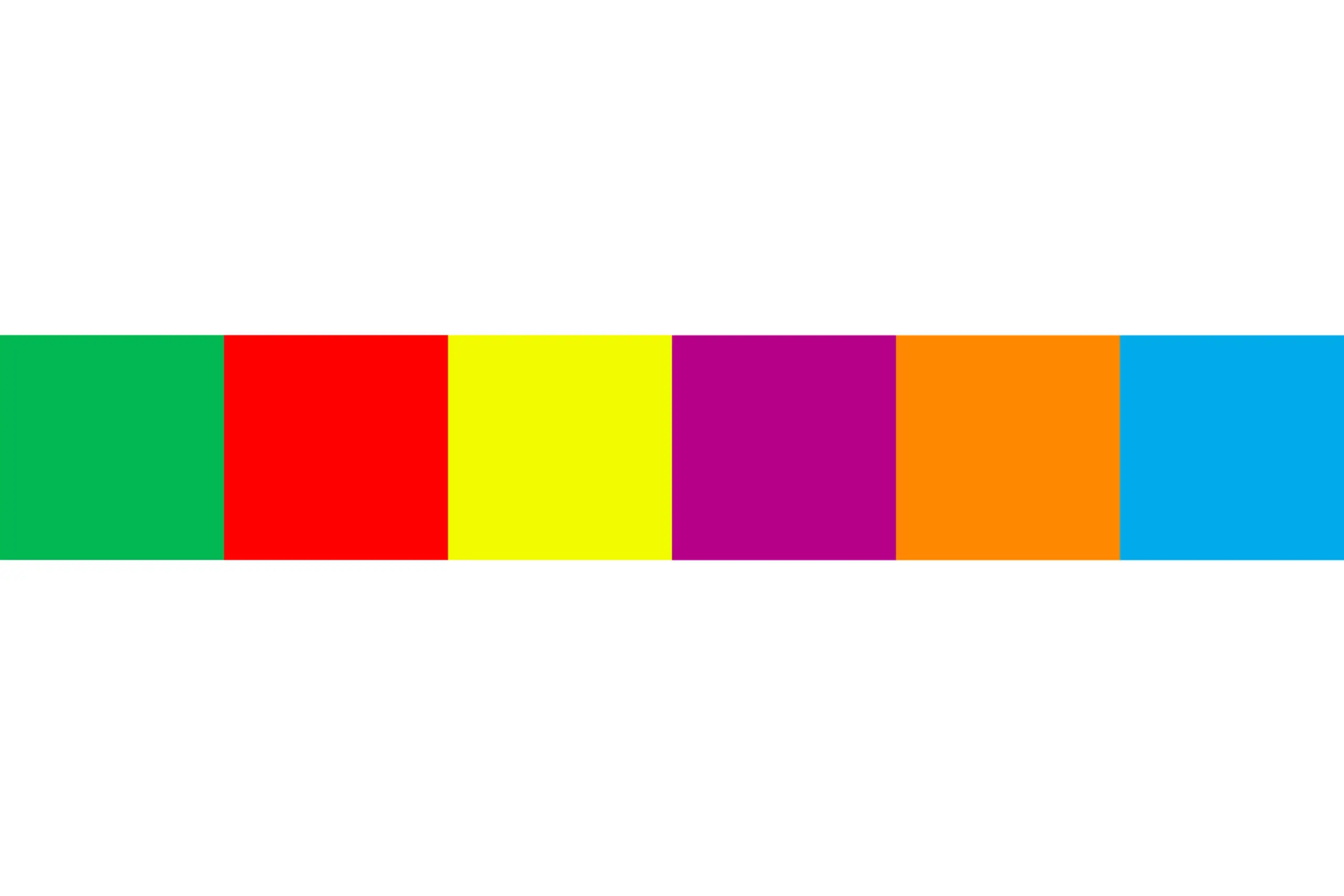
I selected six colours: purple, orange, blue, green, red, and yellow. Colours are divided into chromatic (colours of sunlight) and achromatic (black, white, grey). Chromatic colours split into primary and secondary. I used primary and secondary chromatic colours because tertiary colours are just derivatives, testing them would add noise without insight.
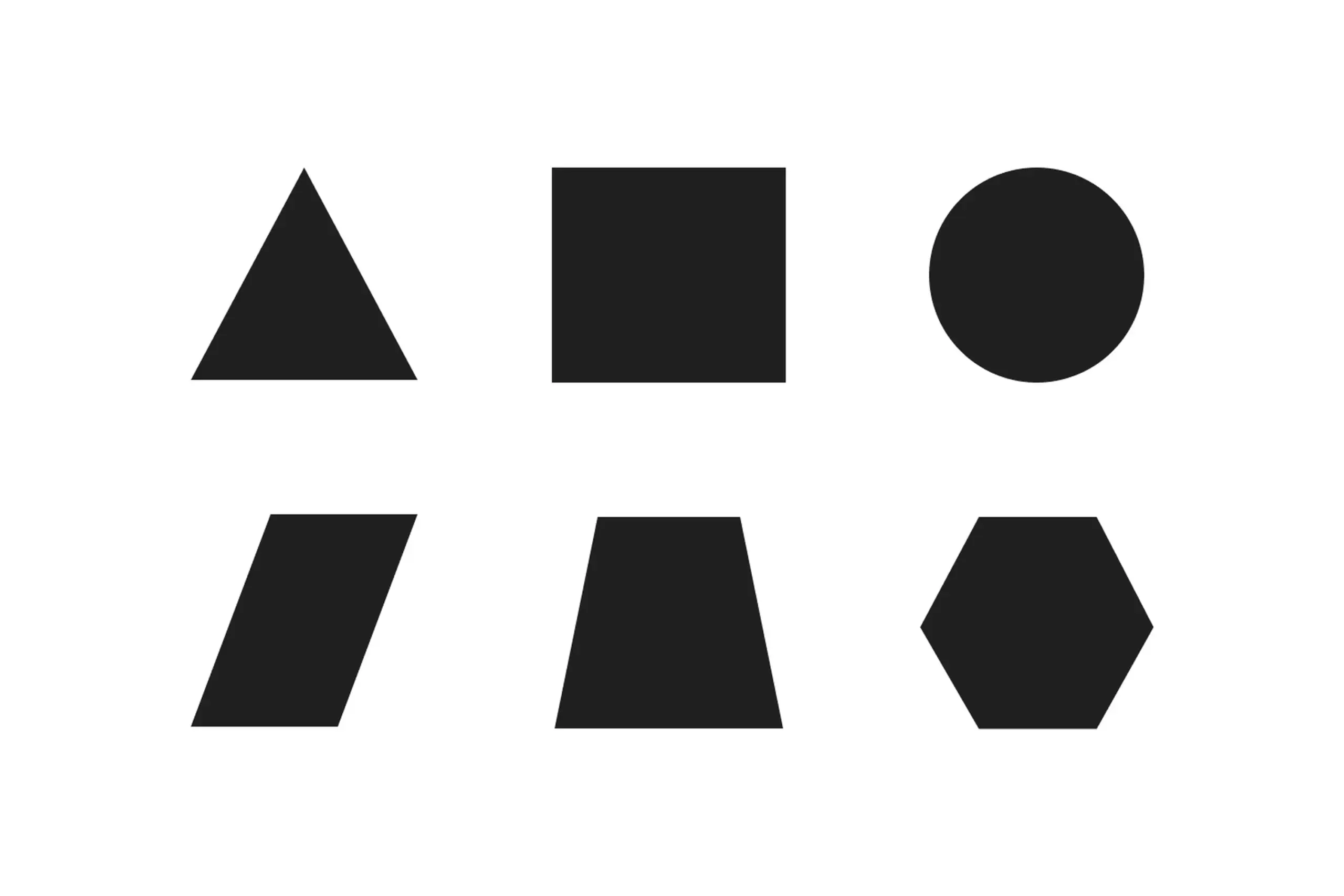
Six shapes: triangle, square, circle, parallelogram, trapezoid, and hexagon. They're the simplest forms according to research on shape perception. I included the hexagon as a representative polygon. I had to limit the number to keep survey time reasonable, since participants also had to rank colours and typography against two separate emotion groups.
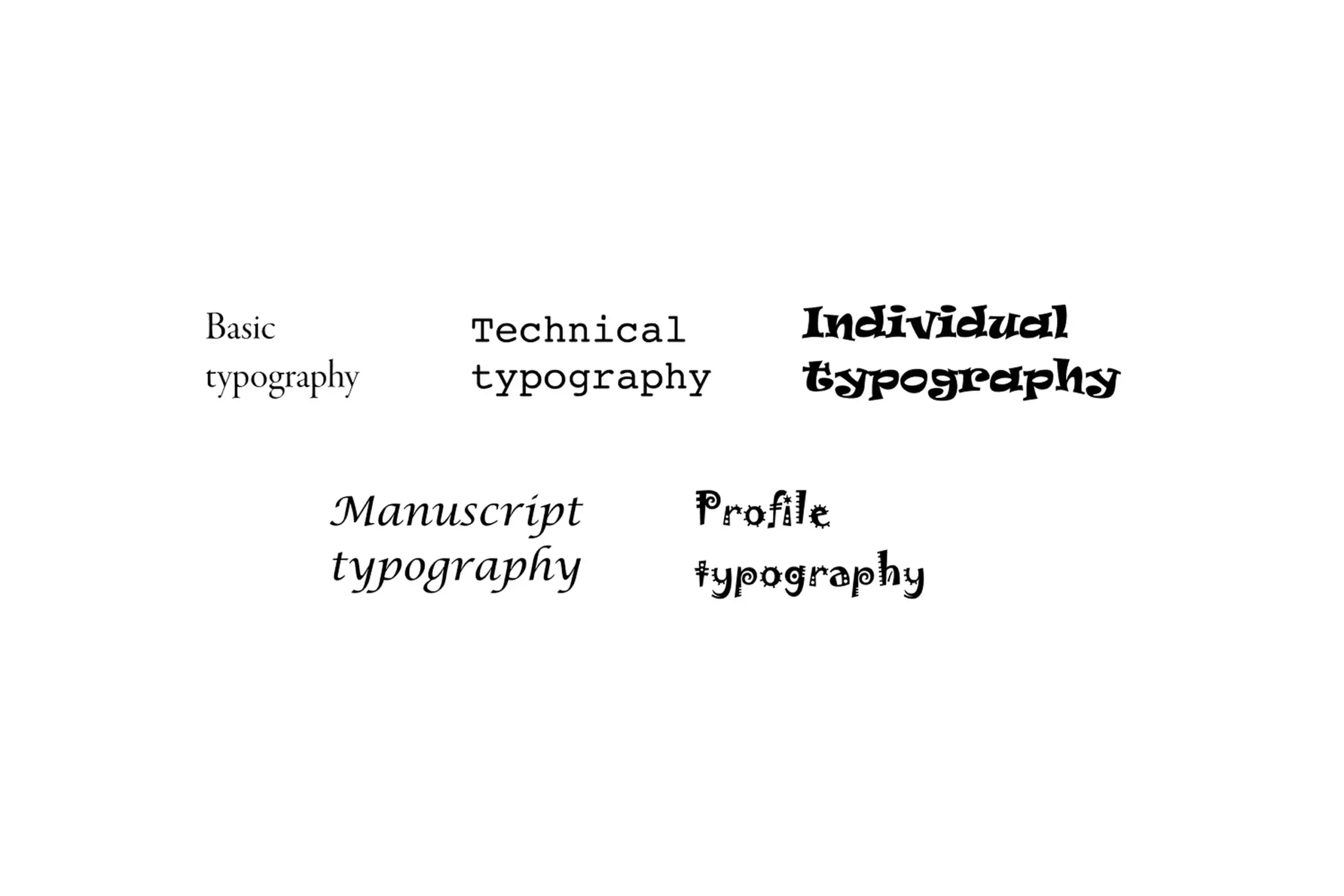
Five groups of typefaces: Basic (Garamond, Minion Pro, Bodoni MT Poster), Technical (Courier, Helvetica, OCR A Extended), Individual (Harrington, Ravie, Cooper Black), Manuscript (Lucida Calligraphy, Chopin Script, Mistral), and Profile (Jokerman, Sketch Block, Circus). I chose three fonts per category that are available on every computer, so the results would stay practically applicable.
Two groups of nine emotions each. Positive (satisfaction, creativity, inspiration, strength, excitement, happiness, interesting, pride, confidence) and Warm (calm, emotionality, hopefulness, kindness, moved, peacefulness, sentimental, touched, warmhearted). Why no negative emotions? Designers never want a visual identity to carry negative associations, so the negative bucket was deliberately left out of the data model. The split into positive and warm comes from the advertising study The Power of Feelings in Understanding Advertising Effects, which categorises emotional responses as positive, negative, or warm.
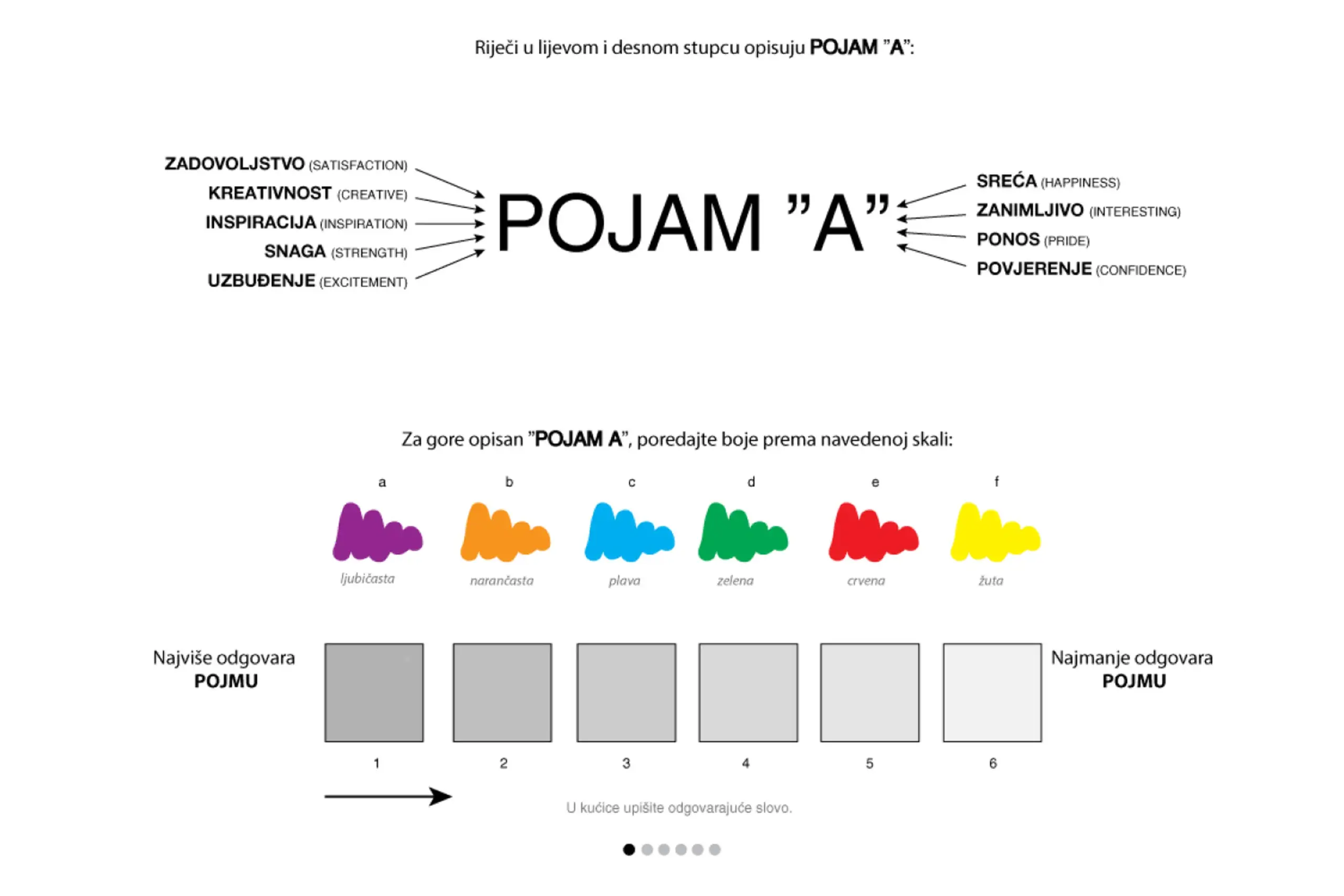
Survey asked participants to connect colors, shapes, and typography with emotions
Decisions that narrowed the scope
With so many possible combinations of colours, shapes, and typography, the hardest design challenge wasn't building the algorithm. It was deciding what to leave out. We tested six colours instead of twelve because adding tertiary options would have tripled the survey length without meaningfully improving the recommendations. We used six basic shapes instead of twenty because every extra shape meant another full ranking sequence for each participant. Survey fatigue was the real enemy of good data. Every constraint in the research design came back to the same question: if we add this, will people still give us reliable answers?
I co-specified an algorithm with the developer that goes beyond simple frequency counting. When a participant ranks colours, shapes, or typography, their first choice carries a weight of 6, their last choice a weight of 1. The algorithm multiplies frequency by position weight, so an answer that appears often and in first position wins over one that appears often but low down.
On top of that, I added an objectivity factor, a slider from 0 to 1 in 0.1 steps. It changes how much extra weight the first position gets relative to the others, without changing the total. A designer who wants stricter adherence to the strongest response pushes the slider towards 1. Someone exploring a broader palette of options pulls it back towards 0. Same data, different lenses.
Designers also pick how many emotion words to use and which group they come from. The algorithm tracks the ratio of positive vs. warm words selected and uses that ratio to weight the final recommendation, even though the designer never has to classify the words themselves.
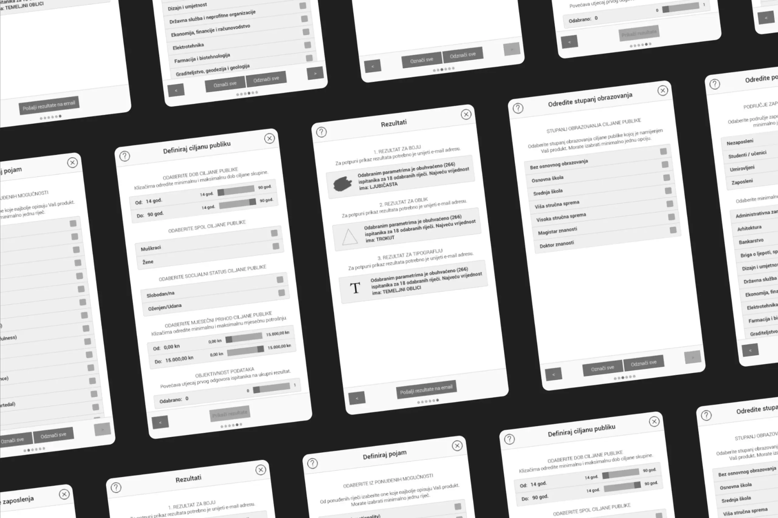
DesignersTool is a cross-platform app that runs on Windows, Mac, Linux, Android, and in the browser. The designer moves through a six-step flow: intro, emotion words, target-audience parameters, trigger the algorithm, review the recommended colour, shape, and typography, and optionally email the full result set for later reference.
Choose any combination of 18 words that describe how the identity should feel. The algorithm quietly classifies them into positive vs. warm in the background.
Age, gender, marital status, education, monthly spending, profession, and field of work. Pick one parameter or all of them, the algorithm accepts any number.
See the ranked colour, shape, and typography for that exact audience and emotional goal, with the option to email the results for later use.
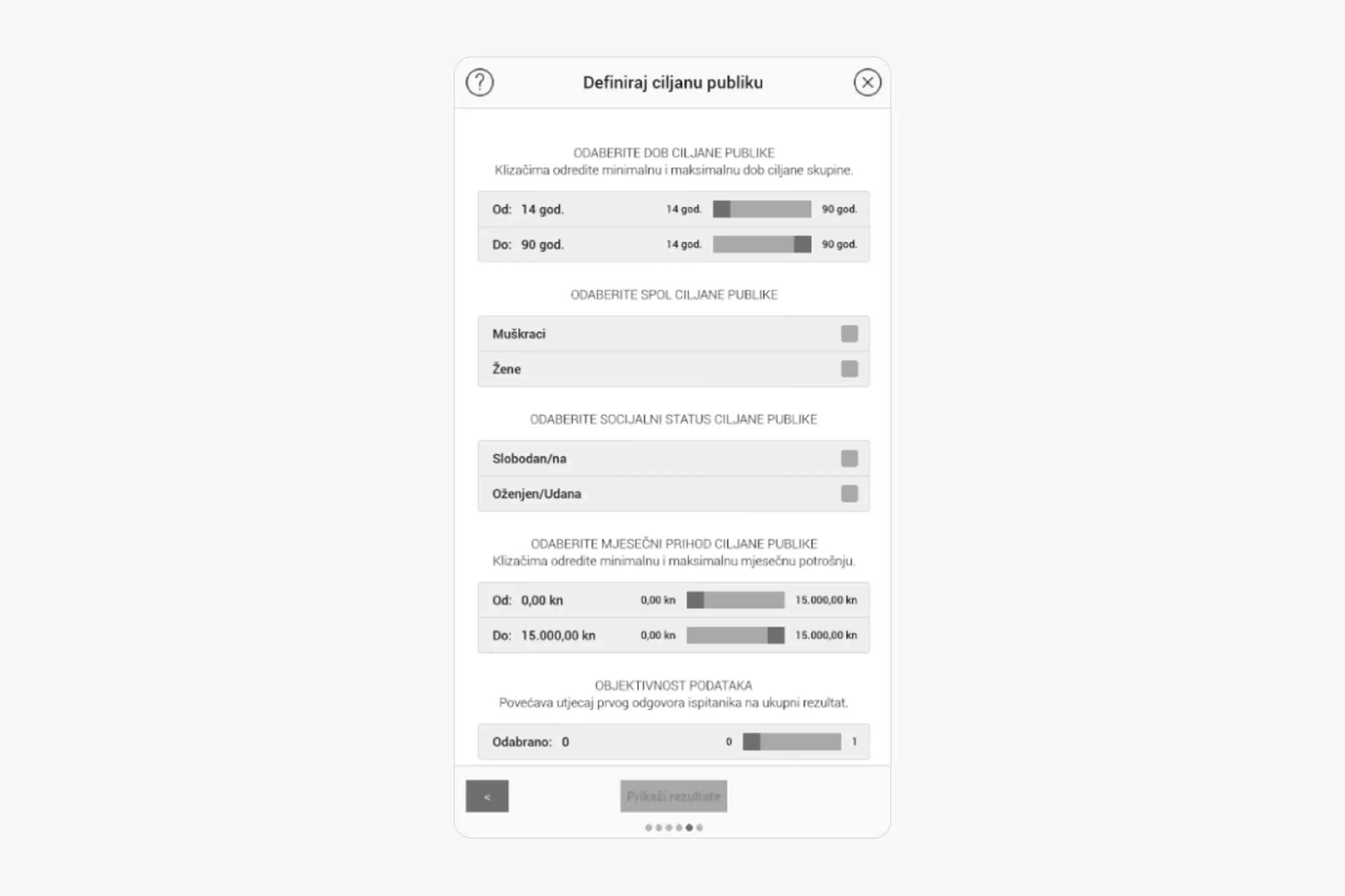
Users define their target audience demographics
Users select which emotions the logo should evoke
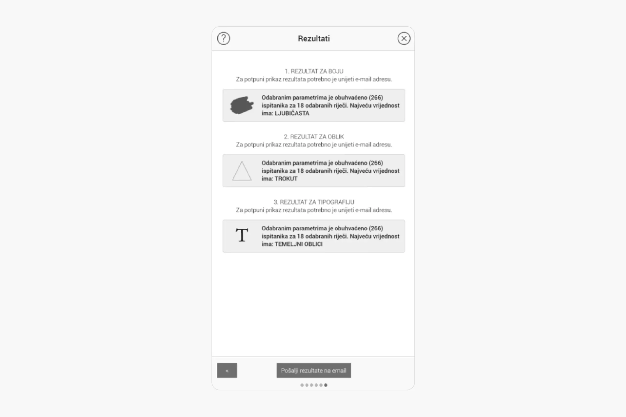
Results show recommended color, shape, and typography with data backing
What the data challenged
Some of the results from 267 respondents genuinely surprised us. Warm colours weren't always seen as "energetic" the way we'd expected. Context changed everything. Sans-serif fonts didn't automatically read as "modern" when you paired them with rounded shapes. The algorithm had to be smarter than just mapping one variable to one feeling. It needed to account for how elements interact with each other. That tension between data and intuition is actually what led to the objectivity slider in the final tool. It lets designers choose how much weight to give the algorithm's suggestion versus their own judgment, because research should support the decision, not make it for you.
267 participants is a good start, but larger samples would increase confidence in findings, especially for demographic subgroups.
My research was primarily conducted with local participants. Colour psychology and emotional associations vary across cultures. A truly universal tool would need data from diverse cultural groups.
The tool gives recommendations, but designers still need judgment. Data shows correlations, not causation. A designer who understands the research can adapt recommendations to their project context.
When you pair research with design, decisions stop being about personal taste. How people respond to colours, shapes, and typography is rooted in psychology and culture, and you can actually measure it.
Research design is harder than I expected. Which colours to test, how to weight survey responses, what the sample looks like. Every choice affects the findings, and I had to learn to think about bias in a way design school didn't prepare me for.
Data doesn't replace taste. It gives you a starting point, but the designer still needs to interpret it, consider the context, and make creative calls. The tool recommends, it doesn't decide.
Colour meanings shift across cultures. Blue means trust in Western design, but something else entirely in other contexts. To make this tool truly universal, I'd need data from many more cultural groups.
Academic work can be more exploratory, but commercialization requires different thinking about scalability and user needs.
Most design decisions come down to opinions. This project proved that designer-client conflicts don't need to be fights. With the right data, they can be collaborations. Designers can say "research shows," and clients can feel confident because decisions are backed by evidence, not gut feeling.
The project also showed that design and science aren't separate. Design can be rigorously researched. Creativity isn't the opposite of methodology. They work together.
Curious about the details? Ask the AI assistant anything about this case study: the process, decisions, challenges, or outcomes.
Hi\! I can tell you all about this case study. Pick a question or type your own.
Redesigned a multi-channel CMS for a major sports app. Cut publishing time and eliminated content errors by restructuring around channel-based workflows.
View case study
Took an SDK with a 70% failure rate and turned it around. Two rounds of usability testing, then a full flow redesign.
View case study
Users kept hitting "no results" because the app demanded exact dates. Redesigned the booking flow to match how people actually plan camping trips.
View case study