Meditation & Spirituality App
People want to keep their spiritual practice going, but most apps feel overwhelming. They end up googling prayers instead of opening the app they already downloaded.
People want to keep their spiritual practice going, but most apps feel overwhelming. They end up googling prayers instead of opening the app they already downloaded.
There are tons of meditation and spirituality apps out there, but I kept hearing the same thing in interviews: people google their prayers instead of opening the app they already have. The apps feel so overwhelming that a search engine is just faster. I talked to 13 people and designed a mobile app for the Croatian market that puts daily practice in one customisable screen.
Before designing anything I needed to understand what spiritual people actually struggle with. I talked with 13 people aged 23 to 46 about their daily spiritual life. Four patterns kept coming up, and each one was a gap existing apps were not filling.
People download meditation and spirituality apps, then google what they need anyway. The apps feel overwhelming and search engines feel faster, even if the content is technically inside the app.
Users write down things that matter to them from videos and articles. Later they cannot find those notes. They spend more time searching than they saved by writing them down.
During prayer or meditation people check the phone for time and get hit by notifications. A moment meant to calm them becomes a moment of distraction.
Some prayers take more time than people have in the morning. Without any sense of duration, users skip them rather than do a shorter version. The app has no idea how long anything takes.
If users google instead of opening your app, the app is not the problem. The amount of friction is.
I interviewed 13 people aged 23 to 46 about their daily spiritual life. From the patterns that emerged, I built two personas who stood in for the main audiences: Marina, 38, a mom juggling family and quiet time, and Luka, 27, a programmer who wants short, consistent practice. Every feature in the app maps back to something one of them said out loud.
The simpler-than-Google challenge
Thirteen interviews all pointed to the same paradox. People wanted a rich content library, but they'd abandon any app the moment it felt complex. And the real benchmark wasn't other meditation apps. It was literally typing a prayer into Google and reading the first result. If the app added even a little more friction than that, people would just go back to their browser. That insight killed a lot of features that seemed like obvious additions. Social sharing, streak tracking, gamification: none of it survived. If a feature didn't directly help someone find the right prayer and start, it got cut.
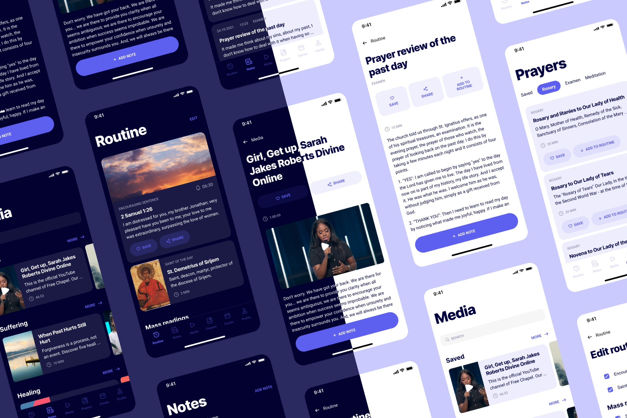
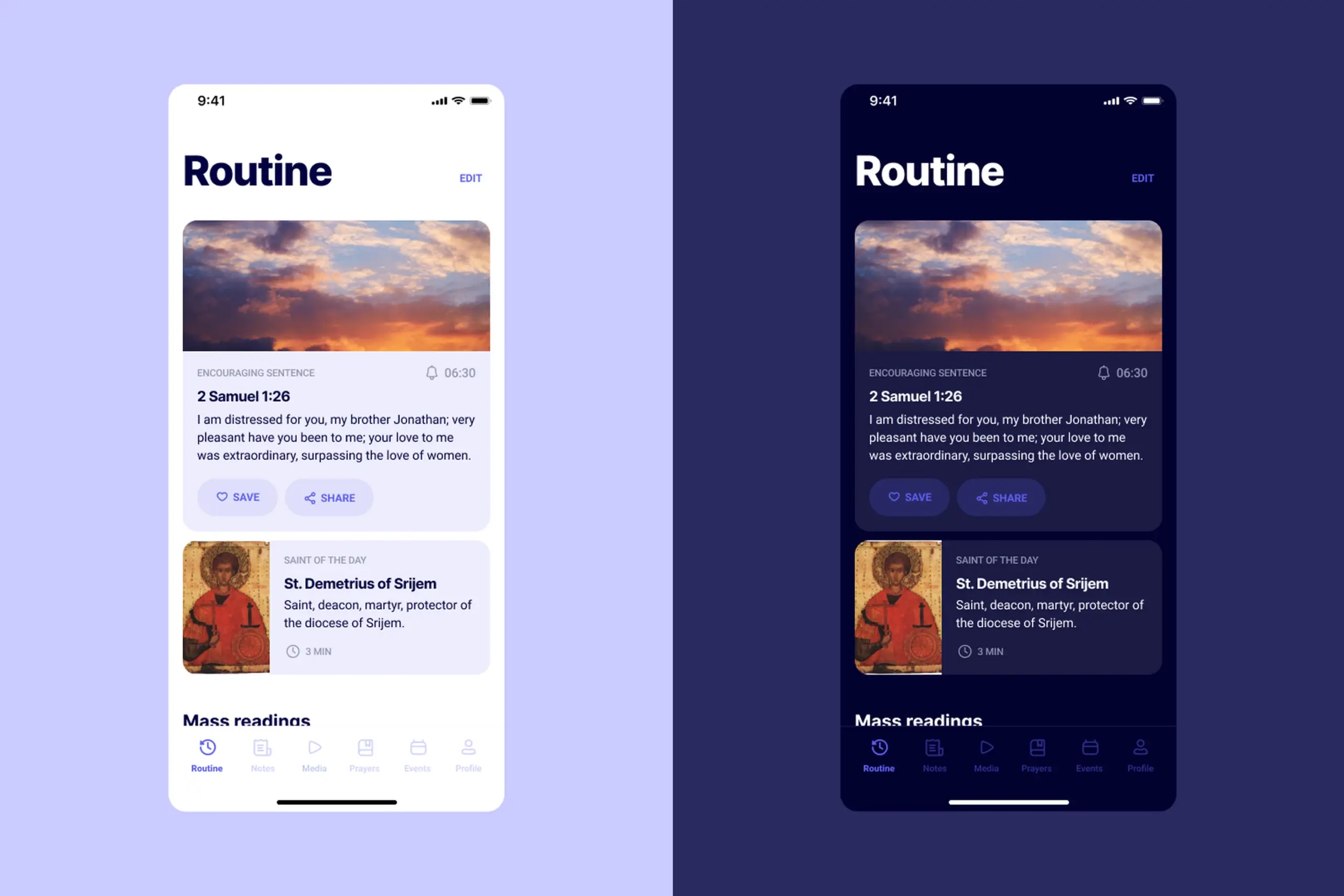
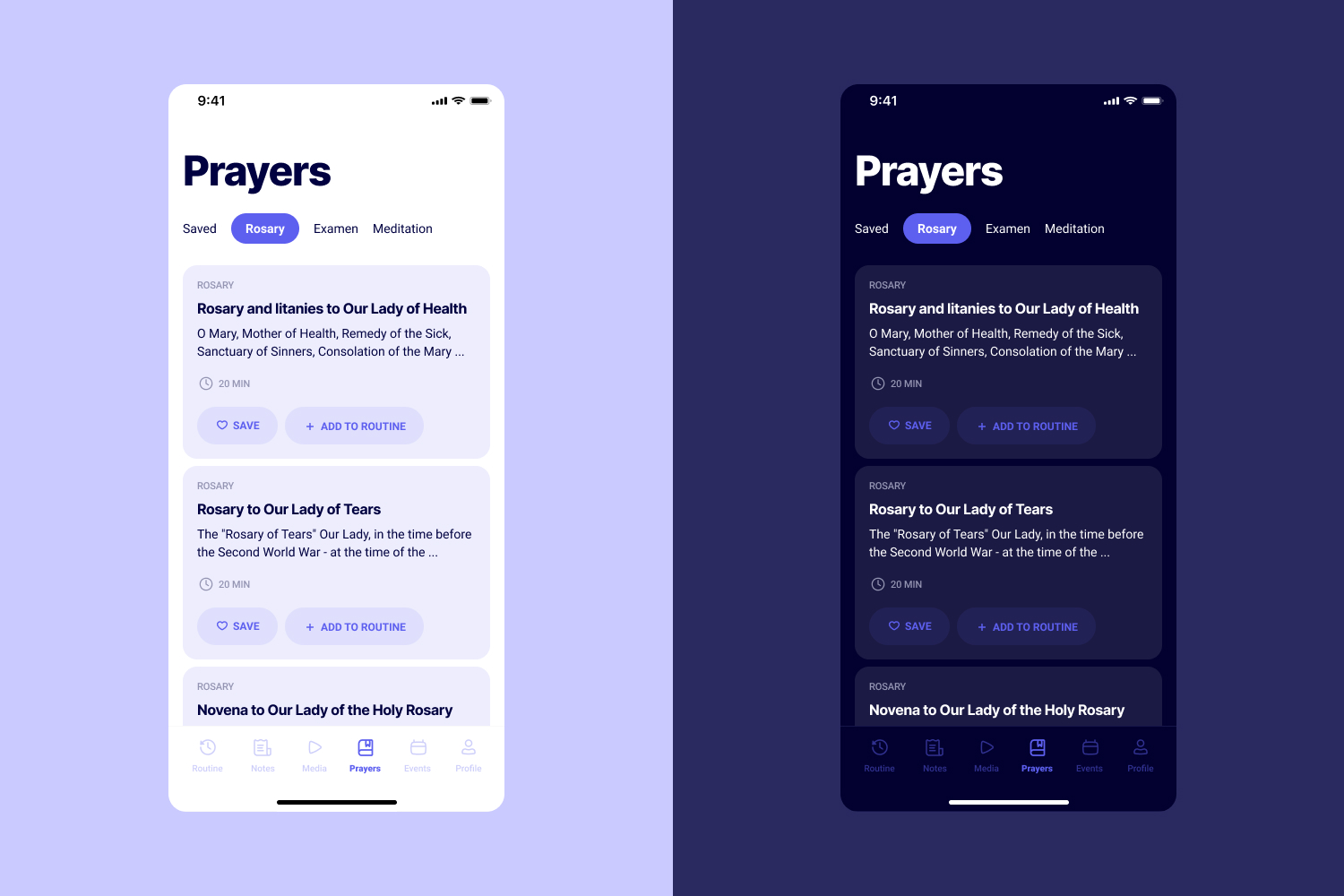
The home screen is the heart of the app. It shows everything for daily practice in one place: an encouraging sentence, saint of the day, mass readings, breviary prayers, and suggestions.
Fully editable. Users can add or remove any element based on their schedule. Marina wants a full set in the morning, Luka wants two minutes between commits. Same screen, different shapes.
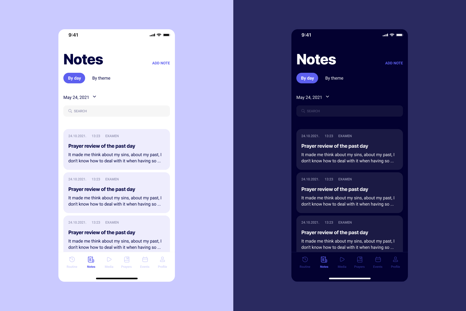
Two filters: by date and by theme. Plus "on this day" notifications, so a year from now users get reminded of what they wrote. Old notes become valuable instead of buried.
Users specifically asked for colours in notes during interviews, so each note can be tagged with a colour that makes it recognisable at a glance.
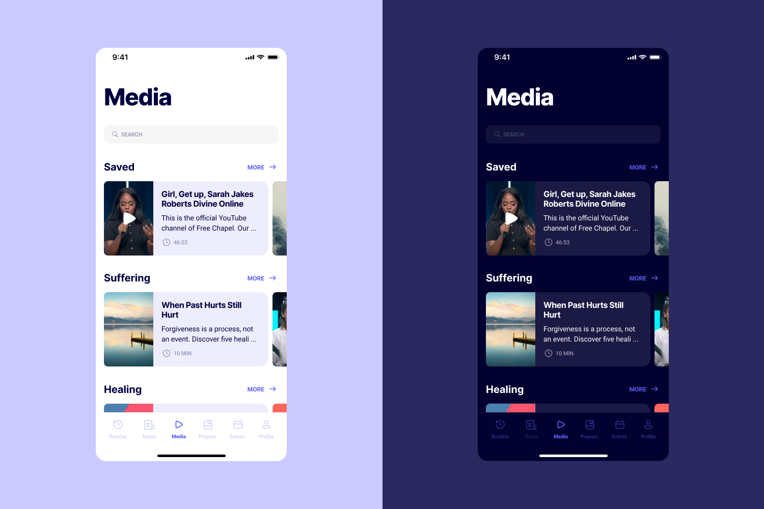
Content is organised by topic and author, which is how users actually look for things in interviews. Every piece shows reading or watching time, so users can choose something that fits the moment they have.
At the end of every list there is a "search the internet" button. If the app does not have what they want, help them find it instead of creating a dead end.
Each prayer has Save and Add to Routine actions, so users can slot it straight into their daily flow. Events integrate with the user's calendar and show a green dot when there is free time to sit with one.
Light and dark themes for morning and evening use. A purple palette carries through the app as a quiet signal of the spiritual context, without shouting it at users.
Six main sections, built around user mental models instead of product taxonomy:
Customisable home screen with everything for a single day of practice, editable per user.
Filter by date or theme, "on this day" reminders, topic and author organisation, and time estimates on every piece of content.
Save, add to routine, calendar integration, and theming that fits both morning and evening practice.
A single customisable home screen replaced the scattered menu structure that drove users to Google. Daily practice starts where the app opens.
Date and theme filters, plus "on this day" reminders, turned old notes from a search problem into a source of unexpected value a year later.
Time estimates on every piece of content, calendar-aware event suggestions, and light and dark themes for morning and evening use.
What I'd do differently
Looking back, the biggest gap in this project was not testing the final designs with real users before handing them to developers. The research phase gave us strong hypotheses, and every screen mapped to something we'd heard in interviews. But the solutions went straight from high fidelity mockups into code without any validation step in between. If I could redo it, I'd run at least one round of prototype testing with five or so users before anything got built. Especially around the customisable home screen, which is really the feature holding the whole experience together.
If googling is faster than opening the app, the app has already lost. That was the core problem I needed to solve.
Some users want a full morning ritual. Others want two minutes between tasks. A customisable home screen fit both without forcing either.
Notes get forgotten by default. "On this day" notifications turned old notes into small surprises, giving them a second life users had not expected.
13 interviews before any wireframes meant every screen mapped to something real. Next time I would also validate final designs with usability testing and check accessibility earlier, especially with the purple palette.
If users google instead of opening the app, the research is already telling you the answer.
Wellness apps often compete on features. This one had to compete with a search bar. The only way to win that comparison was to reduce friction: one customisable home screen, content organised the way people actually look for it, and time estimates so users could choose something that fit the moment they had.
The broader lesson: if research shows that users route around your product, the answer is not more features. It is less distance between the user and the thing they came for.
Curious about the details? Ask the AI assistant anything about this case study: the process, decisions, challenges, or outcomes.
Hi\! I can tell you all about this case study. Pick a question or type your own.
Redesigned a multi-channel CMS for a major sports app. Cut publishing time and eliminated content errors by restructuring around channel-based workflows.
View case study
Took an SDK with a 70% failure rate and turned it around. Two rounds of usability testing, then a full flow redesign.
View case study
Users kept hitting "no results" because the app demanded exact dates. Redesigned the booking flow to match how people actually plan camping trips.
View case study